16 Styled Layer Descriptor (SLD)
SLD is an XML scheme defined by OGC which is used to stylize layers or groups of layers (maps); in other words, SLD is a tool for cartographic formatting of layers. By using it, it is possible to define the adequate display of vector and raster data. Typical use of SLD is the precise definition of the way in which rendering of a layer will be done when sending WMS a request for that layer.
In 2007, OGC split SLD specifications into two new ones: Symbology Encoding (SE), a server-independent specification used to describe and shape system data unconnected to servers (desktop GIS), and Styled Layer Descriptor (SLD) which describes the way in which symbolization can be used on WMS layers (a layer is defined as a set of data which can have different characteristics).
Numerous open code software support SLD specification: desktop (Udig, JUMP GIS, QGIS, AtlasStyler) and Web map servers (GeoServer, Mapserver).
The diagam on Figure 16.1 shows the method of SLD implementation. From left to right:
Content to style,
Connecting style to data, using FeatureTypeStyle elements. The example below has two feature types to be stylized, roads and cities,
Rule elements define which data will be stylized and when a style will be applied.
Symbols contain real information,
The task of the composition is to stratify layers on a map.
FeatureTypeStyle, Rule and Symbolizers are the most important elements of an SLD document.
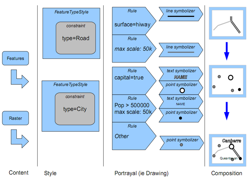
Figure 16.1: SLD implementation (adapted from Making Maps Pretty, The art of SLD and tricks for great looking maps, November 2009).
The following example shows the basic structure of SLD documents.
<StayledLayerDescriptor>
     <NamedLayer>
           <Name> LAYER STYLE NAME</Name>
                    <UserStyle>
                        <Title> LAYER STILE TITLE </Title>
                         <FeatureTypeStyle>
                                    ...
                         <FeatureTypeStyle>
                </UserStyle>
      </NamedLayer>
</StayledLayerDescriptor>
Key elements of an SLD file are
NamedLayer,
UserLayer,
NamedStyle, and
UserStyle.
NamedLayer is the name of the layer on the server. NamedStyle is the style name stored on the server. UserLayer is the layer (or layer section) name when it is exported into GML format. UserStyle is the part of the document containing SLD syntax, this part of the XML file defines the cartographic formatting of the layer.
16.1 Element FeatureTypeStyle
For an entity type (all entities or parts of data in a layer) to be styled, the entity or its part must be stated in SLD. If isohypses are styled, we can either define a rule to display all isohypses in the same color or line thickness, or we can make a rule that every fifth isohypse should have greater thickness. The FeatureTypeStyle element contains one or more rules defining the display of entities. The list of rules for FeatureTypeStyle elements should contain rules for all entities appearing in a layer.
FeatureTypeStyle can also have tags for metadata: name (Name), title (Title), and abstract (Abstract).
16.2 Rule elements
Rules (Rule) are used to group parts of data formatted in the same way. Each rule can be uniquely determined with additional metadata, such as name, title, and abstract, in which the user can textually describe the Rule element. Within the Rule element, a LegendGraphic element can be specified, defining the content of the stylized layer section in the map legend. The Rule element is limited to describing only one group of entities (points, lines, polygons, raster, toponyms; PointSymbolizer, LineSymbolizer, PolygonSymbolizer, TextSymbolizer, RasterSymbolizer), because the FeatureTypeStyle element contains stylization for only one data type. Besides the stylization of entities, formatting can be defined depending on the display scale. Filters can also be applied to specify which rule should have priority, depending on criteria besides scale. How to use Rule elements within FeatureTypeStyle elements is not a simple question. On the one hand, the Rule elements should be sorted according to their natural priorities, with more important rules coming first. For example, highways should come before regional roads. On the other hand, SLD generally uses a “painter’s model,” i.e., the first item on the list is the first to be displayed, whereby it is placed on the “bottom,” when looking at the map. This is unintuitive for assigning priorities since highways should generally be displayed over secondary roads. Therefore, rules should be placed in an order of priorities in the UserStyle element; then, data will be displayed using a natural or logical order, i.e., higher-priority data will be displayed over lower-priority data (this means applying characteristics whose values will serve to assign priority).
An example of SLD terrain color styling:
<?xml version="1.0" encoding="ISO-8859-1"?>
<StyledLayerDescriptor version="1.0.0" xmlns="http://www.opengis.net/sld" xmlns:ogc="http://www.opengis.net/ogc"
  xmlns:xlink="http://www.w3.org/1999/xlink" xmlns:xsi="http://www.w3.org/2001/XMLSchema-instance"
  xsi:schemaLocation="http://www.opengis.net/sld http://schemas.opengis.net/sld/1.0.0/StyledLayerDescriptor.xsd">
  <NamedLayer>
    <Name>gtopo</Name>
    <UserStyle>
      <Name>dem</Name>
      <Title>Simple DEM style</Title>
      <Abstract>Classic elevation color progression</Abstract>
      <FeatureTypeStyle>
        <Rule>
          <RasterSymbolizer>
            <Opacity>1.0</Opacity>
            <ColorMap>
              <ColorMapEntry color="#000000" quantity="-500" label="nodata" opacity="0.0" />
              <ColorMapEntry color="#AAFFAA" quantity="0" label="values" />
              <ColorMapEntry color="#00FF00" quantity="1000"/>
              <ColorMapEntry color="#FFFF00" quantity="1200" label="values" />
              <ColorMapEntry color="#FF7F00" quantity="1400" label="values" />
              <ColorMapEntry color="#BF7F3F" quantity="1600" label="values" />
              <ColorMapEntry color="#000000" quantity="2000" label="values" />
            </ColorMap>
          </RasterSymbolizer>
        </Rule>
      </FeatureTypeStyle>
    </UserStyle>
  </NamedLayer>
</StyledLayerDescriptor>
16.2.1 Scale-dependent formatting
Using certain tags (elements) and parameters within the Rule element, a setting can be made to display data differently for each scale denominator value. This is achieved by setting MinScaleDenominator and MaxScaleDenominator tags.
The following code defines the display for libraries in Belgrade, based on the scale denominator values, i.e., zoom. For scale denominator values smaller than 160000, points representing libraries are displayed in blue; for scale denominator values between 160000 and 320000 in purple; and for scale denominator values greater than 320000 in red.
<FeatureTypeStyle>
     <Rule>
       <Name>Red</Name>
       <MaxScaleDenominator>160000</MaxScaleDenominator>
       <PointSymbolizer>
         <Graphic>
           <Mark>
             <WellKnownName>circle</WellKnownName>
             <Fill>
               <CssParameter name="fill">#0000cd</CssParameter>
             </Fill>
           </Mark>
           <Size>10</Size>
         </Graphic>
       </PointSymbolizer>
     </Rule>
     <Rule>
       <Name>Purple</Name>
       <MinScaleDenominator>160000</MinScaleDenominator>
       <MaxScaleDenominator>320000</MaxScaleDenominator>
       <PointSymbolizer>
         <Graphic>
           <Mark>
             <WellKnownName>circle</WellKnownName>
             <Fill>
               <CssParameter name="fill">#ba55d3</CssParameter>
             </Fill>
           </Mark>
           <Size>10</Size>
         </Graphic>
       </PointSymbolizer>
     </Rule>
     <Rule>
       <Name>Blue</Name>
       <MinScaleDenominator>320000</MinScaleDenominator>
       <PointSymbolizer>
         <Graphic>
           <Mark>
             <WellKnownName>circle</WellKnownName>
             <Fill>
               <CssParameter name="fill">#ff0000</CssParameter>
             </Fill>
           </Mark>
           <Size>10</Size>
         </Graphic>
       </PointSymbolizer>
     </Rule>
   </FeatureTypeStyle>
Figure 16.2 is composed of three parts, showing maps for each of the three defined rendering based on the scale denominator value.
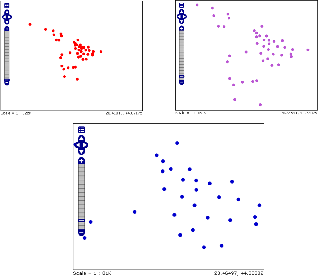
Figure 16.2: Displaying data based on scale denominator values.
As seen from their names, MinScaleDenominator and MaxScaleDenominator elements are simply the minimum and maximum scale denominator values between which the Rule element, for which they are intended, will be applied.
16.2.2 Data filtering
Filter and ElseFilter elements allow the choice of data based on criteria, i.e., attribute values.
The Filter element has a relatively simple meaning. The filter syntax is defined using WFS specification and enables spatial and attributive filtering.
Filters used in different Rule elements, applied to the same FeatureTypeStyle allow overlapping of data used in each of the Rule elements. A style for a map must execute all Rule elements related to data, according to the order in which they appear.
The ElseFilter element enables the activation of data not selected by any Rule element in the FeatureTypeStyle.
The interpretation of the ElseFilter element is more complicated compared with the Filter element. The nominal display scale of a map is calculated and all rules for the scale range which do not include the calculated nominal display scale are excluded from further processing. Then, specific conditions for the ElseFilter element are calculated based on all other Filter elements and then, global “no” conditions are taken. For example, if there are “rules” in the style having conditions a = 6 and b ` 20, then the ElseFilter condition will be
not ( (a=6) or (b>20) )
Figure 16.3 shows the results of attributive filtering. The filtered data are cities in Europe. Large red circles represent European capitals, whereas orange circles represent European provincial capitals.
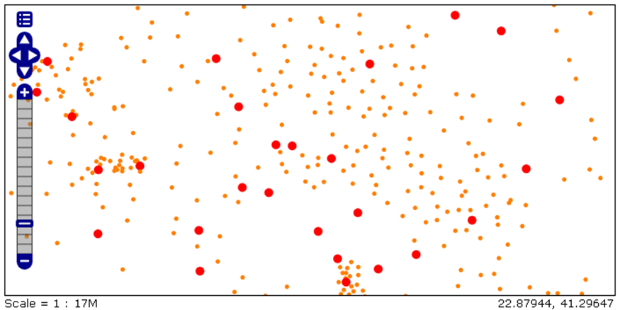
Figure 16.3: Using an attribute filter on a point layer.
Based on the following “rule”, the map visualization in Figure 16.3 is defined.
 <Rule>
   <Name>Glavni_gradovi_Evrope</Name>
   <Title>Glavni_gradovi</Title>
      <ogc:Filter>
       <ogc:PropertyIsEqualTo>
        <ogc:PropertyName>STATUS</ogc:PropertyName>
        <ogc:Literal>National capital</ogc:Literal>
       </ogc:PropertyIsEqualTo>
      </ogc:Filter>
   <PointSymbolizer>
     <Graphic>
       <Mark>
        <WellKnownName>circle</WellKnownName>
          <Fill>
           <CssParameter name="fill">#FF0000</CssParameter>
          </Fill>
       </Mark>
       <Size>10</Size>
     </Graphic>
   </PointSymbolizer>
 </Rule>

<Rule>
   <Name>Provincijski_gradovi_Evropa</Name>
   <Title>Provincijski gradovi</Title>
      <ogc:Filter>
       <ogc:PropertyIsEqualTo>
        <ogc:PropertyName>STATUS</ogc:PropertyName>
        <ogc:Literal>Provincial capital</ogc:Literal>
       </ogc:PropertyIsEqualTo>
      </ogc:Filter>
   <PointSymbolizer>
     <Graphic>
       <Mark>
        <WellKnownName>circle</WellKnownName>
          <Fill>
           <CssParameter name="fill">#FF7F00</CssParameter>
          </Fill>
       </Mark>
       <Size>5</Size>
     </Graphic>
   </PointSymbolizer>
 </Rule>
The tags in the first three lines of this example are explained in previous sections. In the fourth line, the ogc:Filter tag starts data filtering, i.e., between the ogc:Filter and /ogc:Filter tags, filtering is defined.
The fifth line contains the filtering function, in this case IsEqualTo, which prescribes that the Rule element, in which the filter is located, relates to data whose attribute, defined in the ogc:PropertyName tag, has a prescribed value defined in the ogc:Literal tag.
The ogc:PropertyName defines the attribute to which the filtering function relates to; in this case, the STATUS attribute, and the attribute value is defined using the ogc:Literal tag, and that value for the first Rule element (related to capitals) is “National capital.”
The visualization of provincial capitals is realized in the same way, except that the attribute value is “Provincial capital.”
There are 120 functions which can be used for data filtering. They are divided into groups, and the most important ones are the following:
Comparison functions,
Geometric functions,
Mathematical functions,
String functions.
The manner of defining symbols representing data (color, size, etc.) will be described in the following sections.
16.2.3 Legend definition
A legend can be taken directly using the WMS GetLegendGraphic request. Additional formatting of the legend is defined within the SLD file which defines formatting. The LegendGraphic element explicitly provides optional graphic symbols to be displayed in the legend for a certain Rule. Title and Abstract are used to define the title and description of the element. It is useful to provide at least the Title so that it can be used in the map legend. The Name element enables external connection, necessary when using some SLD methods.
The following section describes how to add the legend and scale to a map.
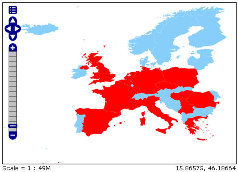
Figure 16.4: European countries formatted according to population – no legend.
Figure 16.4 shows European countries with a population under 10 million in blue, and those with a population over 10 million in red.
To represent data based on an attribute value, data filtering is used, as explained in a previous section.
Figure 16.5 shows a map identical to the one in Figure 16.4, except that a legend and scale have been added.
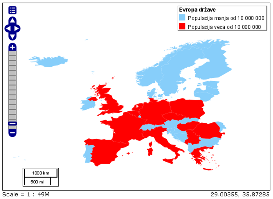
Figure 16.5: European countries formatted according to population – with a legend and scale.
The request which returns the legend and scale is identical to the request for receiving a map from Figure 16.4, with the addition of one more parameter in the WMS GetMap request – the &format_options=layout:Layout_1 parameter. This parameter calls the XML that was previously stored in a subfolder in the data_dir folder, where the server is installed (in this case, the example is valid for Geoserver).
The XML file for the previous example is:
<layout>
    <decoration type="image" affinity="bottom,left" offset="6,6" size="80,31">
    </decoration>
    <decoration type="scaleline" affinity="bottom,left" offset="36,6"/>
    <decoration type="legend" affinity="top,right" offset="6,6" size="auto"/>
</layout>
The position and size of the legend and scale are defined in the XML file.
16.2.4 Styling points
The PointSymbolizer element is used to format point-like entities. PointSimbolezer elements always contain theGraphic tag, defining the way in which the point will be graphically represented and which sign will be used. The ExternalGraphic tag enables the points to be displayed as images. Images can be used via na URL address or a file related to SLD (local address).
Also within PointSymbolizer elements, it is ipossible to adjust the size of the symbol representing the points. This is done through the Size tag.
Graphic is a graphical symbol with a unique shape, color, and size. Graphic can also be informally defined as a small image of raster or vector type. The term Graphic used because the term Simbol, just as the term Symbolizer, is used in another context in SLD.
Graphic can be imported via an URL address, in a specific format (e.g., GIF or SVG), or made up of Mark elements.
The external element within PointSymbolizer elements is the Graphic tag. There are five tags that can contain the <Graphic> tag, shown in Table 16.1.
| TAG | REQUIRED? (YES/NO) | DESCRIPTION |
ExternalGraphic |
NO (when using Mark) |
Defines which image is used as a symbol. |
Mark |
NO (when using ExternalGraphic) |
Defines the shape to be used as a symbol. |
Opacity |
NO | Determines the transparency of a symbol. Values range from 0 (completely transparent) to 1 (completely opaque). The default value is 1. |
Size |
YES | Defines the symbol size in pixels. When used for images, determines its height, with width proportional to height. |
Rotation |
NO | Defines the symbol rotation in degrees. Rotation increases in the clockwise direction. Negative values point to a counterclockwise rotation. The default value is 0. |
Within the ExternalGraphic tag, there are additional tags (Table 16.2, Figure 16.6), as in the Mark tag (Table 16.2, Figure 16.7)
| TAG | REQUIRED? (YES/NO) | DESCRIPTION |
OnlineResource |
YES | Determines the image location. It can be a URL or local address related to SLD. |
Format |
YES | Defines the image format. |
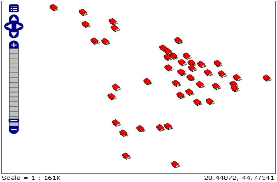
Figure 16.6: Example of using the ExternalGraphic tag (imported symbols for libraries in Belgrade).
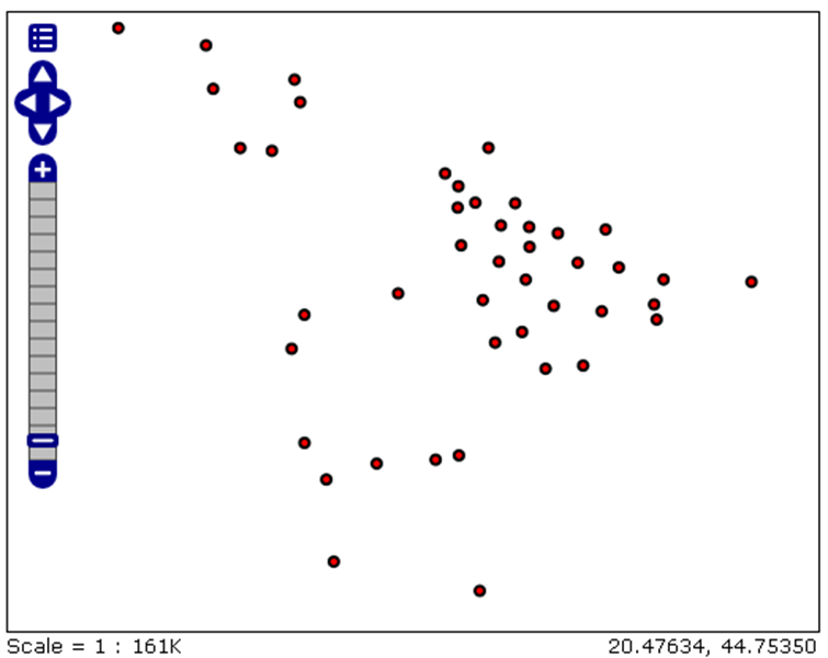
Figure 16.7: Example of using the Mark tag (imported symbols for libraries in Belgrade)
The following example presents a code which executes a visualization for data in the previous Figures 16.7 and 16.6. A description of the tags used in the Mark tag (WellKnownName, Fill, Stroke) are given in Table 16.3.
<PointSymbolizer>
  <Graphic>
   <ExternalGraphic>
     <OnlineResource
     xlink:type="simple"
     xlink:href="Biblioteka.png"/>
     <Format>image/png</Format>
  </ExternalGraphic>
  <Size>25</Size>
 </Graphic>
</PointSymbolizer>

<PointSymbolizer>
  <Graphic>
      <Mark>
          <WellKnownName>circle</WellKnownName>
          <Fill>
           <CssParameter name="fill">#FF0000</CssParameter>
          </Fill>
          <Stroke>
           <CssParameter name="stroke">#000000</CssParameter>
           <CssParameter name="stroke-width">2</CssParameter>
          </Stroke>
      </Mark>
     <Size>6</Size>
  </Graphic>
</PointSymbolizer>
This example uses a predefined symbol – a circle. This is achieved using the WellKnownName tag. The symbol color is determined within the Fill tag. If we want to create a border around the point-like symbol, the Stroke tag should be used and border line color and thickness should be defined in it.
| TAG | REQUIRED? (YES/NO) | DESCRIPTION |
WellKnownName |
YES | Shape name. Options are circle, square, triangle, star, and cross. The default value is square. |
Fill |
NO (when using Stroke) |
Determines how the symbol will be colored. Options are CSSParameter name=“fill“ and the color is defined in the form of #RRGGBB or GraphicFill. |
Strike |
NO (when using Fill) |
Defines how the symbol will be rendered on the border. Options are CSSParameter name=“fill“ and colors are defined in the form of ##RRGGBB. |
16.2.5 Styling lines
As indicated by its name, the LineSymbolizer element is a key element for the cartographic formatting of line vectors. A good example are roads, which showcase what can be achieved through line stylization. Different categories of roads can represent different line types – thin and brighter lines for secondary roads, dark and thick lines for primary roads.
The Geometry element of the LineSymbolizer defines the linear geometry to be used for display. Geometry is an optional element, if it is absent, the default geometry is the one contained in the FeatureTypeStyle tag.
The outer tag within the LineSymbolizer is Stroke. This tag is mandatory and it determines the way in which lines are visualized. There are three possible tags that can be included into Stroke and they are given in Table @(tab:sldLin).
| TAG | REQUIRED? (YES/NO) | DESCRIPTION |
GraphicFill |
NO | Defines how a line will be graphically completed |
GraphicStroke |
NO | Defines the symbol to be rendered along the line |
CssParameter |
NO | Defines parameters of line stylization |
When GraphicFill and GraphicStroke tags are used, it is necessary to insert the Graphic tag inside them. The syntax for the Graphic tag is identical to the Graphic tag syntax in the section describing PointSymbolizer elements. In this case, Graphic specifies linear graphics.
Within the CssParameter tag, graphical parameters and their values are used, imported from the SVG/CSS2 standard with identical names and semantics. A description of these elements is given in Table 16.5.
| PARAMETER | REQUIRED? (YES/NO) | DESCRIPTION |
name=“stroke“ |
NO | Defines the color of the line in the form of #RRGGBB. The default color is black (#000000). |
name=“stroke-width“ |
NO | Defines the line width in pixels. The default value is 1. |
name=“stroke-opacity“ |
NO | Defines line transparency. Values range from 0 (completely transparent) to 1 (completely opaque). |
name=“stroke-linejoin“ |
NO | Defines how lines are shown in regions of line segment contact. Possible values are mitre (sharp angles), round, and bevel (diagonal angles). The default value is mitre. |
name=“stroke-linecap“ |
NO | Defines how the ends of line segments are displayed. Possible values are butt (sharp square edges), round (rounded edges), and square (slightly elongated square edges). The default value is butt. |
name=“stroke-dasharray“ |
NO | Defines lines as a series of short dashes (dashed lines). Even numbers define the dash length in pixels and odd numbers define the length of the space between the dashes in pixels. |
Figure 16.8 represents the result of applying LineSymbolizer elements to lines representing European rivers. Below is the code for LineSymbolizer elements defining the stylization of the map in Figure 16.8.
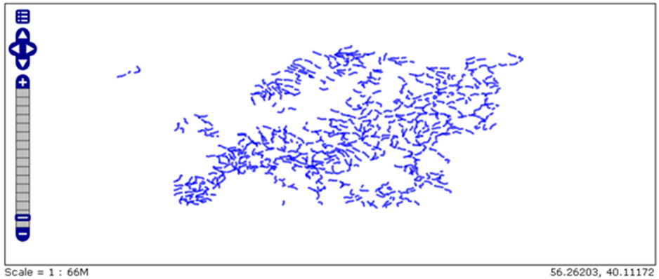
Figure 16.8: Application of LineSymbolizer elements to European rivers.
 <LineSymbolizer>
     <Stroke>
       <CssParameter name="stroke">#0000FF</CssParameter>
       <CssParameter name="stroke-width">4</CssParameter>
       <CssParameter name="stroke-opacity">0.7</CssParameter>
       <CssParameter name="stroke-linejoin">round</CssParameter>
       <CssParameter name="stroke-linecap">round</CssParameter>
       <CssParameter name="stroke-dasharray">16 5</CssParameter>
    </Stroke>
</LineSymbolizer>
As can be seen, all <Stroke> parameters were used in the LineSymbolizer element.
The first parameter defines the line color; in this case, blue. The color is defined using the RGB scale in the form of #RRGGBB where R, G, and B stand for red, green, and blue, respectively.
The second parameter defines the line width in pixels; in this case, the value is 4.
The third parameter defines the transparency of linesegments. The values range from 0 (completely transparent) to 1 (completely opaque). In this case, the value is 0.7; looking at the map, the sense of the display of other values can be gained.
The fourth parameter, stroke-linejoin, defines the way in which line segments are displayed at contact points. Possible values are mitre (sharp angles), round, and bevel (diagonal angles).
The stroke-linecap parameter determines the shape in which lines are visualized at their end segments. Possible values are butt (sharp square edges), round (rounded edges), and square (slightly elongated square edges). In this case, rounded edges are used.
The map in Figure 16.9 below, relates to the map in Figure 16.8, except that the zoom has been increased, so as to better see details resulting from the lat three parameters.
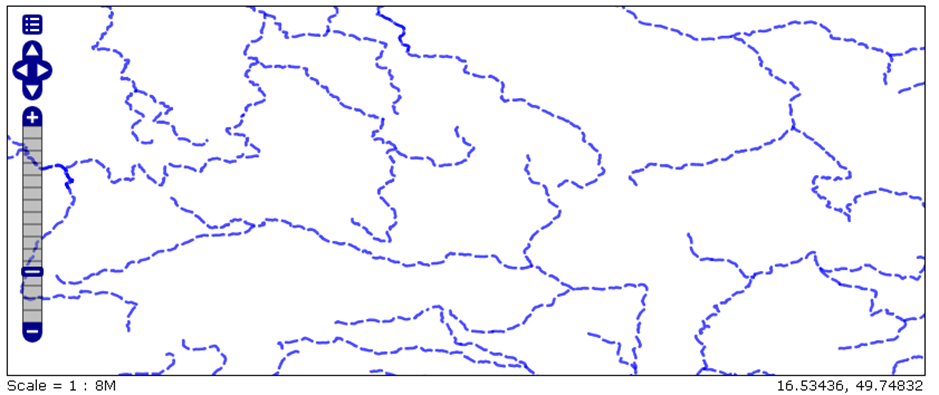
Figure 16.9: Application of LineSymbolizer elements to European rivers (larger zoom).
The last parameter of this example (strok-dasharray) forms dashed lines. The value of this parameter are two numbers, and even and an odd one. The even number represents the length of dashes (in pixels), whereas the odd number represents the length of the spaces between the dashes (in pixels). In this example, the length of the dashes is 16 pixels and the length of the spaces between dashes is 5 pixels.
16.2.6 Styling polygons
PolygonSymbolizer is used to format polygons (or other surface geometries), including filling areas and drawing polygon border lines.
PolygonSymbolizer can have two external tags given in Table 16.6.
| TAG | REQUIRED? (YES/NO) | DESCRIPTION |
Fill |
NO (when using Stroke) |
Defines the style of the polygon surface (interior) |
Stroke |
NO (when using Fill) |
Defines the polygon border lin style |
Details and subelements for the Stroke tag are identical to the ones for LineSymbolizer, whereas additional tags for Fill are given in Table 16.7.
| TAG | REQUIRED? (YES/NO) | DESCRIPTION |
GraphicFill |
NO | Fills the polygon interior according to a pattern |
CssParameter |
NO | Defines style parameters |
When using the GraphicFill tag, it is mandatory to include the Graphic tag. The Graphic tag syntax is described in more detail in the PointSymbolizer section.
TheCssParameter tag is accompanied by additional tags given in Table 16.8.
| PAREMETER | REQUIRED? (YES/NO) | DESCRIPTION |
name=“fill“ |
NO | Defines the color of the polygon fill. The color is defined in the form of #RRGGBB and the default value is gray (#808080) |
name=“fill-opacity“ |
NO | Defines the transparency of the polygon interior. Values range from 0 (completely transparent) to 1 (completely opaque). The default value is 1. |
The following example is used for polygon formatting. European countries are represented by polygons (Figure 16.10).
<PolygonSymbolizer>
 <Fill>
   <CssParameter name="fill">#000080</CssParameter>
   <CssParameter name="fill-opacity">0.5</CssParameter>
 </Fill>
 <Stroke>
   <CssParameter name="stroke">#FFFFFF</CssParameter>
   <CssParameter name="stroke-width">2</CssParameter>
   </Stroke>
</PolygonSymbolizer>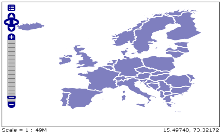
Figure 16.10: Application of PolygonSymbolizer elements.
The previous example used all tags described in the tables in this section, except the GraphicFill tag. This tag can be used to call an image which will be used to fill the polygon interior with certain geometry, not just color. This is necessary for hatching polygon surfaces. The result of this possibility is given in Figure 16.11, below which the code for this display is given.
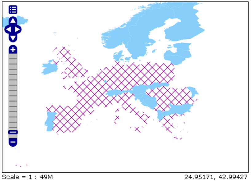
Figure 16.11: Hatched polygons.
Figure 16.11 shows European countries. Countries with a population under 10 million are colored blue, whereas the countries with a population above 10 million are hatched.
Hatches are imported using the GraphicFill tag, within which additional parameters are defined. Below is a part of the SLD code defining this presentation of European countries. The second Rule of this code shows how GraphicFill is used.
Additionally, data filtering (described in subsection 16.2.2) was also used for the map in Figure 16.11.
<FeatureTypeStyle>
     <Rule>
       <Name>Small_population</Name>
       <Title>Less_than_10_million</Title>
       <ogc:Filter>
         <ogc:PropertyIsLessThan>
           <ogc:PropertyName>POP_CNTRY</ogc:PropertyName>
           <ogc:Literal>10000000</ogc:Literal>
         </ogc:PropertyIsLessThan>
       </ogc:Filter>
       <PolygonSymbolizer>
         <Fill>
           <CssParameter name="fill">#87cefa</CssParameter>
         </Fill>
       </PolygonSymbolizer>
    </Rule>

     <Rule>
       <Name>Large_population_1</Name>
       <Title>from 100,000 to 1000,000</Title>
       <ogc:Filter>
           <ogc:PropertyIsGreaterThanOrEqualTo>
             <ogc:PropertyName>POP_CNTRY</ogc:PropertyName>
             <ogc:Literal>10000000</ogc:Literal>
         </ogc:PropertyIsGreaterThanOrEqualTo>
       </ogc:Filter>
       <PolygonSymbolizer>
         <Fill>
           <GraphicFill>
             <Graphic>
               <Mark>
                 <WellKnownName>shape://times</WellKnownName>
                 <Stroke>
                   <CssParameter name="stroke">#990099</CssParameter>
                   <CssParameter name="stroke-width">1</CssParameter>
                 </Stroke>
               </Mark>
               <Size>16</Size>
             </Graphic>
           </GraphicFill>
         </Fill>
       </PolygonSymbolizer>
     </Rule>
  </FeatureTypeStyle>
16.2.7 Cartographic formatting of raster data
Tag names used for raster data are analogous to those used for vector data. The key element is RasterSymbolizer.
Elements which can be used as parameters within the RasterSymbolizer tag are
OpacityColorMapChannelSelectionContrastEnhancementShadeRelifOverlapBehaviorImageOutline
Opacity
This element defines the transparency level for a corresponding data set. As usual, values range from 0 (completely transparent) to 1 (completely opaque). The syntax for Opacity is very simple (Opacity0.5/Opacity).
ColorMap
The ColorMap element sets rules for color gradients, based on attribute values. This value relates to all pixels or groups of pixels in the raster. The ColorMap element can also contain Opacity and a Label. Using transparency is described in the previous paragraph, while using the Label will be described in the TextSymbolizer section.
ChannelSelection
This element determines channel formatting. A data set can contain three standard color channels (red, green, and blue) or one grayscale channel.
ContrastEnhancement
The ContrastEnhancement element is used in color channels to set the brightness of data for that channel. There are three possibilities:
Normalization,
Histogram,
GammaValue.
Normalization entails expanding contrast: the pixel with a minimum value is given minimum brightness and a pixel with a maximum value is given maximum brightness.
A histogram is similar to normalization except that it attempts to produce an image with an equal number of pixels in all brightness levels.
Finally, GammaValue is a data scaling factor which calculates brightness of the data. Pixels with values smaller than 1 are darker, while pixels with values greater than 1 are brighter.
ShadeRelif
The ShadeRelif element is used for creating an effect of plasticity by selectively adjusting brightness. This is a very useful effect for elevation data. There are two types of terrain shading: BrightnessOnly and ReliefFactor.
OverlapBehavior
Sometimes, raster data are composed of multiple sets of images, e.g., a satellite recording. In such cases, it is necessary that those smaller units partially overlap. The OverlapBehavior element is designed to define handling of this overlap. There are four types of OverlapBehavior: AVERAGE, RANDOM, LATEST_ON_TOP i EARLIEST_ON_TOP.
AVERAGE takes every overlap point and displays their average value. RANDOM determines which image is shown based on a choice (this can sometimes lead to a sharper image). LATEST_ON_TOP and EARLIEST_ON_TOP set a decision factor decision as an internal “stamp” for every image in a data set.
ImageOutline
Considering the previous situation with raster image composition, it is possible to format each image with border lines. In order to use ImageOutline, it is necessary to define LineSymbolizer or PolygonSymbolizer elements.
16.2.8 Formatting toponyms
TextSymbolizer is used within the same Rule as the other symbolizers since they place an attribute’s value on the map, relying on data location. The attribute value is defined using the Label tag. The text position (attribute value) is defined using the LabelPlacement tag. The Label tag is used to identify text for display, i.e., to define which attributes will be shown as toponyms. Table 16.9 contains all tags used in TextSymbolizer.
| TAG | REQUIRED? (YES/NO) | DESCRIPTION |
Label |
YES | Defines the label text |
Font |
NO | Defines the label font |
LabelPlacement |
NO | Determines the label position relative to individual data |
Halo |
NO | Creates a color background around the text |
Fill |
NO | Determines text color |
Within the Font tag, only the CssParameter tag is used. There are four types of parameters for this tag included within the CssParameter tag, Table 16.10.
| PARAMETER | REQUIRED? (YES/NO) | DESCRIPTION |
| *name=“font-family“* | NO | Defines the font to be used. The default font is Times. |
| *name=“font-style“* | NO | Defines the font style. Options are normal, italic, and oblique. The default value is normal. |
| *name=“font-weight“* | NO | Defines font letter thickness. Options are normal and bold. The default value is normal. |
| *name=“font-size“* | NO | Defines font size in pixels. The default value is 10. |
Within the LabelPlacement tag, there are tags related to defining the text position. Text positioning is done relative to a point or line, whereas the polygon text is always in its center. Hence, withing the LabelPlacement tag, PointPlacement and LinePlacement tags are used.
16.2.8.1 PointPlacement
For PointPlacement, a label anchor point and displacement from that point can be defines using the AnchorPoint and Displacement tags.
The AnchorPoint element gives the text location inside the text box. The text position is given based on two numbers in the tag: AnchorPointX and AnchorPointY, and values range from 0.0 to 1.0. The influence of these values on text position is based on an encompassing rectangle, i.e., a text box. The value 0.0 is considered to be the upper right corner of the text box and the value 1.1 is considered to be the bottom left corner of the text box. The default values are X = 0 and Y = 0.5.
The Displacement element provides X and Y displacements of text relative to a geometric point. This tag is typically used to avoid overlap between text and symbols, moving the text along the X or Y axis by a certain number of pixels. The default values are X = 0 and Y = 0.
In PointPlacement, there is a Rotation tag which rotates the text around a center point in the clockwise direction. The default value is 0.0. Values are given in decimal degrees.
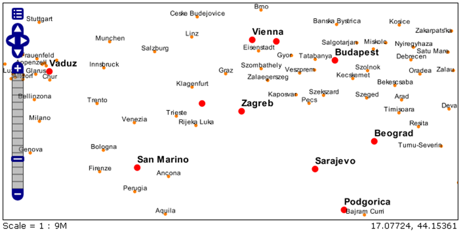
Figure 16.12: Example of using PointPlacement for European cities.
Fiure 16.12 presents major European cities. The symbols for capitals is a large red circle, and for other major cities, a smaller orange circle. It can clearly be seen that names of cities are not positioned relative to the symbols in the same way for capitals and other major cities. The differences in city name positions is the result of different parameters in the PointPlacement tag. For capitals, AnchorPointX and AnchorPointY are 0, and DisplacementX = 0 and DisplacementY = 5; therefore, the capital names are above and to the right of the symbols. For other major cities, these parameters have their default values, AnchorPointX = 0.5, AnchorPointY = 0, and the Displacement parameter is (0,0); hence, the names of other major cities are exactly above the symbols. The method of using the above mentioned tags and parameters can be seen in the SLD code which defines toponyms using TextSymbolizer tags. Within the first TextSymbolizer tag, parameters for the display of names of capitals are set, and within the second TextSymbolizer tag, the display of other major cities is defined.
<TextSymbolizer>
         <Label>
           <ogc:PropertyName>CITY_NAME</ogc:PropertyName>
         </Label>
         <Font>
           <CssParameter name="font-family">Arial</CssParameter>
           <CssParameter name="font-size">14</CssParameter>
           <CssParameter name="font-style">normal</CssParameter>
           <CssParameter name="font-weight">bold</CssParameter>
         </Font>
          <LabelPlacement>
           <PointPlacement>
             <AnchorPoint>
               <AnchorPointX>0</AnchorPointX>
               <AnchorPointY>0</AnchorPointY>
             </AnchorPoint>
             <Displacement>
               <DisplacementX>0</DisplacementX>
               <DisplacementY>5</DisplacementY>
             </Displacement>
           </PointPlacement>
         </LabelPlacement>
         <Fill>
           <CssParameter name="fill">#000000</CssParameter>
         </Fill>
</TextSymbolizer>

<TextSymbolizer>
         <Label>
           <ogc:PropertyName>CITY_NAME</ogc:PropertyName>
         </Label>
         <Font>
           <CssParameter name="font-family">Arial</CssParameter>
           <CssParameter name="font-size">10</CssParameter>
           <CssParameter name="font-style">normal</CssParameter>
         </Font>
          <LabelPlacement>
           <PointPlacement>
             <AnchorPoint>
               <AnchorPointX>0.5</AnchorPointX>
               <AnchorPointY>0.0</AnchorPointY>
             </AnchorPoint>
           </PointPlacement>
         </LabelPlacement>
         <Fill>
           <CssParameter name="fill">#000000</CssParameter>
         </Fill>
</TextSymbolizer>
The LinePlacement tag offers the possibility of the text following the line’s shape. This is very useful for toponyms like rivers and roads. VendorOption is a tage used with LinePlacement. It is accompanied by parameters related to the text position relative to the line. The name=“followLine” parameter defines whether the text should follow the line shape. Possible options are true and false. Logically, if the value is true, the text will follow the line shape. The name=“maxAngleDelta” parameter defines the maximum angle that the text can follow, i.e., if the line changes direction more than this parameter, the text will not follow its shape. If there is overlap of two texts, i.e., toponyms, the name=“maxDisplacement” parameter will define how much the text can be displace relative to its true location. The maximum displacement parameter is given in pixels. The name=“repeat” parameter assigns after how many pixels the text will appear again. This is very useful for long line objects, when the text needs to be written in several places along the object.
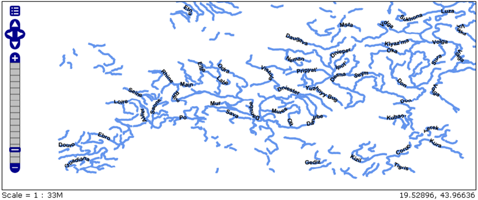
Figure 16.13: Example of using LinePlacment for European rivers.
Figure 16.13 represents a map of European rivers with their names. The code that defines this map is give below.
<TextSymbolizer>
            <Label>
              <ogc:PropertyName>NAME</ogc:PropertyName>
            </Label>
            <Font />
            <Fill>
              <CssParameter name="font-family">Arial</CssParameter>
              <CssParameter name="font-weight">bold</CssParameter>
              <CssParameter name="font-size">10</CssParameter>
            </Fill>
            <VendorOption name="followLine">true</VendorOption>
            <VendorOption name="maxAngleDelta">90</VendorOption>
            <VendorOption name="maxDisplacement">400</VendorOption>
            <VendorOption name="repeat">150</VendorOption>
</TextSymbolizer>