12 Geovisualization in R
In this Chapter, example of geovisualization in R will be presented. In the first section, the R language and environment will be briefly presented, along with basic data structures. Afterwards, spatial data structures in R will be presented, and finally, example of visualization will be given, in R and on virtual globes and Web maps. Code and data are provided for each example so that the readers can reproduce them or adjust them according to their needs.
12.1 R
R was created as a system for statistical analyses and graphing and is currently one of the most powerful data analysis tools. R is a free, open source interpreter. Among other things, R is a programming language with a high potential for creating graphs and visualization. Besides, R offers an interface towards other programming languages and GIS applications. R is very popular for data analysis in different fields: statistics, geoinformatics, geography, agriculture, ecology, bioinformatics, and many others.
A detailed introduction into R is outside the scope of this section. For that purpose, some of the following free materials are recommended, especially if the reader is not familiar with any programming languages:
12.1.1 R installation
The basic installation of the R interpreter contains a set of packages which for linear algebra, descriptive statistics, creating graphs, etc. The installation depends on the operating system, an it can be downloaded from https://cran.r-project.org/.
The packages are sets of functions, documentation files, and data. Packages are created by R users and development team experts. Currently, there are over 12000 packages. For example, the rgdal package is a set of classes and methods for reading and writing spatial data using GDAL functionalities.
Users usually install a set of packages that best fits their specific needs. For example, a set of packages related to spatial data can be found at https://cran.r-project.org/web/views/Spatial.html. This page contains a list of packages with a brief description and all of the packages are in a group called view Spatial.
If the user wishes to install all packages meant for working with spatial data (belonging to the view Spatial group), it is necessary to input the following commands.
install.packages("ctv")
library("ctv")
install.views("Spatial")
The first command is for the installation of a package called ctv (Cran Task View). Afterwards, the ctv package is loaded into the work environment using the library command. Finally, using the install.views command, the installation of all packages in the group is initiated.
The most popular environment for R is RStudio (Figure 12.1), which offers an integrated work environment for the R interpreter, a code editor, a window for viewing data, graphs, help regarding functions, and much more. The installation is available from https://www.rstudio.com/products/rstudio/download/.
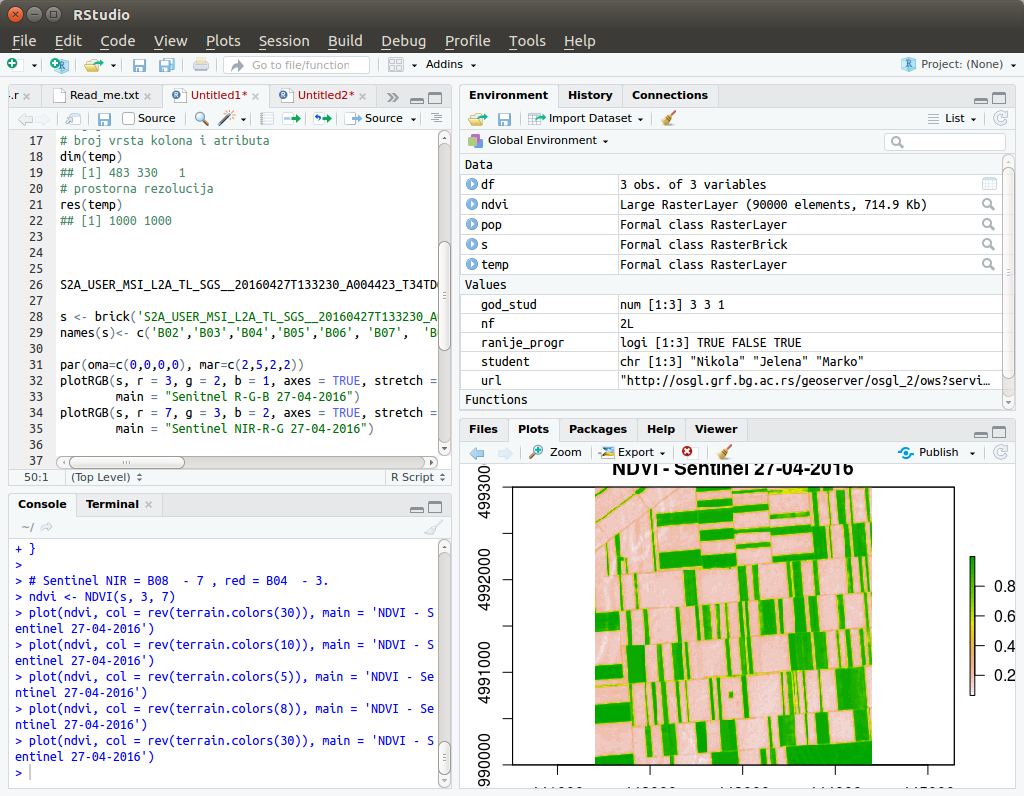
Figure 12.1: View of the RStudio environment.
12.1.2 Using built-in functions and operators in R
If the user directly starts the R console (Figure 12.2), an interpreter will be started, expecting commands which are directly executed. The simples approach is to use R as an ordinary calculator.
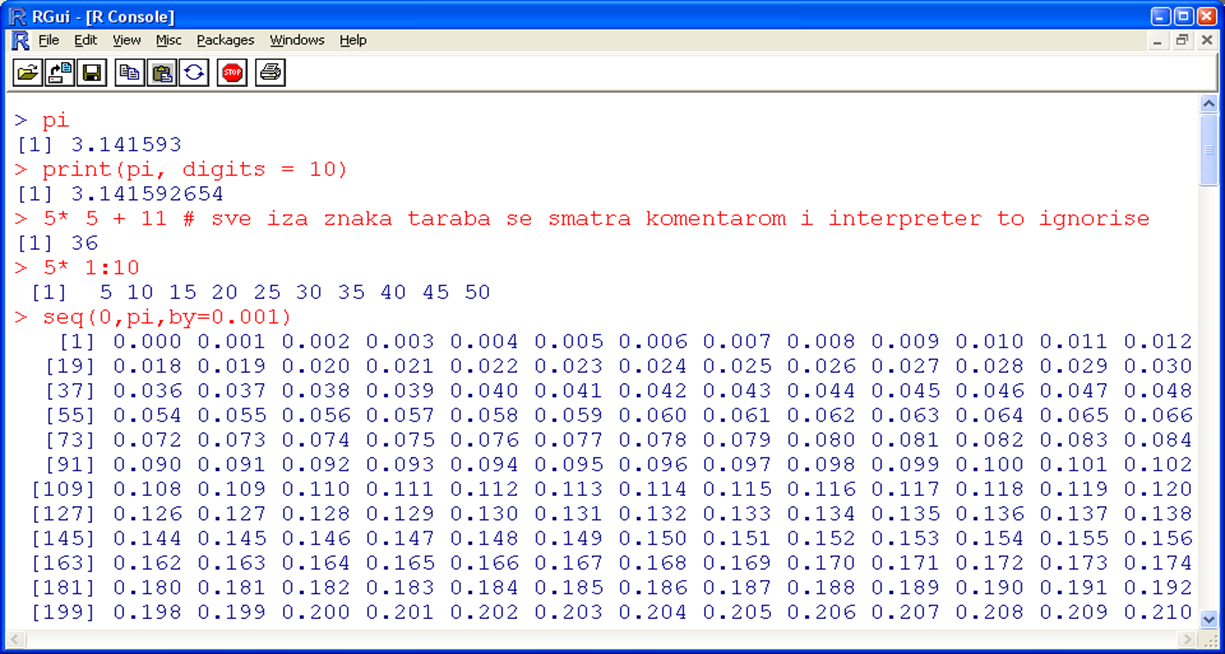
Figure 12.2: R interpreter; R console.
Table 12.1 presents the most important mathematical and logical operators in R.
| Operator | Description | Operator | Description |
| <- | Assignment | ||
| + | Sum | & | And |
| - | Difference | < | Smaller than |
| * | Product | > | Larger than |
| / | Division | <= | Smaller than or equal to |
| ^ | Exponent | >= | Larger than or equal to |
| %% | Module | ! | No |
| %*% | Matrix multiplication | != | Not equal |
| %/% | Integer division | == | Equal |
When assigning a variable in R, a symbol is assigned (usually an abbreviation or name or any string of characters) for values in the R environment. Variables in R are case sensitive, i.e., variable x is not the same as variable X, and variable xX is not the same as variable xx. Assignment in R can be performed using the <- or = operators.
x <- c(1,2,3,4,8,11,18)
mean(x)
## [1] 6.714286
? mean
help(mean)
In this example, variable x was assigned a vector with 7 elements using the c (combine) command. Then, a built-in mean function was executed for calculating the mean value and an example is given how to obtain the description of the function and its arguments using built-in function descriptions (help regarding functions). Similarly, variable x can be assigned another vector, after which a histogram of data can be created, Figure 12.3.
x <- c(12, 15, 13, 20, 14, 16, 10, 10, 8,15)
hist(x)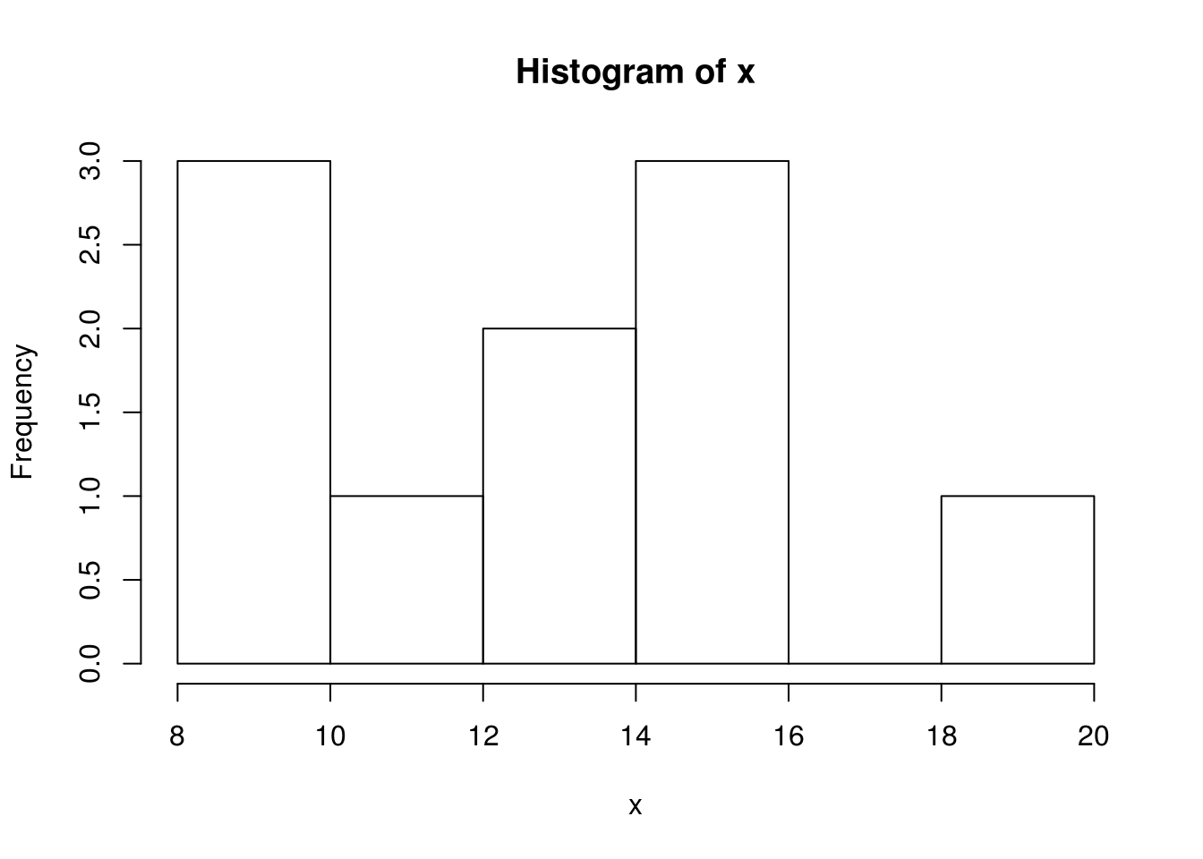
Figure 12.3: Example of a histogram
If we want to construct a variable x so that it contains the sequence from 1 to 10 with a step of 0.5, then, we can use the seq command. Then, using mathematical operators, we can obtain the value of variable y (y=x2-5x+1) and finally, we can create a visualization of the results in a graph using the plot function, i.e., an xy scatter plot, Figure 12.4).
x <- seq(1, 10,by=0.5)
y <- x^2- 5*x +1
plot(x,y)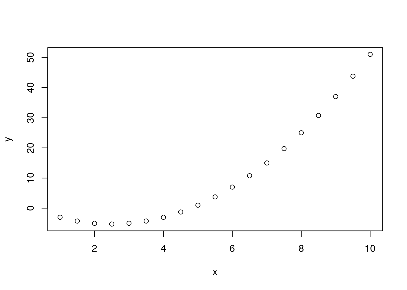
Figure 12.4: Example of an xy plot.
Similarly, we can create a visualization of trigonometric functions using the curve command, Figure 12.5.
curve (expr = sin, from = 0, to=2*pi)
curve (expr = cos, from = 0, to=2*pi)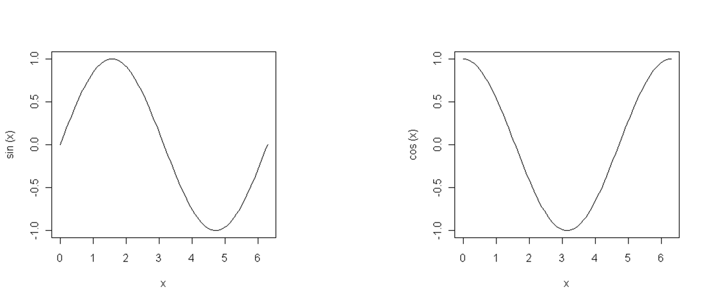
Figure 12.5: Sine and cosine functions.
12.2 Basic data structures in R
There are three basic data types in R: numeric, character, and logical data. They can be parts of different complex classes, such as objects representing spatial data.
a<-c(1,2,3)
mode(a)
## [1] "numeric"
b<-c("a","b","c")
mode(b)
## [1] "character"
C<-c(T,F,T)
mode(C)
## [1] "logical"
Any data type (numeric, character, or logical) can contain NA (not available) values which indicate missing data. Many functions will not execute until a command is given to disregard NA values. This type of command or argument is usually in the form of na.rm=T, which is an optional argument for many mathematical and statistical functions.
max(c(NA, 4, 7))
## [1] NA
max(c(NA, 4, 7),na.rm=T)
## [1] 7
NA | TRUE
## [1] TRUE
NA & TRUE
## [1] NA
An example of manipulating data containing NA values is given with the built-in function for extracting the maximum value. The relation of NA data to logical data is also given. Unlike NA, NULL does not indicate missing data, rather, it indicates that the data does not exist. For example, NULL should be used to define an empty vector.
In R, vectors are a basic data type. Generally, any data written in R is a vector with a unit length. A vector is a string of data of the same type. For more details on the types and characteristics of vector data in R, visit http://adv-r.had.co.nz/Data-structures.html#vectors.
In R, # is the symbol used for comments, so that anything beginning with # is not interpreted by the R interpreter.
a<-c(11,27,38)
length(a) # vector length
## [1] 3
summary(a) # summary statistics
## Min. 1st Qu. Median Mean 3rd Qu. Max.
## 11.00 19.00 27.00 25.33 32.50 38.00
a[2]*8 # 2. vector element multiplied by 8
## [1] 216
as.character(a) # conversion into a text vector
## [1] "11" "27" "38"
In this example, a vector a is created with 3 elements: the first element is 11, the second is 27, and the third is 38. If we wish to access the second element of the vector, square brackets are used; in this case, the code would be a[2]. In R, vectors are indexed from one, whereas in some other languages such as Java, JavaScript, and Python, vectors are indexed from zero.
A matrix is a rectangular data table in which all data are of the same type and all columns are of the same length. Typically, matrices contain numeric data.
A<-cbind(c(11,2,3),c(8,4,2), c(88,33,11))
## A
## [,1] [,2] [,3]
## [1,] 11 8 88
## [2,] 2 4 33
## [3,] 3 2 11
A<-rbind(c(11,8,88),c(2,4,33),c(3,2,11) )
## A
## [,1] [,2] [,3]
## [1,] 11 8 88
## [2,] 2 4 33
## [3,] 3 2 11
Two examples of creating a matrix are given: (1) when the matrix is created column by column, using the cbind command, and (2) when the matrix is created row by row, using the rbind command. A matrix can also be created using the matrix command.
x.mat <- matrix(c(3, -1, 2, 2, 0, 3, -3, 6), ncol = 2)
## x.mat
## [,1] [,2]
## [1,] 3 0
## [2,] -1 3
## [3,] 2 -3
## [4,] 2 6
x.mat[3,2] # matrix element from row 3 column 2
## [1] -3
# matrix indices can have non-numeric names
dimnames(x.mat) <- list(c("R1","R2","R3","R4"), c("C1","C2"))
## x.mat
## C1 C2
## R1 3 0
## R2 -1 3
## R3 2 -3
## R4 2 6
x.mat["R3","C2"]
## [1] -3
Rows are typically used as multi-dimensional matrices or vectors.
h<-1:24
Z <- array(h, dim=c(3,4,2))
## Z
## , , 1
## [,1] [,2] [,3] [,4]
## [1,] 1 4 7 10
## [2,] 2 5 8 11
## [3,] 3 6 9 1

## , , 2
## [,1] [,2] [,3] [,4]
## [1,] 13 16 19 22
## [2,] 14 17 20 23
## [3,] 15 18 21 24
12.2.1 Class data.frame
The most used data class in R is data.frame. Objects of this type can be viewed as a rectangular table in which each column can be of a different type, but all columns must have the same length. Each column must contain data of a uniform type since each column is essentially one vector. This data structure resembles a table from a database.
An example is given of a data.frame object composed of three vectors of different types: character, numeric, and logical.
student = c("Nikola", "Jelena", "Marko")
year_stud = c(3, 3, 1)
earlier_progr = c(TRUE, FALSE, TRUE)
df = data.frame(student , year_stud, earlier_progr)
## df
## student year_stud earlier_progr
## 1 Nikola 3 TRUE
## 2 Jelena 3 FALSE
## 3 Marko 1 TRUE
fix(df)
Using the data.frame function, a data.frame-type object was created and saved in the df variable. Executing the str command, the structure of the df object can be viewed. It contains three columns (attributes) with the following names: student, year_stud, and earlier_progr.
str(df)
## 'data.frame': 3 obs. of 3 variables:
## $ student : Factor w/ 3 levels "Jelena","Marko",..: 3 1 2
## $ year_stud : num 3 3 1
## $ earlier_progr: logi TRUE FALSE TRUE
We can see that the column created from the student vector (object attribute df) changed its type from character to factor. This is typical for storing categorical data in R, and the data.frame function has a default argument to convert character data to categorical data. This expands the possibilities of performing statistical analyses compared with the case when data are stored as character data. Basically, a number is assigned to each unique vector element of the factor type, where every number is a category sign.
There are several ways to select an entire column from a data.frame object, as shown in the following examples.
df$student # selection by attribute name using the $ operator
## [1] Nikola Jelena Marko
## Levels: Jelena Marko Nikola
df[,1] # selection by attribute order, like a matrix index
## [1] Nikola Jelena Marko
## Levels: Jelena Marko Nikola
df[,'year_stud'] # selection by attribute name, as an index
## [1] 3 3 1
The first selection is performed using the $ operator and column name; the second selection is performed using the column number (as with a matrix); and the third selection is performed using the column name in square brackets (as with a matrix with defined dynamic column names). For selecting individual elements, e.g., the element in the second row and third column, the same selection procedure is used as for matrices (df [2,3]).
A df-type object enables attributive selection. In spatial vector data, attributes are stored in data.frame objects; thus, this selection procedure is also applicable to spatial data.
If we want to select all rows for which a certain condition is met, e.g., that the student’s name is Nikola, we will enter the following syntax for row querying.
df[df$student=='Nikola',]
## student year_stud earlier_progr
## Nikola 3 TRUE
Similarly, we can enter a query to display all data for students who are on their second year of studies or later.
df[df$year_stud>1,]
## student year_stud earlier_progr
## 1 Nikola 3 TRUE
## 2 Jelena 3 FALSE
We can also query by multiple criteria, e.g., that the students are on their second year of studies or later and that they studied programming before.
df[df$year_stud>1 & df$earlier_progr==T,]
## student year_stud earlier_progr
## 1 Nikola 3 TRUE
12.2.2 Lists
A list is an organized set of data which do not need to be of the same type or length. Hence, lists represent a flexible class for storing data. For example a list = \[vector, data.frame, list\]
kurs.l <- list(name="R course", participant_number=3, data=df)
## $name
## [1] "R course"
## $participant_number
## [1] 3
## $data
## student year_stud earlier_progr
## 1 Nikola 3 TRUE
## 2 Jelena 3 FALSE
## 3 Marko 1 TRUE
In lists, for selection by element, double square brackets are used or the $ operator.
# Selections
course.l$name # by list element with the label name
course.l[[3]] # selection of the third element in the list
course.l[[3]]$student
# selection of the third element in the list which is of data.frame type,
# plus additional selection by student column
12.2.3 Objects and classes in R
Besides existing classes, whether basic or defined within a package, the user can use his own classes and methods. There are three types of classes in R:
S3 classes – old, informal classes,
S4 classes – formal classes,
R5 classes - R reference classes.
An example is given of creating a class and method for visualization over the children class, using the old S3 system.
# creating the children class
children <- function(ID, p, u, v, t){
x <- list(ID=ID,
Sex=p,
Data=data.frame(Age.m=u, Height.cm=v, Weight.kg=t)
)
class(x) <- 'children'
invisible(x)
}

# Creating a method over the children class
plot.children <- function(object){
Data <- object$Data
par(mfrow=c(1,2))
plot(Data$Age, Data$Height.cm, type="b", pch=19,col="red",
xlab="Age (months)", ylab="Height (cm)", main="Height to age ratio")

plot(Data$Age, Data$Weight.kg, type="b", pch=19,col="blue",xlab="Age (months)", ylab="Weight (kg)", main="Weight to age ratio")
mtext(paste("ID",object$ID,",",object$Sex,sep=""), side=3,outer=TRUE,line=-1.5,cex=1.5)
}
In the first section, the children class is created and data structuring is defined using the list class. Then, a method is created to be applied to the children class for visualizing data. Practically, the method creates two graphs where one represents the age to height ratio and the other represents the age to weight ratio, Figure 12.6.
Creating an instance and applying the method
age = c(0,3,6,12,18,24,30,36)
boys.t =c(3.53,6.39,8.16,10.46,11.80,12.74,13.56,14.33)
boys.v = c(49.99,62.08,67.86,76.11,82.41,87.66,92.13,95.45)

# Class instance (creating obj. x class children)
x <- children(1, "M", age, boys.v, boys.t)
str(x)
## List of 3
## $ ID : num 1
## $ Sex : chr "M"
## $ Data:'data.frame': 8 obs. of 3 variables:
## ..$ Age.m : num [1:8] 0 3 6 12 18 24 30 36
## ..$ Height.cm: num [1:8] 50 62.1 67.9 76.1 82.4 ...
## ..$ Weight.kg: num [1:8] 3.53 6.39 8.16 10.46 11.8 ...
## - attr(*, "class")= chr "children"
## class(x)
## [1] "children"
##
   plot(x)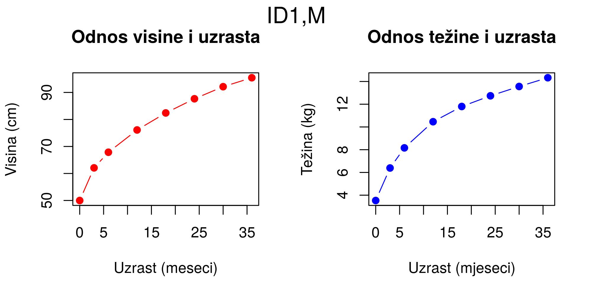
Figure 12.6: Plot method for class children
The example for creating S4 classes and methods is given without detailed explanations.
setClass("children",representation(ID="numeric",
Sex="character",Data = "data.frame"))

# Creating methods for S4 class children
setGeneric("plot")
setMethod ("plot" , "children",
function (x , xlab ="Age (months)", ylab="Height (cm)" , main="Height to age ratio", pch=19, ...){
Data=x@Data
par(mfrow=c(1,2))
plot(Data[,1], Data[,3], type="b", pch=19,col="red",
xlab="Age (months)", ylab="Height (cm)", main="Height to age ratio", ...)
plot(Data[,1], Data[,2], type="b", pch=19,col="blue",xlab="Age (months)", ylab="Weight (kg)", main="Weight to age ratio", ...)
mtext(paste("ID",x@ID,",",x@Sex,sep=""), side=3,outer=TRUE,line=-1.5,cex=1.5)
par(mfrow=c(1,1))
})

# Creating an instance of the children object
age = c(0,3,6,12,18,24,30,36)
boys.t =c(3.53,6.39,8.16,10.46,11.80,12.74,13.56,14.33)
boys.v = c(49.99,62.08,67.86,76.11,82.41,87.66,92.13,95.45)
x <- new("children", ID=1, Sex="M", Data=data.frame(age, boys.t, boys.v))
# Object structure
str(x)
## Formal class 'children' [package ".GlobalEnv"] with 3 slots
## ..@ ID : num 1
## ..@ Sex : chr "M"
## ..@ Data:'data.frame': 8 obs. of 3 variables:
## .. ..$ age : num [1:8] 0 3 6 12 18 24 30 36
## .. ..$ boys.t: num [1:8] 3.53 6.39 8.16 10.46 11.8 ...
## .. ..$ boys.v: num [1:8] 50 62.1 67.9 76.1 82.4 ...
plot(x)
R5 classes (RC - Reference classes) are similar to S4 classes but with an associated environment and a similar approach as in other programming languages such as Python, Ruby, Java, and C#.
class |
Object class. |
(vector, matrix, function, logical, list, … ) |str | Data structure |
mode | Data type. (Numeric, character, logical, …) |
storage.mode typeof | Type used by R to store data in memory (double, integer, character, logical, …) |
is.function | Is it a function (TRUE if function) |
is.na | Is it NA (TRUE if missing) |
names | Names associated with an object |
dimnames | Names for vector, matrix, and row indices |
slotNames | Slot (object part) names (e.g., SP data) |
attributes | Names and classes of object attributes… |12.3 Some functions in R for data export and import
In R, there are several functions for reading and writing data files:
readLines, writeLines;
scan, write;
read.csv, write.csv;
read.csv2, write.csv2;
read.delim, write.delim;
read.delim2, write.delim2;
Also, there are multiple packages that enable direct communication with databases such as
RODBC,
RMySQL,
RpostGIS,
RRasdaman,
RPostgreSQL,
ROracle,
RJDBC, and others.
12.4 Control flow and looping
Similar to other programming languages, in R, the if command is used for control flow which generally directs the interpreter towards what is executed if a certain logical condition is met, and what is executed if it is not. The functioning of the if command is presented in the form of code.
if (logical condition) {
statements
}
else {
alternative statements
}

# { } are optional in the case of a single statement
# for simple cases
ifelse (logical condition, yes statement, no statement)
The functioning of the if command is illustrated with the following example.
x<- runif(100, min=0, max=5)
x=mean(x)

if(x>2.5){
cat('x larger than 2.5 \n') # \n new row
Y=2*x
} else {
cat('x smaller than 2.5 \n')
Y=3*x
}

# use of the ifelse command for simple control flow cases
Y<-ifelse(x>2.5, 2*x, 3*x)
First, a vector is created with elements generated using a uniform distribution with a minimal value of 0 and a maximal value of 5. Then, the variable x became the mean of the vector. Finally, a logical condition was defined and a set of commands which are executed when the condition is or is not fulfilled.
In R, loops are implemented similar to other programming languages. An example is given for for and while loops without special elaboration.
for(i in 1:10) {
print(i*i+2*i)
}

i<-1
while(i<=10) {
print(i*i)
i<-i+sqrt(i)
}

# See: repeat, break, next
Functions are created using the function command. Functions are used to create a procedure over data, process input data, and obtain (return) results. An example is given of creating a function which calculates the geometric average.
# creating a function
gs <- function(a,b) {
result <- sqrt(a*b)
return(result)
}

gs(7,88) # calling a function
## [1] 24.8193472919817
The lapply, sapply, apply functions are integrated into R and enable easier manipulation of vectors, lists, and matrices. The control of elements with loops is avoided, in this case with functions in which functions of data are arguments as well as the data themselves. Thus, process speed is almost always increased.
A<-cbind(c(11,2,3) , c(8,4,2) , c(88,33,11) )
A
## [,1] [,2] [,3]
## [1,] 11 8 88
## [2,] 2 4 33
## [3,] 3 2 11

apply(A, 1, sum) # sum by rows
## [1] 107 39 16

apply(A, 2, sum) # sum by columns
## [1] 16 14 132

apply(A, 2, sort) # sorting by columns

## [,1] [,2] [,3]
## [1,] 2 2 11
## [2,] 3 4 33
## [3,] 11 8 88
The previous example demonstrates the use of the apply function for easy processing of matrices by rows and columns, meanwhile not using the for loop.
The following example illustrates the use of the lapply and sapply functions applied on lists and vectors. The lapply function always produces a list, while the sapply function always produces a vector.
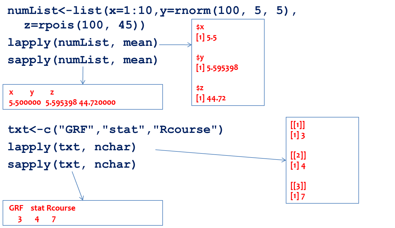
Figure 12.7: Illustration of the lapply and sapply functions
In the previous example, the mean was calculated using all list elements. With the lapply function, a list with results was returned and with the sapply function, a vector. A similar feature was illustrated with the txt vector and the character count function; even though the input data was a vector, the output of the lapply and sapply functions is a list and vector, respectively.
12.5 Spatial data in R
12.5.1 Package sp
Previously, many packages contained their own representation of spatial data. This approach made the exchange of data between packages as well as with external applications difficult. The sp package (Pebesma and Bivand 2018) standardized spatial data representation in R and enabled simple conversion into other data types within R or into data types for external applications. The sp package enables the representation of vector and raster spatial data.
All sp spatial data classes are shown in the following example.
library(sp)
getClass("Spatial")
## Class "Spatial" [package "sp"]
##
## Slots:
##
##   Name:         bbox proj4string
## Class:      matrix         CRS
##
## Known Subclasses:
##   Class "SpatialPoints", directly
## Class "SpatialMultiPoints", directly
## Class "SpatialGrid", directly
## Class "SpatialLines", directly
## Class "SpatialPolygons", directly
## Class "SpatialPointsDataFrame", by class "SpatialPoints", distance 2
## Class "SpatialPixels", by class "SpatialPoints", distance 2
## Class "SpatialMultiPointsDataFrame", by class "SpatialMultiPoints", distance 2
## Class "SpatialGridDataFrame", by class "SpatialGrid", distance 2
## Class "SpatialLinesDataFrame", by class "SpatialLines", distance 2
## Class "SpatialPixelsDataFrame", by class "SpatialPoints", distance 3
## Class "SpatialPolygonsDataFrame", by class "SpatialPolygons", distance 2
12.5.1.1 SpatialPointsDataFrame class
The Spatial class is a basic class contained in all other subclasses. The Spatial class contains two slots or attributes: bbox – a boundary box and proj4string, a slot which contains the description of the coordinate reference system in the PROJ.4 notation. For example, besides these two slots, SpatialPoints contains another, third slot, which represents the coordinate matrix. In addition to these three slots contained in the SpatialPoints class, the SpatialPointsDataFrame class also contains the the data slot which stores attribute data as a data.frame object. The coords.nrs slot is filled only if point data are generated from a table (a data.frame object). Then, this slot stores information about the x and y coordinates in a table; hence, the inverse conversion from SpatialPointsDataFrame to data.frame yields the same input table.
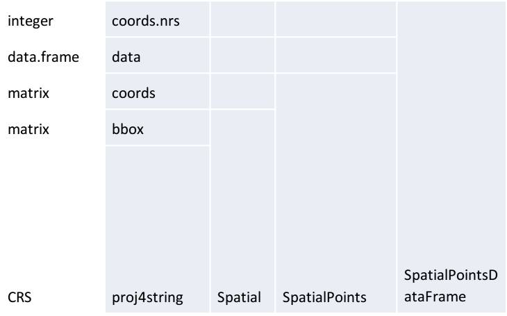
Figure 12.8: SpatialPointsDataFrame subclass structure and its relation to the SpatialPoints subclass and Spatial class.
An example of creating a SpatialPointsDataFrame object from a data.frame object is demonstrated using the meuse dataset in the form of a table (a data.frame object), and data is contained in the sp package. More information about the data can be found by executing the ? meuse command in the command window. The data contain coordinates of 155 points and information on soil characteristics sampled in those points.
library(sp)
data(meuse)
str(meuse)
## 'data.frame':    155 obs. of  14 variables:
##   $ x      : num  181072 181025 181165 181298 181307 ...
## $ y      : num  333611 333558 333537 333484 333330 ...
## $ cadmium: num  11.7 8.6 6.5 2.6 2.8 3 3.2 2.8 2.4 1.6 ...
## $ copper : num  85 81 68 81 48 61 31 29 37 24 ...
## $ lead   : num  299 277 199 116 117 137 132 150 133 80 ...
## $ zinc   : num  1022 1141 640 257 269 ...
## $ elev   : num  7.91 6.98 7.8 7.66 7.48 ...
## $ dist   : num  0.00136 0.01222 0.10303 0.19009 0.27709 ...
## $ om     : num  13.6 14 13 8 8.7 7.8 9.2 9.5 10.6 6.3 ...
## $ ffreq  : Factor w/ 3 levels "1","2","3": 1 1 1 1 1 1 1 1 1 1 ...
## $ soil   : Factor w/ 3 levels "1","2","3": 1 1 1 2 2 2 2 1 1 2 ...
## $ lime   : Factor w/ 2 levels "0","1": 2 2 2 1 1 1 1 1 1 1 ...
## $ landuse: Factor w/ 15 levels "Aa","Ab","Ag",..: 4 4 4 11 4 11 4 2 2 15 ...
## $ dist.m : num  50 30 150 270 380 470 240 120 240 420 ...
# Converting tabular into spatial data
coordinates(meuse) <- ~x+y
proj4string(meuse) <- CRS("+init=epsg:28992")
When using the coordinates command to convert a data.frame object into a SpatialPointsDataFrame object, it is necessary to identify which columns represent coordinates (<-~x+y, in this case, columns are labeled x and y). This generates a spatial object which can be assigned a coordinate reference system using the proj4string command. For these data, it is the stereographic projection for the Netherlands (more at http://epsg.io/28992).
The data structure with all slots with details down to level two is given for the newly formed meuse object:
str(meuse, max.level=2)
## Formal class 'SpatialPointsDataFrame' [package "sp"] with 5 slots
## ..@ data       :'data.frame':    155 obs. of  12 variables:
##   ..@ coords.nrs : int [1:2] 1 2
## ..@ coords     : num [1:155, 1:2] 181072 181025 181165 181298 181307 ...
## .. ..- attr(*, "dimnames")=List of 2
## ..@ bbox       : num [1:2, 1:2] 178605 329714 181390 333611
## .. ..- attr(*, "dimnames")=List of 2
## ..@ proj4string:Formal class 'CRS' [package "sp"] with 1 slot
The selection of attribute data is the same as with data.frame objects. The following example shows how to select the first three points with three attributes.
meuse@data[1:3,c("zinc","dist.m","elev")]
## zinc dist.m  elev
## 1 1022     50 7.909
## 2 1141     30 6.983
## 3  640    150 7.800
Spatial data visualization can be created using standard functions such as plot or methods created for sp classes such as spplot or bubble. Command spplot is a standard visualization method for all vector and raster sp data types, whereas bubble is a geovisualization method for point data which uses the proportional symbol method depending on the attribute being visualized. In the following example, the bubble method was used to create a map using symbols proportional to the attribute data on soil zinc concentration (zinc attribute, in ppm); the main argument was used to assign the title, Figure 12.10.
spplot(meuse,
       "zinc",
       key.space= list(x=0.2,y=0.9, corner=c(0,1)),
       scales=list(draw=T),
       col.regions=rainbow(5),
       main="Zinc")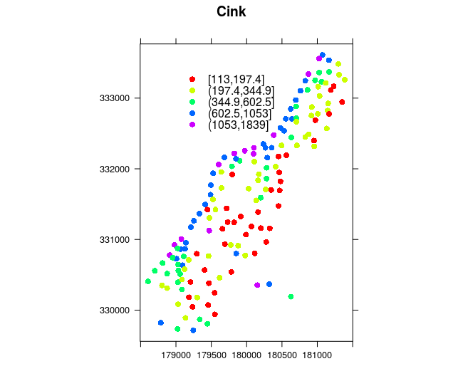
Figure 12.9: Spplot and coloring methods.
bubble(meuse, "zinc", main="Zinc" ,maxsize = 1.5)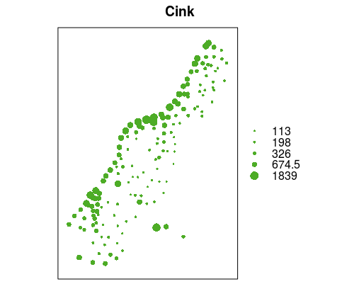
Figure 12.10: Bubble method: proportional symbols.
The spplot method is typically used to generate maps which visualize attribute data using a coloring method, Figure12.9. The col.regions argument is used to assign a color palette and the available rainbow palette was used, the position of the legend (key.space) and the title (main) were defined, and coordinate axes were drawn (scales).
Geovisualization can also be performed using standard plot functionalities. The following example illustrates the creation of a map using a proportional symbol representation, and using the standard plot approach, Figure 12.11.
plot(meuse, pch = 1, cex = sqrt(meuse$zinc)/12, axes = TRUE)
v = c(100,200,400,800,1600)
legend("topleft", legend = v, pch = 1, pt.cex = sqrt(v)/12)
The pch argument is used to define symbol shapes: in this case, a circle was selected (1-circle). The symbol size is proportional to the square root of the zinc concentration in each point divided by 12 (the cex argument), and axes are drawn using the axes argument. Then, a legent is defined using the legend command and corresponding arguments as in the plot command.
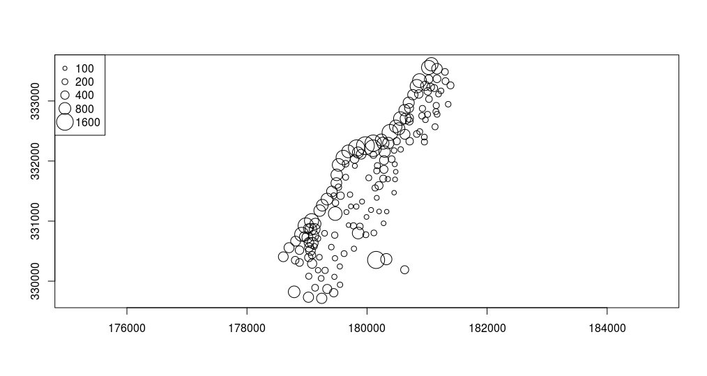
Figure 12.11: Plot method: proportional symbols.
12.5.1.2 SpatialLinesDataFrame class
The SpatialLines class is somewhat more complicated than the class related to points and can contain lines and multiple lines as types of geometry. The following code defines the creation of one SpatialLines object.
l1 = cbind(c(1, 2, 3), c(3, 2, 2))
l1a = cbind(l1[, 1] + 0.05, l1[, 2] + 0.05)
l2 = cbind(c(1, 2, 3), c(1, 1.5, 1))
Sl1 = Line(l1)
Sl1a = Line(l1a)
Sl2 = Line(l2)
S1 = Lines(list(Sl1, Sl1a), ID = "a")
S2 = Lines(list(Sl2), ID = "b")
Sl=SpatialLines(list(S1,S2))

summary(Sl)
## Object of class #SpatialLines
## Coordinates:
##   min  max
## x   1 3.05
## y   1 3.05
## Is projected: NA
## proj4string : [NA]
A SpatialLines object can be assigned attribute data which are data.frame objects; this way, SpatialLinesDataFrame objects are obtained which represent line type vector data.
df = data.frame(line_name= c("first line", "second line"))
Sldf = SpatialLinesDataFrame(Sl, data = df, mach.ID=F)
plot(Sl, col = c("red", "blue"),axes=T,type="b",lwd=2)
grid(nx=3, ny=3, lwd=1,lty=2,col="green")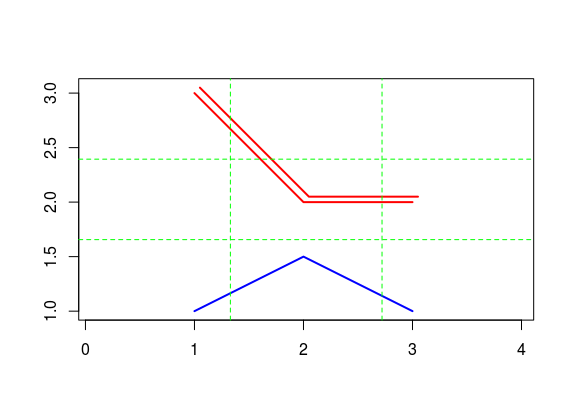
Figure 12.12: Plot line method.
df = data.frame(ime_linije= c("first line", "second line"))
Sldf = SpatialLinesDataFrame(Sl, data = df, mach.ID=F)
plot(Sl, col = c("red", "blue"),axes=T,type="b",lwd=2)
grid(nx=3, ny=3, lwd=1,lty=2,col="green")
spplot(Sldf, col.regions=c('red','blue'),scales=list(draw=T))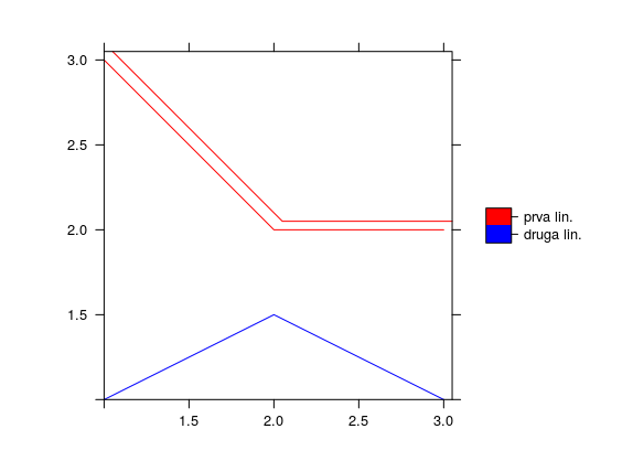
Figure 12.13: Spplot line method.
The Sldf object is plotted using the spplot (Figure 12.12) and plot methods. In the plot method, plot type, line type, line color, grid lines (i.e. coordinate lines), and drawing of coordinate axes were defined, Figure 12.13.
Another example of line data is given, in which the geosphere (R. J. Hijmans 2017a) package was used to generate a geodesic (the greatCircle command) containing approximate coordinates of Belgrade and New York. The lengths of the geodesic and loxodrome from Belgrade to New York were also calculated using the distGeo and distRhumb commands, respectively. National borders are drawn, then the geodesic, and finally, positions of Belgrade and New York are given as star symbols, Figure 12.14. In these examples, line data are given as standard matrices and not structured spatial data.
library(geosphere)
NY <- c(-73.78, 40.63)
BG <- c(20.44, 44.78)
# Length of geodesic and loxodrome
distGeo(BG, NY); distRhumb(BG, NY)
## 7271839 7716831
gc <- greatCircle(BG,NY)
data(wrld)
plot(wrld, type='l')
lines(gc, lwd=2, col='blue')
points(rbind(BG,NY), pch='*', cex=3, col='red')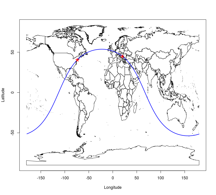
Figure 12.14: Geodesic and point plot method.
12.5.1.3 SpatialPolygonsDataFrame class
Polygon data with attributes belong to the SpatialPolygonsDataFrame class. An explanation of the polygon-type sp object structure will not be provided herein. In the following example, attribute polygon data were loaded directly from an ESRI Shape file using the rgdal (Bivand, Keitt, and Rowlingson 2018) package for R. The rgdal package directly converts raster and vector data into appropriate sp objects. Also, if the file contains data on the coordinate reference system, these data are written into an appropriate sp slot. The rgdal package can be used to export sp objects into GDAL/OGR formats. A detailed description of the packages and functions can be found in the rgdal package manual.
The following code loads the rgdal package, downloads the file using the download.file command and the Web Feature Service (WFS) url query, finally, using the rgdal package’s functionality (ogrInfo command) requests a display of basic information on the downloaded file (poage.gml).
library(rgdal)
url='http://osgl.grf.bg.ac.rs/geoserver/osgl_4/wfs?service=WFS&version=1.0.0&request=GetFeature&typeName=osgl_4:POP_age'
download.file(url, 'poage.gml')
ogrInfo('poage.gml')

## Source: "poage.gml", layer: "POP_age"
## Driver: GML; number of rows: 197
## Feature type: wkbPolygon with 2 dimensions
## Extent: (18.81499 41.8521) - (23.00637 46.19006)
## Number of fields: 14
## name type length typeName
## 1 gml_id 4 0 String
## 2 ID_Municip 0 0 Integer
## ...
Afterwards, data are loaded using the readOGR command which has one mandatory argument which is the file name and file path (if the file is located in the working directory, the file path is not necessary). This command defines additional arguments such as the layer name and the option to not convert string attributes to factor attributes. Then, the structure of data stored in the pa object is displayed. Data represent municipal boundaries in Serbia with population census data assigned as attributes, Figure 12.15. The TOTAL_POP attribute which represents the municipality populations, according to the 2011 Serbian census, is converted into a numerical data type.
pa <- readOGR(dsn ='poage.gml', layer = 'POP_age', stringsAsFactors=FALSE )
str(pa, max.level=2)
## Formal class 'SpatialPolygonsDataFrame'
## ..@ data :'data.frame': 197 obs. of 14 variables:
## ..@ polygons :List of 197
## ..@ plotOrder : int [1:197] 143 10 20 171 170 168 121 169 152 3 ...
## ..@ bbox : num [1:2, 1:2] 18.8 41.9 23 46.2
## .. ..- attr(*, "dimnames")=List of 2
## ..@ proj4string:Formal class 'CRS'

pa$TOTAL_POP <-as.numeric(pa$TOTAL_POP)
spplot(pa, zcol = 'TOTAL_POP', scales=list(draw=T), main="Municipality populations, 2011 census data")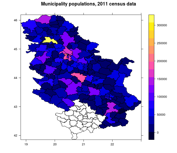
Figure 12.15: Spplot method: choroplet map.
The previous map was produced using the spplot method. A choroplet map of municipality populations was obtained. Data is given in the WGS84 system as it is known that it is not usual to represent statistical data using ellipsoidal coordinates, but rather, equivalent projections.
Using municipality census data (the object is saved in the pa variable), a population density map will be generated. First, spatial data is transformed from one coordinate system to another using the spTransform command. The transformation is from WGS84 into a Lambert azimuthal equival area projection with a contact parallel 44 degrees North, a central meridian 21 degrees East, with assigned plane coordinates of the coordinate system origin and the WGS84 datum.
### assignment of CRS #######################################
proj4string(pa) <- CRS("+init=epsg:4326")
# Transformation from WGS to LAEA
pa <- spTransform(pa, CRS('+proj=laea +lat_0=44 +lon_0=21 +x_0=200000 +y_0=200000 +datum=WGS84'))
Using the rgeos (Bivand and Rundel 2017) package in R, which is a GEOS open source library interface, areas of each polygon, i.e. municipality, where calculated using the gArea and sapply commands. Areas were divided by one million in order to be expressed in km2 and were assigned to the pa object as a new attribute; then, population density was calculated per km2.
### calculating area in LAEA ###############################
library(rgeos)
pa$area <-sapply(1:nrow(pa), function(i) gArea(pa[i,])/1000000)
pa$density <- pa$TOTAL_POP/pa$area
Afterwards, intervals were defined depending on population density in municipalities. The classInt (Bivand 2017) package in R contains a number of methods for classifying attributes for the purpose of geovisualization. In the following example, the quantile method was used to classify data according to population density. Quantile intervals divide attribute data into equal groups (with an equal number of municipalities in each group), but the division range is not constant. For choosing colors, the RColorBrewer (Neuwirth 2014) package was used which comes with predefined geovisualization color palettes suggested by American cartography professor Cynthia Brewer (Brewer, Hatchard, and Harrower 2003), http://colorbrewer2.org.
######### intervals and colors #############################
library(classInt)
library(RColorBrewer)
plotvar <- pa$density
nclr <- 8
plotclr <- brewer.pal(8,"YlOrRd")
class <- classIntervals(plotvar, nclr, style="quantile", dataPrecision=1)
colcode <- findColours(class, plotclr)
After the quantile data classification according to municipal population density, a map was generated using standard plot method. First, a projected coordinate grid was generated using the graticule package (Sumner 2016). Then, a choroplet map was created with a generated coordinate grid, title, and legend in accordance with the chosen quantile classification of density and colors, Figure 12.16.
######### map generation ##############################
####### grid lines in projection #########
library(graticule)
lons <- 18:23 ; lats <- 42:46
xl <- range(lons) + c(-0.4, 0.4)
yl <- range(lats) + c(-0.4, 0.4)
grat <- graticule(lons, lats, proj = proj4string(pa), xlim = xl, ylim = yl) # SpatialLinesDataFrame
labs <- graticule_labels(lons, lats, xline = min(xl), yline = max(yl), proj = proj4string(pa)) # SpatialPointsDataFrame
#######################
op <- par(mar = c(0,0,2,2))
plot(raster::extent(grat) + c(4, 2) * 1e5, asp = 1, type = "n", axes = FALSE, xlab = "", ylab = "")
plot(pa, add = TRUE)
plot(pa, col=colcode, add=TRUE)
title(main="Population density by municipalities",
sub="Classes are in quantiles ")
plot(grat, add = TRUE, lty = 5, col = rgb(0, 0, 0, 0.8))
text(subset(labs, labs$islon), lab = parse(text = labs$lab[labs$islon]), pos = 3)
text(subset(labs, !labs$islon), lab = parse(text = labs$lab[!labs$islon]), pos = 2)
legend("right", legend=names(attr(colcode, "table")),
fill=attr(colcode, "palette"), cex=0.8, bty="n")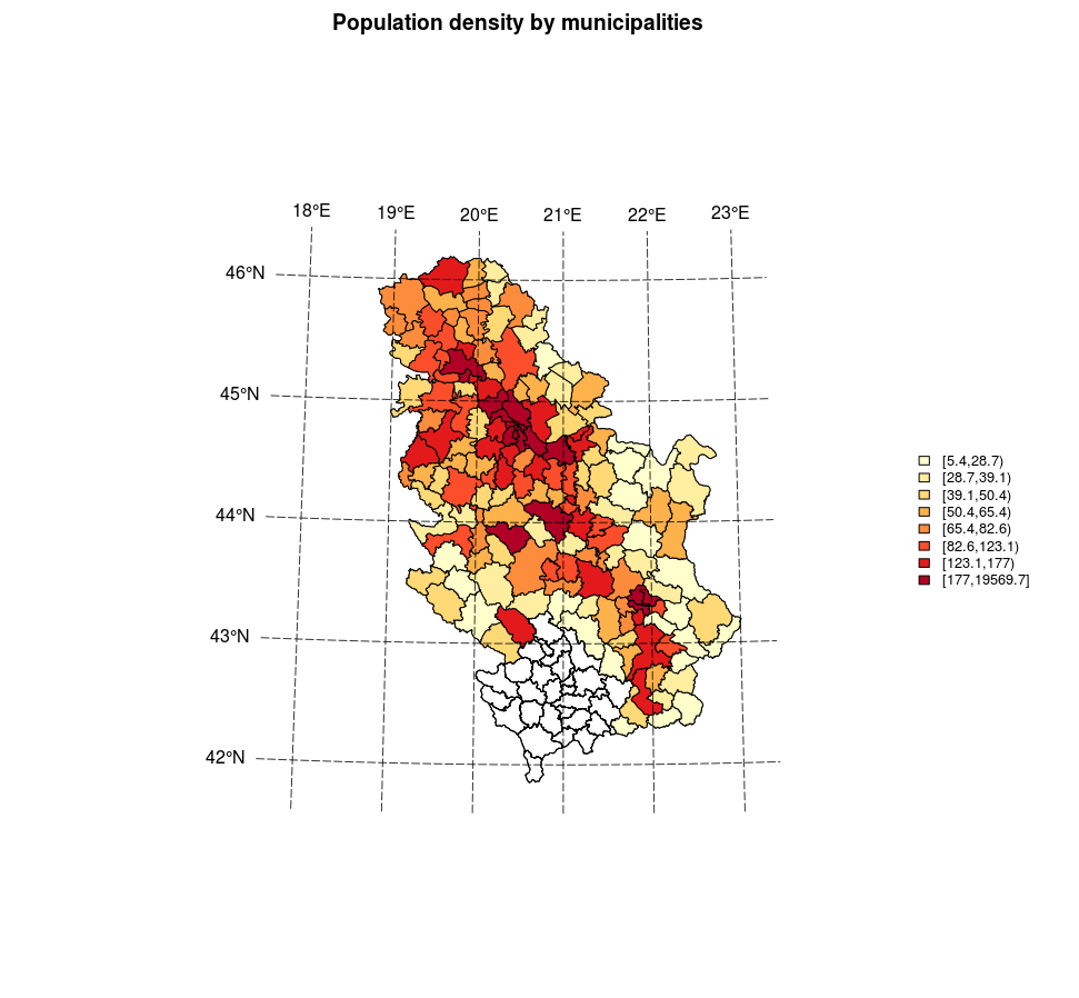
Figure 12.16: Plot method: a choroplet map.
The method of classifying attribute data is very significant for choroplet maps (this is also true for other examples of visualizing quantitative data). The following code will demonstrate three data classification methods for a variable representing the percentage of adults relative to the total population. Besides the previously mentioned quantile method, the equal interval and the Jenks interval methods were used. In the equal interval method, the data range is divided into equal parts; depending on the data distribution, the number of entities in intervals can be very uneven, as demonstrated by this example. Jenks intervals are formed so that classes are optimized by minimizing variance within classes and maximizing it between classes.
library(classInt)
library(RColorBrewer)
library(gridExtra)
library("grid")
library("lattice")

pal = brewer.pal(7,"Oranges")
pa$ADULTS <- as.numeric(pa$ADULTS)
pa$AdultRatio <- 100 * pa$ADULTS/pa$TOTAL_POP
brks.qt = classIntervals(pa$AdultRatio, n = 7, style = "quantile", dataPrecision = 1)
brks.jk = classIntervals(pa$ AdultRatio, n = 7, style = "jenks", dataPrecision = 1)
brks.eq = classIntervals(pa$ AdultRatio, n = 7, style = "equal", dataPrecision = 1)

#  spplot(pa, "AdultRatio",at=brks.eq$brks, col.regions=pal, col="transparent",
#         main = list(label="Equal intervals"))

par(mfrow=c(1,2))
plot(pa,  col=pal[findInterval(pa$AdultRatio, brks.eq$brks, all.inside=TRUE)] )
title("Equal intervals")
plot(brks.eq,pal=pal,main="Equal intervals")
par(mfrow=c(1,1))

par(mfrow=c(1,2))
plot(pa,  col=pal[findInterval(pa$AdultRatio, brks.qt$brks, all.inside=TRUE)] )
title("Quantile intervals")
plot(brks.qt,pal=pal,main="Quantile intervals")
par(mfrow=c(1,1))

par(mfrow=c(1,2))
plot(pa,  col=pal[findInterval(pa$AdultRatio, brks.jk$brks, all.inside=TRUE)] )
title("Jenks intervals")
plot(brks.jk,pal=pal,main="Jenks intervals")
par(mfrow=c(1,1))
The code given above performs a division into classes using three methods of interval choice and then creates choroplet maps using the spplot method. Along each choroplet map, a probability density distribution is plotted related to the defined classes (Figures: 12.17, 12.18, 12.19).
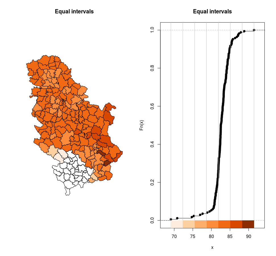
Figure 12.17: Equal intervals.
# Equal intervals
# interval , number of municipalities in interval
[69.2,72.3)  2
[72.3,75.5)  2
[75.5,78.7)  2
[78.7,81.9)  38
[81.9,85.1)  109
[85.1,88.3)  13
[88.3,91.5]  2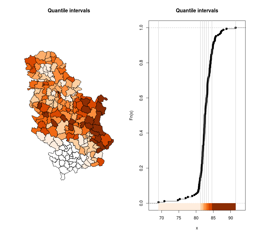
Figure 12.18: Quantile intervals.
# Quantile intervals
# interval , number of municipalities in interval
[69.1,81.3) 24
[81.3,81.9) 24
[81.9,82.4) 24
[82.4,83)  24
[83,83.6)  24
[83.6,84.6) 24
[84.6,91.5] 24
Figure 12.19: Jenks intervals.
# Jenks intervals
# interval , number of municipalities in interval
[69.1,70.8] 2
(70.8,77.6] 4
(77.6,81.4] 23
(81.4,82.7] 58
(82.7,84] 42
(84,85.8] 31
(85.8,91.5] 8
12.5.1.4 SpatialPixelsDataFrame and SpatialGridDataFrame classes
The sp package stores raster data in two classes. Typical raster data can have n attributes and they are stored into the SpatialGridDataFrame structure. This class is structured similar to raster data of any other format with georeferencing ensured with grid topology and origin pixel coordinates. The second sp class for raster data is SpatialPixelsDataFrame which is very similar to point data storing coordinates of every pixel; direct conversion to SpatialPointsDataFrame and SpatialGridDataFrame is possible.
An example of creating a SpatialPixelsDataFrame object from a meuse.grid data table (data is part of the sp package) is given in the following example.
data(meuse.grid)
coordinates(meuse.grid) <- ~x+y
proj4string(meuse.grid) <- CRS("+init=epsg:28992")
gridded(meuse.grid) = TRUE
str(meuse.grid, max.level = 2)
## Formal class 'SpatialPixelsDataFrame' [package "sp"] with 7 slots
## ..@ data :'data.frame': 3103 obs. of 5 variables:
## ..@ coords.nrs : num(0)
## ..@ grid :Formal class 'GridTopology' [package "sp"] with 3 slots
## ..@ grid.index : int [1:3103] 69 146 147 148 223 224 225 226 300 301 ...
## ..@ coords : num [1:3103, 1:2] 181180 181140 181180 181220 181100 ...
## .. ..- attr(*, "dimnames")=List of 2
## ..@ bbox : num [1:2, 1:2] 178440 329600 181560 333760
## .. ..- attr(*, "dimnames")=List of 2
## ..@ proj4string:Formal class 'CRS' [package "sp"] with 1

spplot(meuse.grid, zcol='dist')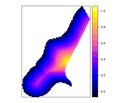
Figure 12.20: Spplot method for a grid.
Similar to vector data, generic plot functions can be used (in this case, the image function) or spplot functions for visualizing raster data, Figure 12.20. When loading raster data using the rgdal package, a SpatialGridDataFrame object is created. An example of visualizing a digital elevation model for a city section is given in the following example using the image (Figure 12.21) and spplot methods, Figure 12.22.
gr <- readGDAL("grid1.TIF")
image(gr, col = grey(1:99/100),axes=T)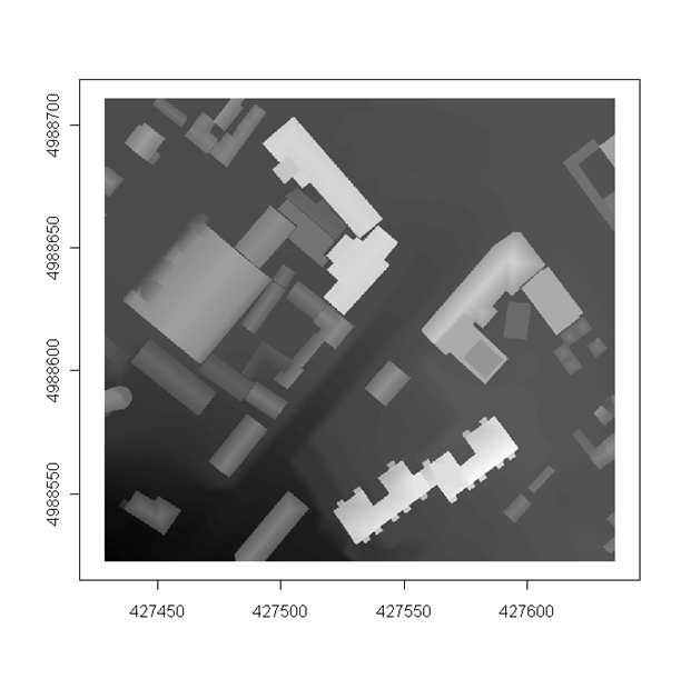
Figure 12.21: Image methods for a grid.
gr <- readGDAL("grid1.TIF")
# generic
image(gr, col = grey(1:99/100),axes=T)
# or spplot
spplot(gr, main="DEM of a city section", scales = list(draw = T),
col.regions=terrain.colors(20) )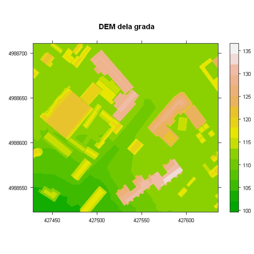
Figure 12.22: Spplot method: DEM.
12.5.2 Package sf
The sf (Pebesma 2018, Lovelace, Nowosad, and Muenchow (2018)) package represents new classes for vector data based on the OGC simple feature. Representation of geometric entities is supported for points, lines, polygons, multiple points, multiple lines, multiple polygons, and geometric collections. Vector data are organized as data.frame objects with an extension for storing geometry in WKT or WKB formats.
The following example presents the creation of a global life expectancy map by countries using data contained in the spData (Bivand, Nowosad, and Lovelace 2018) package. The st_transform method performs a transformation from one coordinate reference system to another; this method is used when manipulating objects from the sf package. Here, data are transformed into a pseudocylindrical equal area projection, Mollweide projection. The plot method can also be applied to sf objects. This method allows for easy addition of map elements, e.g., a coordinate grid can be added using the graticule = TRUE argument, Figure 12.23.
library(sf)
library(spData)
data(world)
world_mollweide = st_transform(world, crs = "+proj=moll")
plot(world_mollweide["lifeExp"], graticule = TRUE, main = "Life expectancy for persons born in 2014.")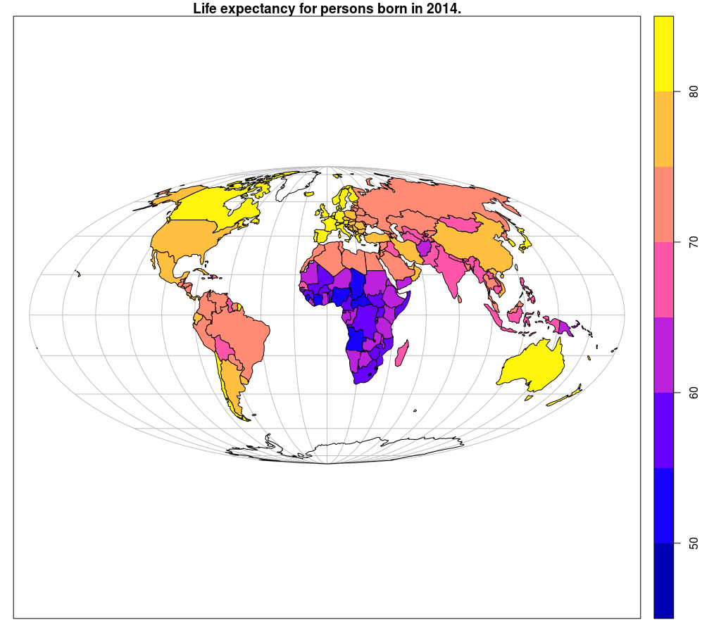
Figure 12.23: Sf method::plot: choroplet map.
Conversion of meuse data from sp to sf objects, as well as the creation of an overview map by each attribute (Figure 12.24) is given in the following example:
library(sf)
library(sp)
data(meuse)
coordinates(meuse) = ~x+y
m.sf = st_as_sf(meuse)
str(m.sf)

## $ cadmium : num 11.7 8.6 6.5 2.6 2.8 3 3.2 2.8 2.4 1.6 ...
## $ copper : num 85 81 68 81 48 61 31 29 37 24 ...
## $ lead : num 299 277 199 116 117 137 132 150 133 80 ...
## $ zinc : num 1022 1141 640 257 269 ...
## $ elev : num 7.91 6.98 7.8 7.66 7.48 ...
## $ dist : num 0.00136 0.01222 0.10303 0.19009 0.27709 ...
## $ om : num 13.6 14 13 8 8.7 7.8 9.2 9.5 10.6 6.3 ...
## $ ffreq : Factor w/ 3 levels "1","2","3": 1 1 1 1 1 1 1 1 1 1 ...
## $ soil : Factor w/ 3 levels "1","2","3": 1 1 1 2 2 2 2 1 1 2 ...
## $ lime : Factor w/ 2 levels "0","1": 2 2 2 1 1 1 1 1 1 1 ...
## $ landuse : Factor w/ 15 levels "Aa","Ab","Ag",..: 4 4 4 11 4 11 4 2 2 15 ...
## $ dist.m : num 50 30 150 270 380 470 240 120 240 420 ...
## $ geometry:sfc_POINT of length 155; first list element: Classes 'XY', 'POINT', 'sfg' num [1:2] 181072 333611
## - attr(*, "sf_column")= chr "geometry"
## - attr(*, "agr")= Factor w/ 3 levels "constant","aggregate",..: NA NA NA NA NA NA NA NA NA NA ...
## ..- attr(*, "names")= chr "cadmium" "copper" "lead" "zinc"

opar = par(mar=rep(0,4))
plot(m.sf)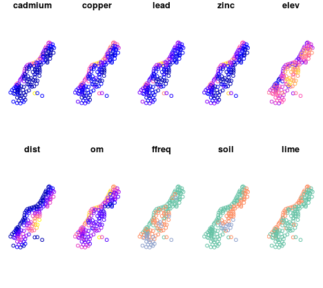
Figure 12.24: Sf method::plot: multi-panel plot.
12.5.3 Raster
The sp supports two classes of raster data: SpatialGridDataFrame and SpatialPixelsDataFrame. The raster (R. J. Hijmans 2017b) package contains multiple classes for raster data of which there are three main ones: RasterLayer, RasterBrick, and RasterStack. The raster package contains functionalities for creating, reading, writing, and manipulating raster data, such as raster algebra and visualization of raster data.
12.5.3.1 RasterLayer
The RasterLayer class represents raster data with a single attribute. Beside attribute data, a RasterLayer object contains all parameters typically stored in the header of a raster file. These are the number of rows and columns, spatial data range, and coordinate reference system parameters. Depending on the file size, all data can be stored in RAM or can be accessed from a computer disk, which is not the case with sp classes which always store data in RAM.
The following example presents the creation of a RasterLayer object that presents a raster map of average annual temperatures in Serbia. Data are downloaded using the Web Coverage Service (WCS) url query. In the end, data are visualized using the plot method which is part of the raster package, Figure 12.25.
library(raster)
library(RColorBrewer)
url ='http://osgl.grf.bg.ac.rs/geoserver/osgl_2/ows?service=WCS&version=2.0.1&request=GetCoverage&coverageId=osgl_2__tac_temp_1961_2010&format=geotiff'
download.file(url, "temp.tif")
temp= raster("temp.tif")
nlayers(temp)
## [1] 1
# coordinate ref. sys. (CRS)
crs(temp)
# CRS arguments:
#   +proj=utm +zone=34 +ellps=GRS80 +towgs84=0,0,0,0,0,0,0 +units=m +no_defs
# Number of pixels
ncell(temp)
## [1] 159390
# number of rows, columns, and attributes
dim(temp)
## [1] 483 330   1
# spatial resolution
res(temp)
## [1] 1000 1000

plot(temp, col=brewer.pal(5,"OrRd"), main= "Average annual temperature 1961-2010" )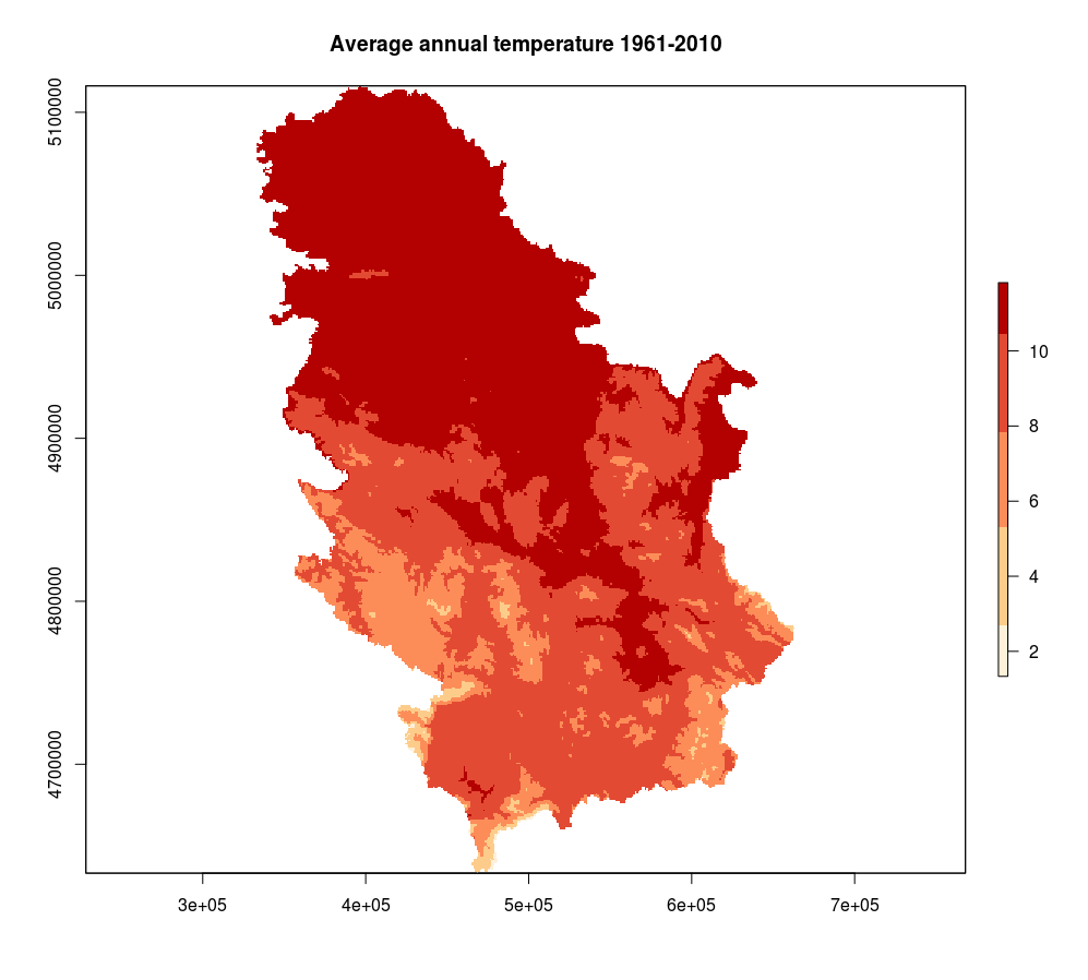
Figure 12.25: Raster method::plot annual temperature.
12.5.3.2 RasterBrick
RasterBrick is a class which supports multiple attributes within raster data, e.g., when using multispectral satellite images such as the multispectral recordings of the Sentinel 2 or Landsat 8 missions. The specific point about RasterBrick is that it can refer to only one file saved on the disk, e.g., a GeoTIFF file storing bands of a multispectral satellite image.
A demonstration of using RasterBrick objects is provided with data from the Sentinel 2 mission for the area of the municipality of Ruma. Data contain bands 2 through 11, all of them resampled to a resolution of 10 m. Table 12.2 presents a description of all channels with their basic characteristics.
| Sentinel-2 Channels | Wavelength (µm) | Resolution (m) | Range (nm) |
| Band 1 – Coastal aerosol | 0.443 | 60 | 20 |
| Band 2 – Blue | 0.490 | 10 | 65 |
| Band 3 – Green | 0.560 | 10 | 35 |
| Band 4 – Red | 0.665 | 10 | 30 |
| Band 5 – Vegetation Red Edge | 0.705 | 20 | 15 |
| Band 6 – Vegetation Red Edge | 0.740 | 20 | 15 |
| Band 7 – Vegetation Red Edge | 0.783 | 20 | 20 |
| Band 8 – NIR | 0.842 | 10 | 115 |
| Band 8A – Narrow NIR | 0.865 | 20 | 20 |
| Band 9 – Water vapour | 0.945 | 60 | 20 |
| Band 10 – SWIR – Cirrus | 1.375 | 60 | 20 |
| Band 11 – SWIR | 1.610 | 20 | 90 |
| Band 12 – SWIR | 2.190 | 20 | 180 |
Part of the satellite data was loaded using the brick method and a RasterBrick-type object s was created. Afterwards, attirbutes of the s object were renamed so that the names were associative.
s <- brick('S2A_USER_MSI_L2A_TL_SGS__20160427T133230_A004423_T34TDQ_fields.tiff')
names(s)<- c('B02','B03','B04','B05','B06', 'B07', 'B08', 'B08A', 'B11', 'B12')
The s object can be tested using methods such as summary, nlayers, crs, and res.
summary(s)
# B02 B03 B04 B05 B06 B07 B08 B08A B11 B12
# Min. 12 138.0 1 313 758 825 872 959.00 444 1101
# 1st Qu. 207 410.0 197 717 1228 1335 1421 1757.75 1119 1586
# Median 494 643.5 871 1037 1492 1664 1658 2517.50 2291 1919
# 3rd Qu. 568 737.0 1007 1171 2484 3366 3479 2738.00 2547 3547
# Max. 1395 1771.0 2141 2280 4379 6270 6349 3461.00 3199 6486
# NA's 0 0.0 0 0 0 0 0 0.00 0 0
nlayers(s)
# [1] 10
crs(s)
# CRS arguments:
# +proj=utm +zone=34 +datum=WGS84 +units=m +no_defs +ellps=WGS84 +towgs84=0,0,0
ncell(s)
# [1] 90000
dim(s)
# [1] 300 300 10
res(s)
# [1] 10 10
Using the plotRGB method, a map which uses one of the color compositions (not necessarily with red, green, and blue channels) can be created, Figure 12.26.
plotRGB(s, r = 3, g = 2, b = 1, axes = TRUE, stretch = "lin", main = "Senitnel R-G-B 27-04-2016")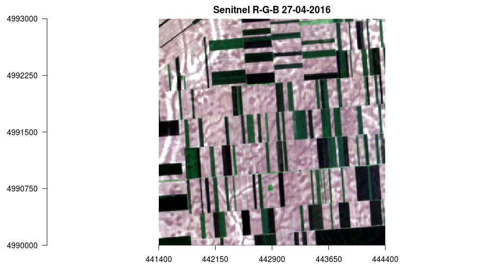
Figure 12.26: Raster method::plot Senitnel R-G-B 27-04-2016.
Similarly, a band composition can be generated: near-infrared, red, and gree, Figure 12.27.
plotRGB(s, r = 7, g = 3, b = 2, axes = TRUE, stretch = "lin", main = "Sentinel NIR-R-G 27-04-2016")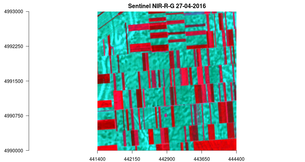
Figure 12.27: Raster method::plot Sentinel NIR-R-G 27-04-2016.
In the following example, the VI function which generates the vegetation index was made. The function has three three arguments: img which is RasterBrick-type, and i and k which represent channels to be used. Then, the VI function was used and a ndvi raster data was created (normalized vegetation index). Finally, ndvi was charted using the plot method, Figure 12.28.
# i, k ordinal number of attribute in object s
VI <- function(img, i, k) {
  bi <- img[[i]]
  bk <- img[[k]]
  vi <- (bk - bi) / (bk + bi)
  return(vi)
}

# Sentinel NIR = B08  -  s[[7]] , red = B04  - 3.
ndvi <- VI(s, 3, 7)
plot(ndvi, col = rev(terrain.colors(30)), main = 'NDVI - Sentinel 27-04-2016')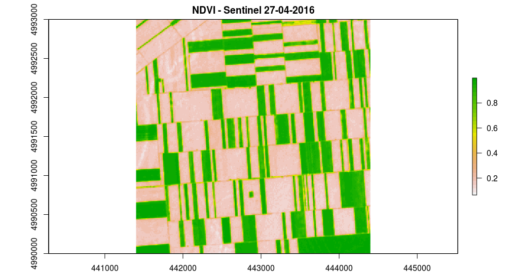
Figure 12.28: Raster method::plot Sentinel NDVI.
12.5.3.3 RasterStack
RasterStack is a list of raster layers with a similar structure as RasterBrick but with no limitation of referring to only one GIS file, but also to a composition of multiple files saved on disk or stored in RAM, or a combination of both. Practically, it can be said that it is a list of RasterLayer objects. By default, the spatial range and resolution is the same for every RasterLayer which is part of a RasterStack object.
12.6 Relief visualization
Different terrain visualizations can be created using the raster and rasterVis package (R. J. Hijmans 2017b, Perpinan Lamigueiro and Hijmans (2018)). The following example shows how to generate a perspective terrain view using the terrain.colors predefined color palette (Figure 12.29), instead of which any other predefined or user-generated palette can be used.
library(RColorBrewer)
library(rgl)
require(raster)
library(rasterVis)
alt = getData('alt', country='SRB') # 1 km resolution
plot3D(alt, drape=NULL, zfac=0.5, col=colorRampPalette(terrain.colors(12) ))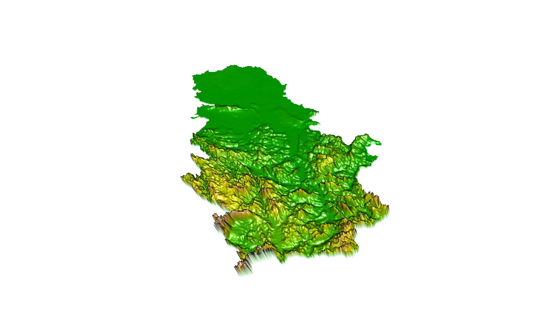
Figure 12.29: plot3D method for a perspective terrain view.
A terrain display using shadowing and hypsometric scaling (color method) can be created in the following way. The map is plotted directly to jpg file, Figure 12.30.
slope = terrain(alt, opt='slope') # slope
aspect = terrain(alt, opt='aspect') # orientation
hill = hillShade(slope, aspect, 45, 270) # shadow declination 45 , azimuth 270
# jpeg plot
jpeg(file = "dem.jpg", width =2000, height = 2000, res = 300, pointsize = 14)
plot(hill, col=grey(0:100/100), legend=FALSE, main='Serbian terrain display – shadows and hypsometry')
plot(alt, col=terrain.colors(12, alpha=0.35), add=TRUE) # color method
dev.off()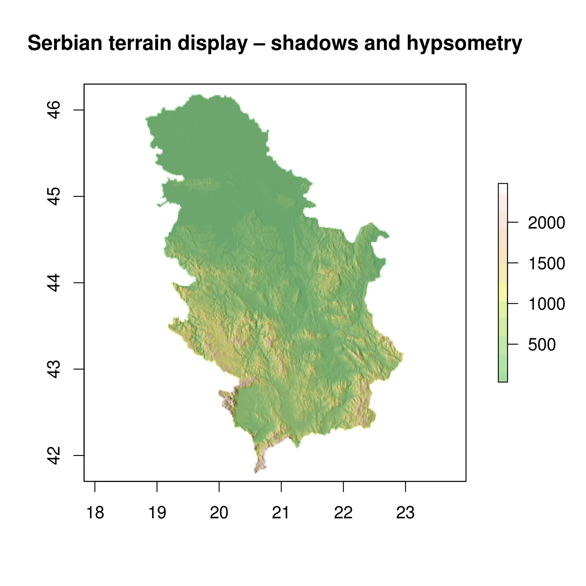
Figure 12.30: Serbian terrain display – shadows and hypsometry.
An interesting option for terrain visualization that produces marginal profiles with average heights in the West-East and North-South directions, is given in the following example, Figure 12.31.
p0 <- levelplot(hill, margin=FALSE, par.settings = GrTheme)
p1 = levelplot(alt, layers = 1, colorkey=FALSE,
col.regions= terrain.colors(12,alpha=0.35) , margin = list(FUN = 'mean'), contour=F)
p1 + as.layer(p0, under = TRUE)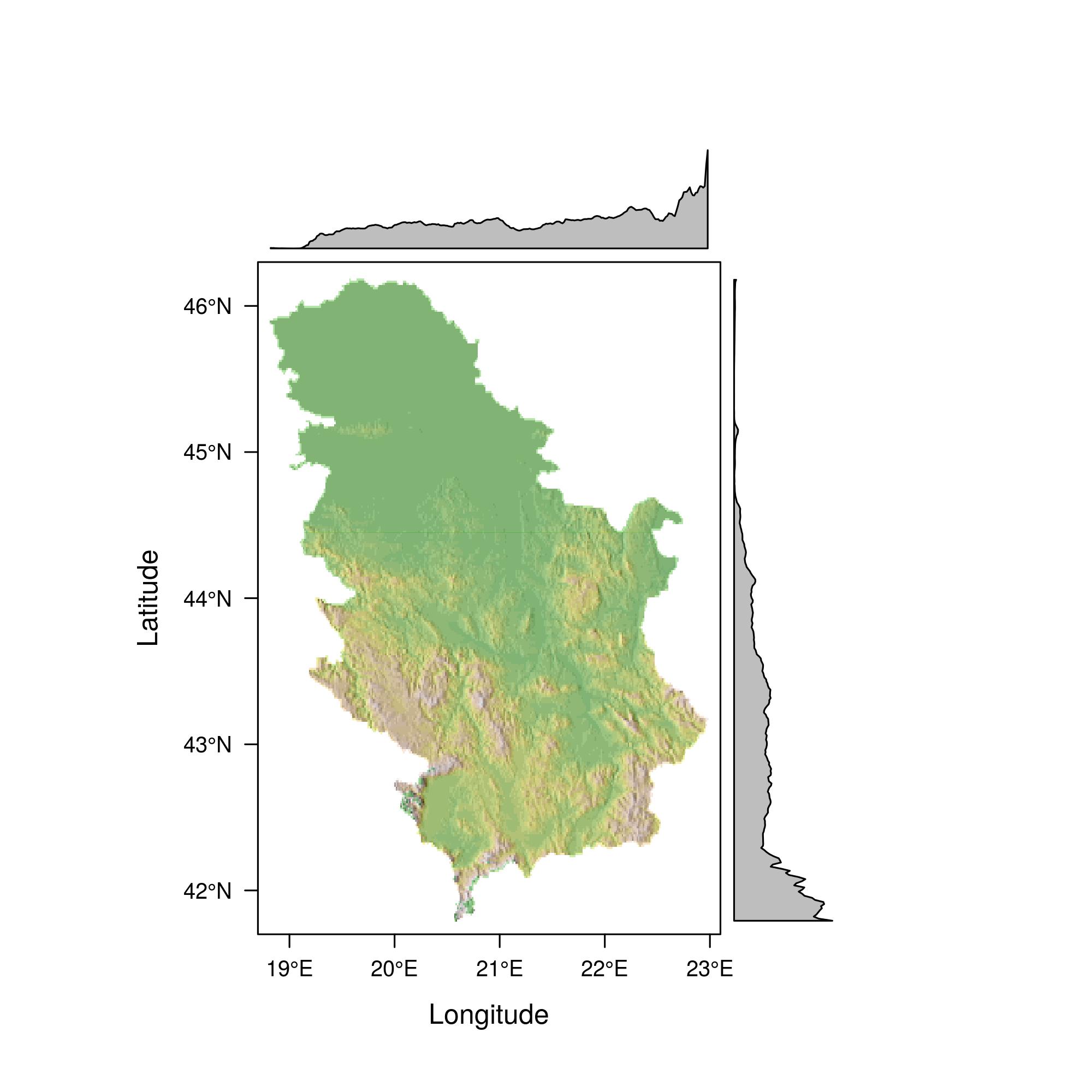
Figure 12.31: Serbian terrain display with average profiles.
The isohypse and color methods for the region of Zlatibor are illustrated with the following example, Figure 12.32.
zlatibor = crop(alt, extent (19.65,19.75, 43.60, 43.75))

plot(zlatibor, col= terrain.colors(160,alpha=0.5) )
contour(zlatibor, add=T)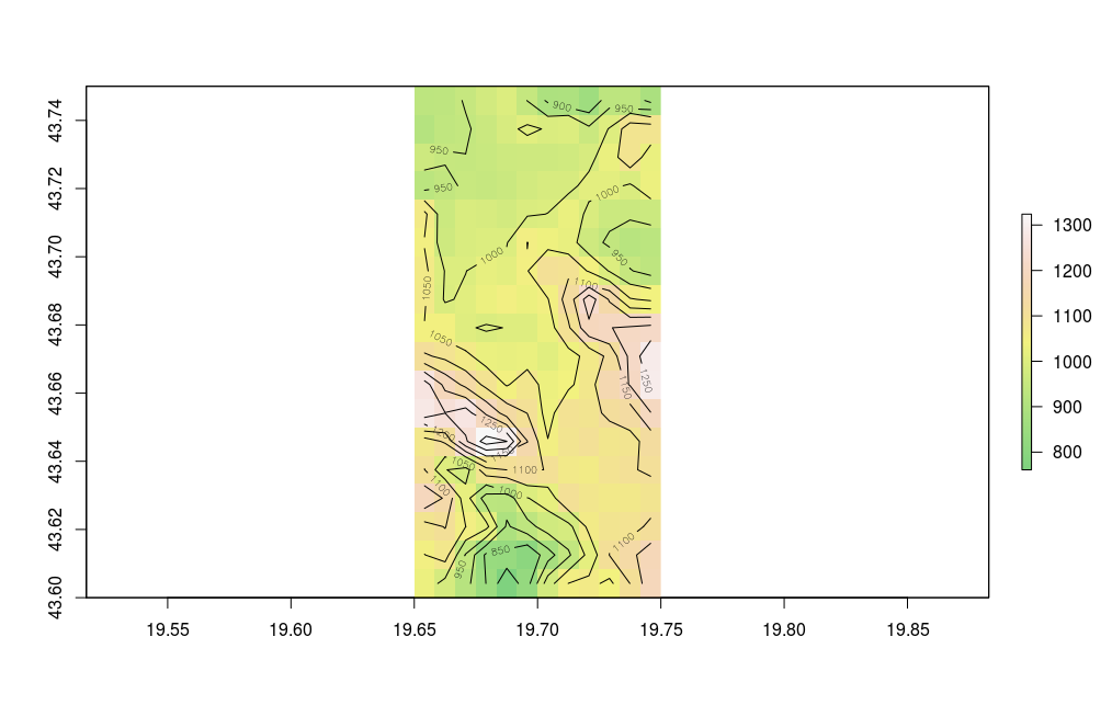
Figure 12.32: Serbian terrain display - isohypse.
12.7 Production of thematic maps using the ggplot2 package
The ggplot2 (Wickham and Chang 2016) package introduces a new system for producing graphs and maps compared with traditional methods in R. The ggplot2 package was developed and is maintained by Hadley Wickham. The package was created on the basis of a book authored by Leland Wilkinson - “The Grammar of Graphics.” The production of graphs and maps with the ggplot syntax uses a layered structure in visualization.
The layered approach can be decomposed into the following parts:
Data which are plotted or mapped,
Stylization (esthetics),
Geometry,
Statistics (if data are summed, grouped, etc.).
The following example shows how to create a map using proportional symbols and meuse data (Figure 12.33); the symbol size is proportional to the attribute data zinc (zinc concentration is in ppm). For the ggplot method, spatial data must be converted into a data.frame object.
library(sp)
data(meuse)
coordinates(meuse) <- ~x+y
library(ggplot2)
ggplot(as.data.frame(meuse)) +
aes(x, y, size = zinc) +
geom_point() +
coord_equal() + labs(x = "E", y="N")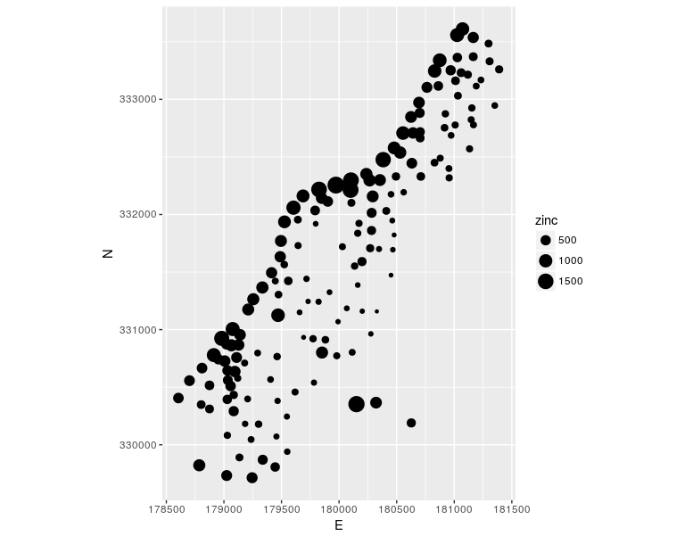
Figure 12.33: Ggplot method: proportional symbols.
Creating a choroplet map using ggplot is explained in the following example. The geometry is converted from an sp to a data.frame object using the fortify method which creates an attribute data table, and coordinates of vertices are grouped according to the ID_Municip (municipality id) attribute. Then, the attributes in the table containing the geometry were connected with attribute data using the merge function and a common attribute. Using the ggplot method, a choroplet map of municipal populations was created in a Bonne pseudocylinder equal area projection, Figure 12.34. The ggplot2 package (Wickham and Chang 2016) uses the notation from the mapproj(McIlroy et al. 2017) R package for defining cartographic projections and calculating projected coordinates.
library(rgdal)
url='http://osgl.grf.bg.ac.rs/geoserver/osgl_4/wfs?service=WFS&version=1.0.0&request=GetFeature&typeName=osgl_4:POP_age'
download.file(url, 'poage.gml')
pa <- readOGR(dsn ='poage.gml', layer = 'POP_age', stringsAsFactors=FALSE )
proj4string(pa) <- CRS("+init=epsg:4326")
pa$TOTAL_POP <-as.numeric(pa$TOTAL_POP)
f = fortify(pa, region = "ID_Municip")
ff = merge(f, pa@data, by.x = "id", by.y = "ID_Municip")
library(mapproj)
ggplot(ff) +
aes(x=long, y=lat, group = group, fill = TOTAL_POP) +
geom_polygon() +
coord_map("bonne", lat0 = 44)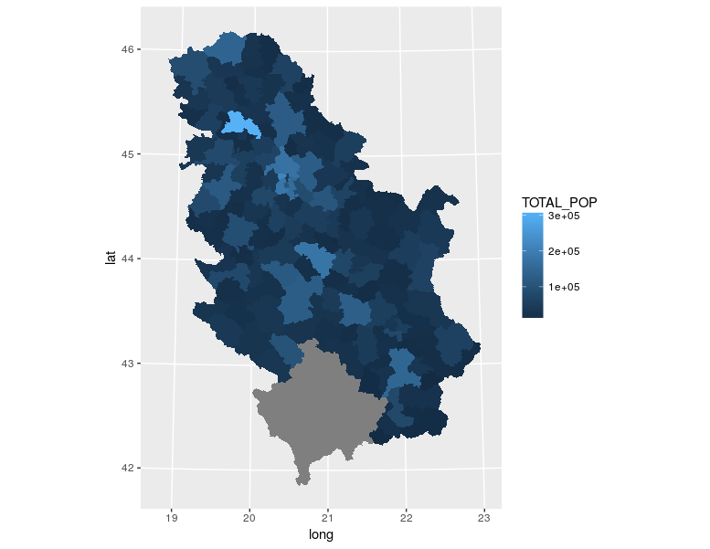
Figure 12.34: Method ggplot method: choroplet map.
Fortunately, recently, ggplot methods supports sf objects directly.
Figure 12.35: Method ggplot method with sf object: choroplet map.
12.8 Production of thematic maps using the tmap package
The tmap package (Tennekes 2018) was created for producing thematic maps using the same approach as the ggplot2 package. Besides a layered organization for producing maps, the qtm method’s standard approach to a quick production of thematic maps can also be used. Unlike the ggplot2 package, the tmap package uses spatial classes (sp, sf, and raster classes) as inputdata, is intended only for producing maps, and offers a large flexibility in the production of map elements.
The tmap package has the following layered structure:
Spatial data;
Points, lines, polygons, or rasters,
Spatial frame,
Coordinate reference system.
Layers (cartographic shaping);
Esthetics,
Statistics,
Scale.
Template maps.
The following example shows how to produce a municipal population map using theqtm method. The map is in the Lambert azimuth equivalent projection, Figure 12.36.
library(tmap)
library(tmaptools)
# transformation into a Lambert azimuth equivalent projection
pa <- spTransform(pa, CRS('+proj=laea +lat_0=44 +lon_0=21 +x_0=200000 +y_0=200000 +datum=WGS84'))
# production of a thematic choroplet map
qtm(pa, fill="TOTAL_POP", style="gray", fill.title="Population", fill.textNA="No data", legend.format.text.separator="to")
Cartographic shaping in the example of the “quick thematic map” is defined within one function, similar to traditional plot methods. A grey background is assigned; the visual variable varies depending on the total population by municipality polygons; next to the title, a separator for numerical data in the legend is given, as well as the instruction on how to label entities with missing data.
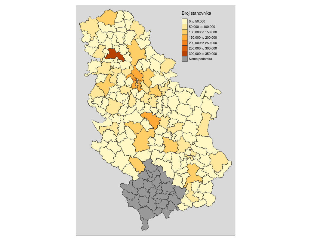
Figure 12.36: Qtm method: choroplet map.
The same data can be used to produce a choroplet map using a layered organization for thematic maps. A detailed description of this process is given: classification of attributes, drawing of a coordinate grid, orientation, definition of a legend and its positions, and theme which contains a template for stylization inside and outside of the frame, Figure 12.37.
The tmap package offers many more possibilities for producing thematic maps, among other things, interactive web maps combined with OpenStreetMaps contents using the Leaflet JavaScript library in the client section; such an example is given in the package vignette.
tm_shape(pa ) +

tm_polygons(c("TOTAL_POP"),
textNA="No data",
style=c("pretty"),
palette="YlOrRd",
auto.palette.mapping=FALSE,
title="Population") +

tm_grid(projection="longlat", labels.size = .5) +

tm_compass(type= "arrow", color.light = "grey90") +

tm_style_classic(inner.margins=c(.04,.06, .04, .04), legend.position = c("right", "top"),
legend.frame = TRUE, bg.color="lightblue", legend.bg.color="lightblue",
earth.boundary = TRUE, space.color="grey90",
legend.format=list(text.separator="to",
format=c(format="f", big.mark = " ", digits=0)
))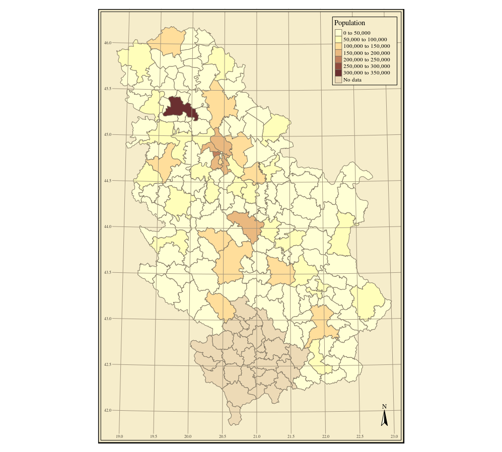
Figure 12.37: Choroplet map, tmap package.
12.9 Production of thematic maps using the cartography package
The cartography (Giraud and Lambert 2017) package uses an approach similar to the tmap package. The following example combines municipal borders, a bacgrund map obtained from the OpenStreetMap service, proportional symbols whose size corresponds to the total municipal population and the symbol color varies depending on the proportion of elderly in the total population. The code in the following example is explained in accompanying comments, Figure 12.38.
library(cartography)
# Converting from an sp to an sf type
pasf <- st_as_sf(pa)
# Proportion of elderly in the total population
pasf$ADULTS <- as.numeric(pasf$ADULTS)
pasf$propElderly <- 100 * pasf$ADULTS/pasf$TOTAL_POP
# Selecting all polygons whose names contain the word Belgrade
library(stringr)
pasf <- pasf[str_detect(pasf$NameASCII,"Beograd"), ]

# Color palette choice
cols <- carto.pal(pal1 = "wine.pal", n1 = 5)

# Map will be printed in a jpeg file
jpeg(file = "mapPop.jpg", width =2000, height = 2000, res = 300, pointsize = 14)
opar <- par(mar = c(0,0,1.2,0))
# obtaining OSM tiles
BGosm <- getTiles(pasf, type = "osmgrayscale", crop = TRUE)

########### THEMATIC MAP ########################

# Drawing the basic map
tilesLayer(BGosm)
# Drawing polygons, only borders
plot(st_geometry(pasf), col =NA, border = "black",
bg = NA, lwd =3, add = TRUE)
# Proportional symbols, size proportional to population, colors
# divided in relation with proportion of elderly in the total population.

propSymbolsChoroLayer(x = pasf, # sf object
var = "TOTAL_POP", # attribute for proportional symbols
var2 = "propElderly", # attribute for color choice
col = cols, # color palette
inches = 0.2, # maximum symbol radius
method = "quantile", # attribute classification
border = "grey50", # proportional symbol border line color
lwd = 1, # proportional symbol border line thickness
legend.var.pos = "topleft", # first legend position
legend.var2.pos = "left", # second legend position
legend.var2.title.txt ="Percentage \n of \n adults",
legend.var.title.txt = "Population",
legend.var.style = "c") # legend style

# Adding a layout
layoutLayer(title="Percentage of adults in Belgrade, 2011 census", # Map title
scale = 20, # scale
north = TRUE, # direction of North
col = "white",
coltitle = "black",
author = "Milan Kilibarda",
sources = "OSM, RSZ Popis, 2011, OSGL",
frame = TRUE)

# initial setting of graphical parameters
par(opar)
# closing of the current plot window
dev.off()
Figure 12.38: Visualization with multiple visual variables.
It is obvious that the old part of Belgrade contains several municipalities with very small areas. An alternative approach in thematic cartography is to create equal area hexagons which will place an emphasis only on mapped variables. Hence, areas will be disregarded since each hexagon has the same area. With these maps, the aim is to maintain spatial orientation as similar to the original data as possible, Figure 12.39. The following code creates a hexagon map, and explanations are given in comments.
# devtools::install_github("jbaileyh/geogrid")
# package with functionalities for converting polygons to hexagons
library(geogrid)
library(sf)
# creating hexagons for Belgrade municipalities
hex_grid <- calculate_grid(shape = as(pasf, 'Spatial'), grid_type = "hexagonal", seed = 1)
# creating sf polygons with attributes from pasf objects with a hex_grid hexagon geometry.
pol = st_as_sf  ( assign_polygons(as(pasf, 'Spatial'), hex_grid ) )
# creating a file for storing the map
jpeg(file = "hexmap.jpg", width =2000, height = 2000, res = 300, pointsize = 14)
# hexagon borders
plot(st_geometry(pol), col =NA, border   = "black",
     bg = NA, lwd =3 )
# proportional symbols
propSymbolsChoroLayer(x =pol, # sf obj.
                      var = "TOTAL_POP", # attr. for symbol size
                      var2 = "propElderly", #  attr. for color choice
                      col = cols, # colors
                      inches = 0.2, # proportional symbol maximum radius
                      method = "quantile", # intervals
                      border = "grey50", # prop. symb. border line colors
                      lwd = 1, # prop. symb. border line thickness
                      legend.var.pos = "topleft", # first legend position
                      legend.var2.pos = "left", # second legend position
                      legend.var2.title.txt =
                        "Percentage \n of \n adults",
                      legend.var.title.txt = "Population",
                      legend.var.style = "c") # legend style
# abbreviating Belgrade municipality names, BGD for "Belgrade-"
pol$Name  = gsub("Beograd-", "", pol$NameASCII)
# toponym creation
labelLayer(spdf = as(pol,'Spatial'), # SpatialPolygonsDataFrame for toponyms
           txt = "Name", # attribute containing toponyms
           col = "black", #  toponym color
           cex = 0.5, # toponym size
           font = 1) # font
# Other content
layoutLayer(title="Percentage of adults in Belgrade, 2011 census", # Title
            scale = 20, # scale size in km
            north = TRUE, # Orientation
            col = "white",
            coltitle = "black",
            author = "Milan Kilibarda",
            sources = "SORS, 2011, OSGL Belgrade",
            frame = TRUE)
dev.off()
Figure 12.39: Map with hexagon geometry.
12.10 Production of interactive thematic maps using the plotly package
The plotly (Sievert et al. 2018) package in R is intended for creating interactive graphs based on the JavaScript plotly.js graphic library. The very comprehensive documentation for this R package is available at the following addresses:
In the following example, a map of Belgrade municipalities was created and each municipality was displayed usinga different color, thus obtaining an interactive map within the RStudio environment, Figure 12.40.
library(plotly)
cols <- c("#89C5DA", "#DA5724", "#74D944", "#CE50CA", "#3F4921", "#C0717C", "#CBD588", "#5F7FC7", "#673770", "#D3D93E", "#38333E", "#508578", "#D7C1B1", "#689030", "#AD6F3B", "#CD9BCD", "#D14285")

plot_ly(pasf, color = ~NameASCII, colors = cols, alpha = 1)
Figure 12.40: Plotly package: interactive map.
The following example uses the “pipe” system with the %>% operator which shortens the code since intermediate results are directly forwarded without being stored in a variable. This system was first introduced with the magrittr package and is now typically used as the default package in many others, such as plotly and tidyverse.
The following example demonstrates the simplest use of this system.
 library(magrittr)
  x<- 60 *pi/180
  # first method with nested functions
  round(exp(sin(tan(x))), 1)
  ## [1] 2.7
  # second method, step by step with an auxiliary variable.
  x1 <- tan(x)
  x2 <- sin(x1)
  x3 <- exp(x2)
  round(x3,1)
  ## [1] 2.7
  # pipe method x in tan then sinus then exp then round
  x %>% tan() %>% sin() %>% exp() %>% round(1)
  ## [1] 2.7
Hence, each of the three methods of calculating the given expression yields identical results with the only difference being in the approach to code readability. A detailed description of the pipe concept is provided in the book “R for Data Science” (Wickham and Grolemund 2016).
The package offers the possibilities of producing interactive web maps based on mapbox services. The following example creates an interactive map of Belgrade municipalities with satellite images provided by the background mapbox service (Figure 12.41), using also the pipe operator. For the example to be operational, the mapbox key is needed, which was, in this case, stored as a system variable in R.
Sys.setenv('MAPBOX_TOKEN' = 'secret key')
pasf <-  st_transform(pasf, crs = 4326)
# map generation
plot_mapbox(pasf, fillcolor = 'rgba(7, 164, 181, 0.2)' ) %>%
    layout(
      title = "Belgrade municipalities",
      mapbox = list(style = "satellite-streets")
    )
Figure 12.41: Plotly package: interactive web map.
The next example show the production of an interactive map and an attribute table, Figure 12.42. Interaction with the map is possible in the left section which is synchronized with the table display. Thus, if only one municipality is selected on the map, then the table shows only attributes for that municipality. Selection of multiple municipalities on the map or in the table is also possible.
library(crosstalk)
  pasf <-  st_transform(pasf, crs = 4326)
  bgd <- SharedData$new(pasf)
  # works only with WGS84
  bscols(
    plot_mapbox(bgd, text = ~NameASCII, hoverinfo = "text"),
    DT::datatable(bgd)
  )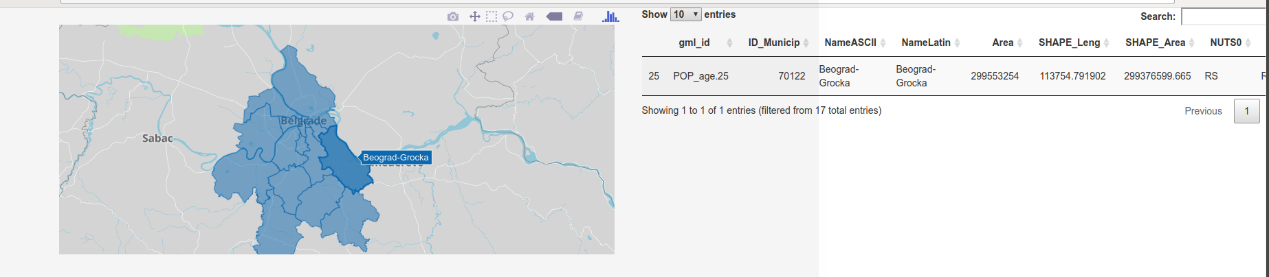
Figure 12.42: Interactive map and attribute table.
The next example is similar to the previous one and works with a synchronized histogram and map. It also offers the possibility of multiple selections shown in different colors on the map and in the histogram, Figure 12.43.
bscols(
    plot_mapbox(bgd) %>%
    highlight(dynamic = TRUE, persistent = T),
    plot_ly(bgd, x = ~TOTAL_POP) %>%
    add_histogram(xbins = list(start = 20000, end = 215000, size = 30000)) %>%
    layout(barmode = "overlay") %>%
    highlight("plotly_selected", persistent = T)
  )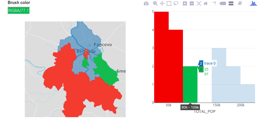
Figure 12.43: Interactive map and histogram.
12.11 Production of web maps using the plotGoogleMaps package
One of the first packages in R for the production of interactive web maps was the plotGoogleMaps (Kilibarda 2017) which was created in 2010, based on Google Maps API and JavaScript library. Basic maps can be chosen using global maps made by Google. The package is based on the standard plot approach and works with sp and raster classes.
The following example illustrates how to create a web map with meuse data (Figure 12.44); the map is interactive, i.e., clicking on entities gives attribute data, a basic map can be chosen, etc.
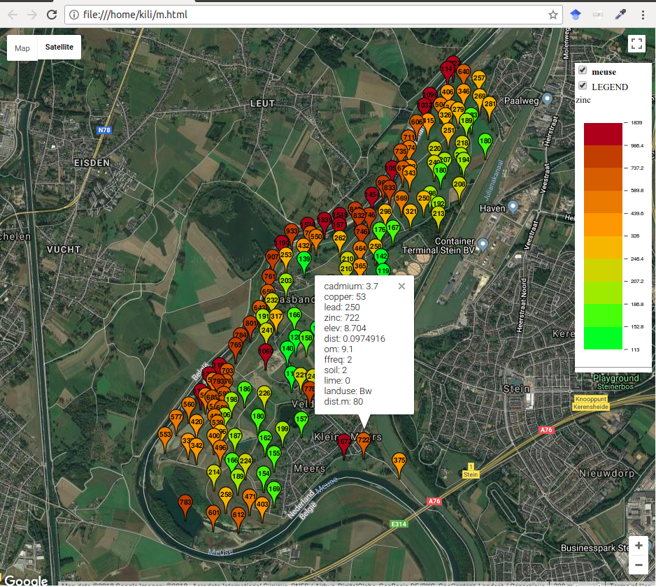
Figure 12.44: Interactive map with meuse data, plotGoogleMaps
Creating a map that uses proportional symbols for visualization of spatial phenomena is simple, Figure 12.45.
m2 <- bubbleGoogleMaps(meuse, 'zinc', filename = 'm.html')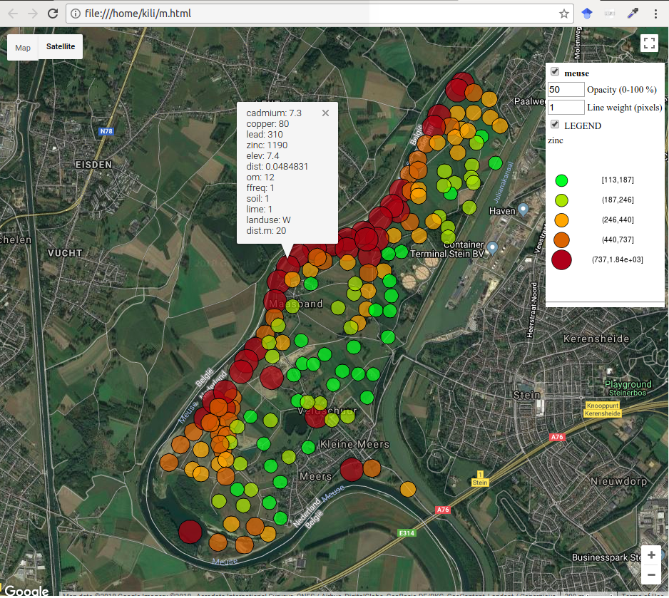
Figure 12.45: Interactive map with meuse data, bubbleGoogleMaps
R contains an excellent package spacetime (Pebesma 2016) which provides classes and methods for spatio-temportal data. More about the package can be found in the package vignette (Pebesma 2012, Bivand, Pebesma, and Gomez-Rubio (2013)). The next example shows one of the classic displays of spatio-temporal data, i.e., a panel display. Spatio-temporal data are shown as a string of spatial data in which every element corresponds to one moment in time, Figure 12.46. An alternative is an animated display or a combination of map and graph. The following code is given without explanations, and based on the spatio-temporal data on the number of unemployed in the USA over time, an object with spatio-temporal information is created.
# Data preparation
  # STFDF data from spacetime vignette spacetime: Spatio-Temporal Data in R
  library("maps")
  states.m = map('state', plot=FALSE, fill=TRUE)
  IDs <- sapply(strsplit(states.m$names, ":"), function(x) x[1])
  library("maptools")
  states = map2SpatialPolygons(states.m, IDs=IDs)
  yrs = 1970:1986
  time = as.POSIXct(paste(yrs, "-01-01", sep=""), tz = "GMT")
  library("plm")
  data("Produc")
# no data for Colorado
  Produc.st = STFDF(states[-8], time, Produc[order(Produc[2], Produc[1]),])
  Produc.st@sp@proj4string=CRS('+proj=longlat +datum=WGS84')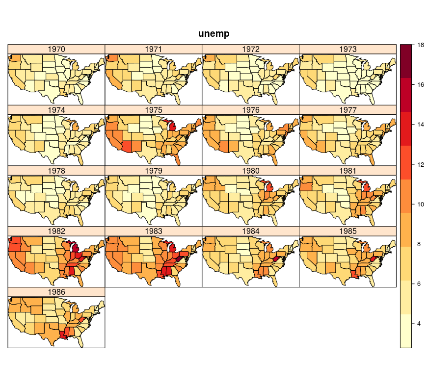
Figure 12.46: Spatio-temporal display of unemployment in the USA, multi-panel plot
For this data structure, it is possible to create a spatio-temporal display in plotGoogleMaps in which the map is created according to the average unemployment in the entire time interval (color method for the visual variable), and after clicking on an entity, a graph is displayed showing the time series for the mapped attribute, Figure 12.47.
# Percentage of unemployed in the USA by state, 1970-1986
m <- stfdfGoogleMaps(Produc.st, zcol= 'unemp', filename = 'mst.html')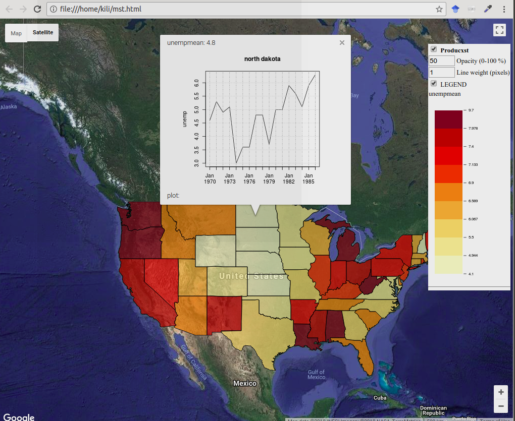
Figure 12.47: Spatio-temporal display of USA unemployment, stfdfGoogleMaps
12.12 Production of web maps using the mapview package
The mapview package (Appelhans et al. 2018) is one of the many packages developed in R in the last several years, intended for the production of web maps which are interactive and based on the Leaflet JavaScript library. The package is easy to use and has a classic plot approach. It offers excellent functionalities for all standard spatial data types in R.
The following example shows the production of a web map with meuse data. Unless specified, the default map is OpenStreetMap. This example uses an sp object for input data. The map is interactive, i.e., attribute data can be obtained for every entity. Also, the basic map can be changed.
library(mapview)
## Loading required package: leaflet
library(sp)
data(meuse)
coordinates(meuse) = ~x+y
proj4string(meuse) <- CRS("+init=epsg:28992")
mapview(meuse, zcol = "zinc", legend = TRUE)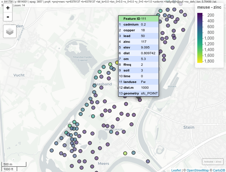
Figure 12.48: Interactive map with meuse data, mapview
The following example creates an interactive choroplet map by municipalities, and the attribute representing municipality population is mapped. Data was used in previous examples, and the object type is sf. For this map, transparency was set at 20%.
mapview(pasf, zcol = c("TOTAL_POP"), alpha.regions = 0.2, legend = TRUE)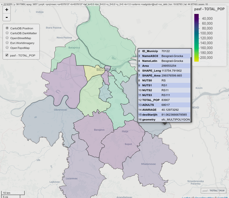
Figure 12.49: Interactive choroplet map, mapview
The next example shows hot to visualize spatio-temporal data representing the NDVI index for the region of Mount Kilimanjaro. A web panel with four synchronized channels was made, so that this display is very suitable for a visual analysis of temporal changes.
library(raster)
kili_data <- system.file("extdata", "kiliNDVI.tif", package = "mapview")
kiliNDVI <- stack(kili_data) # 23 layers in a series
library(RColorBrewer)
clr <- colorRampPalette(brewer.pal(9, "YlGn")) # color palette

m1 <- mapview(kiliNDVI[[1]] , col.regions = clr, legend = TRUE, map.types = "Esri.WorldImagery")
m2 <- mapview(kiliNDVI[[5]], col.regions = clr ,legend = TRUE, map.types = "Esri.WorldImagery")
m3 <- mapview(kiliNDVI[[10]], col.regions = clr, legend = TRUE, map.types = "Esri.WorldImagery")
m4 <- mapview(kiliNDVI[[20]],col.regions = clr, legend = TRUE, map.types = "Esri.WorldImagery")

sync(m1, m2, m3, m4) # four panesl synchronized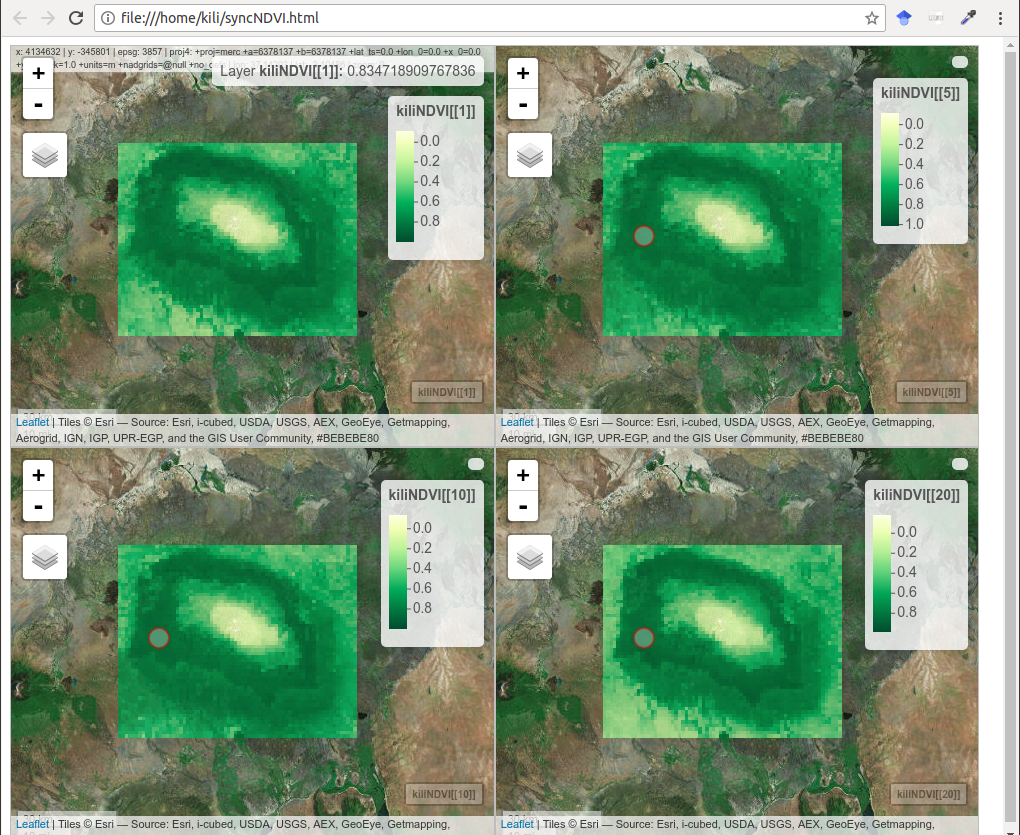
Figure 12.50: Synchronized NDVI maps, mapview
The mapview package offers a simple display of spatio-temporal phenomena in 3D, where Z is the time coordinate. The example is given with the same data as for the synchronized view.
cubeView(kiliNDVI[[c(1,5,10,20)]], col.regions = clr)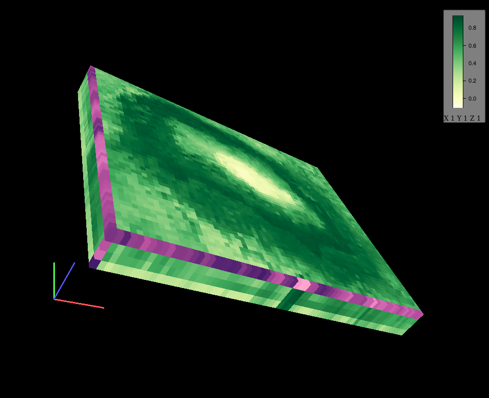
Figure 12.51: Display of spatio-temporal phenomena in 3D
12.13 PlotKML package for visualization on virtual globes
The plotKML package (Hengl 2017) enables the production of thematic maps on virtual globes, primarily on the Google Earth virtual globe, but also others, such as CesiumJs. Practically all of the visualization is in the KML file itself.
The following example shows the creation of proportional symbols for meuse data, with symbol size varying by the zinc attribute.
library(plotKML)
shape = "http://maps.google.com/mapfiles/kml/pal2/icon18.png"
kml(meuse, colour = zinc, size = zinc,
alpha = 0.75, file = "meuse.kml", shape=shape, labels =zinc)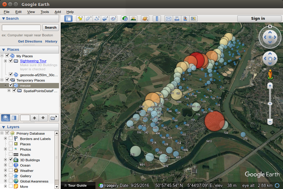
Figure 12.52: Proportional symbols for meuse data on a virtual globe.
Possibilities of a threedimensional display enable the creation of an interactive map in which the variation is shown by symbol height relative to zinc concentration; as in the previous example, the cartographic variable also changes color.
kml(meuse, colour = zinc,
alpha = 0.75, file = "meuseH.kml", shape=shape, altitude =zinc, labels=zinc)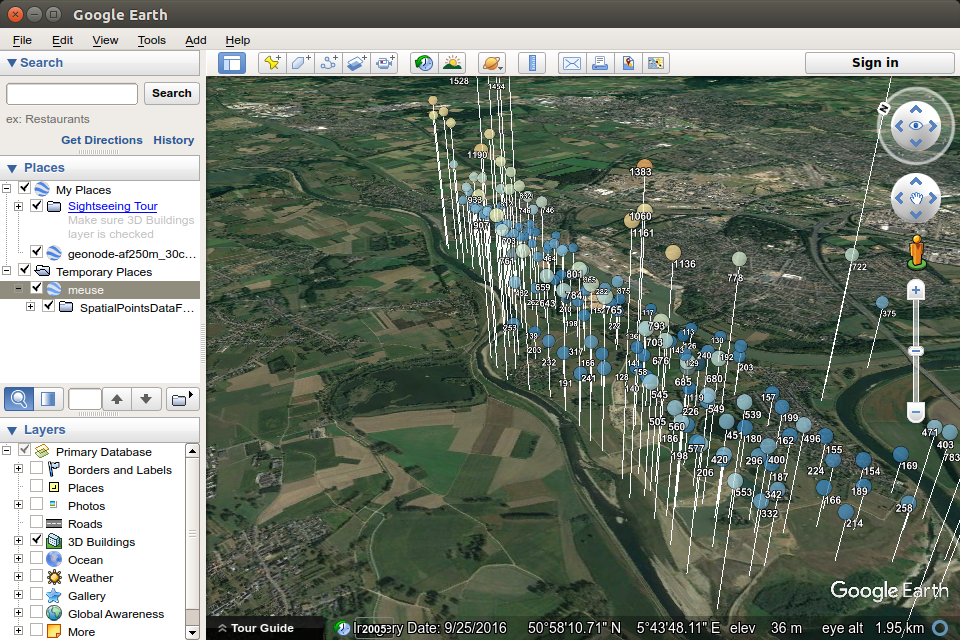
Figure 12.53: Proportional symbols for meuse data on a virtual globe, cartographic variable changing over height.
If we visualize Belgrade municipalities so that they are shown as prisms and if the prism height is proportional to population, then, such a file can be opened in some other virtual globe, e.g., CesiumJs. CesiumJS offers a large number of basic maps shown on the globe.
library(stringr)
BG <- pa[str_detect(pa$NameASCII, "Beograd"), ]
kml(BG, colour = TOTAL_POP,
alpha = 0.75, file = "BGPop.kml", altitude =TOTAL_POP, labels=TOTAL_POP)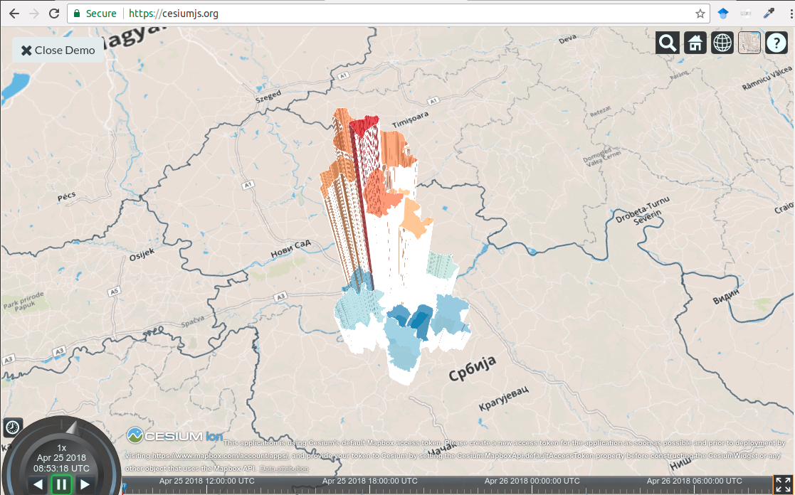
Figure 12.54: Choroplet map with height variations.
The following example creates an animated display of spatio-temporal data for the meteorological station network in Croatia and the displayed attribute is temperature. Google Earth offers a control of the animation so that it is possible to
move forward,
move backward,
speed up,
slow down,
pause,
select a time interval.
Similar options are offered by CesiumJS, except for the choice of time interval.
library(plotKML)
  data(HRtemp08)
  # format the time column:
  HRtemp08$ctime <- as.POSIXct(HRtemp08$DATE, format="%Y-%m-%dT%H:%M:%SZ")
  # create a STIDF object:
  library(spacetime)
  sp <- SpatialPoints(HRtemp08[,c("Lon","Lat")])
  proj4string(sp) <- CRS("+proj=longlat +datum=WGS84")
  HRtemp08.st <- STIDF(sp, time = HRtemp08$ctime, data = HRtemp08[,c("NAME","TEMP")])
  # write to a KML file:
  HRtemp08_jan <- HRtemp08.st[1:500]
  shape <- "http://maps.google.com/mapfiles/kml/pal2/icon18.png"
  kml(HRtemp08_jan, dtime = 24*3600, colour = TEMP, shape = shape, labels = "", kmz=TRUE)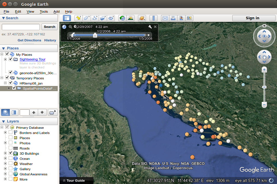
Figure 12.55: Animated display of spatio-temporal data.
References
Pebesma, Edzer, and Roger Bivand. 2018. Sp: Classes and Methods for Spatial Data. https://CRAN.R-project.org/package=sp.
Hijmans, Robert J. 2017a. Geosphere: Spherical Trigonometry. https://CRAN.R-project.org/package=geosphere.
Bivand, Roger, Tim Keitt, and Barry Rowlingson. 2018. Rgdal: Bindings for the ’Geospatial’ Data Abstraction Library. https://CRAN.R-project.org/package=rgdal.
Bivand, Roger, and Colin Rundel. 2017. Rgeos: Interface to Geometry Engine - Open Source (’Geos’). https://CRAN.R-project.org/package=rgeos.
Bivand, Roger. 2017. ClassInt: Choose Univariate Class Intervals. https://CRAN.R-project.org/package=classInt.
Neuwirth, Erich. 2014. RColorBrewer: ColorBrewer Palettes. https://CRAN.R-project.org/package=RColorBrewer.
Brewer, Cynthia A., Geoffrey W. Hatchard, and Mark A. Harrower. 2003. “ColorBrewer in Print: A Catalog of Color Schemes for Maps.” Cartography and Geographic Information Science 30 (1). Taylor & Francis: 5–32. doi:10.1559/152304003100010929.
Sumner, Michael D. 2016. Graticule: Meridional and Parallel Lines for Maps. https://CRAN.R-project.org/package=graticule.
Pebesma, Edzer. 2018. Sf: Simple Features for R. https://github.com/r-spatial/sf/.
Lovelace, Robin, Jakub Nowosad, and Jannes Muenchow. 2018. “Geocomputation with R.”
Bivand, Roger, Jakub Nowosad, and Robin Lovelace. 2018. SpData: Datasets for Spatial Analysis. https://CRAN.R-project.org/package=spData.
Hijmans, Robert J. 2017b. Raster: Geographic Data Analysis and Modeling. https://CRAN.R-project.org/package=raster.
Perpinan Lamigueiro, Oscar, and Robert Hijmans. 2018. RasterVis: Visualization Methods for Raster Data. https://CRAN.R-project.org/package=rasterVis.
Wickham, Hadley, and Winston Chang. 2016. Ggplot2: Create Elegant Data Visualisations Using the Grammar of Graphics. https://CRAN.R-project.org/package=ggplot2.
McIlroy, Doug, Ray Brownrigg, Thomas P Minka, and Roger Bivand. 2017. Mapproj: Map Projections. https://CRAN.R-project.org/package=mapproj.
Tennekes, Martijn. 2018. Tmap: Thematic Maps. https://CRAN.R-project.org/package=tmap.
Giraud, Timothée, and Nicolas Lambert. 2017. Cartography: Thematic Cartography. https://CRAN.R-project.org/package=cartography.
Sievert, Carson, Chris Parmer, Toby Hocking, Scott Chamberlain, Karthik Ram, Marianne Corvellec, and Pedro Despouy. 2018. Plotly: Create Interactive Web Graphics via ’Plotly.js’.
Wickham, Hadley, and Garrett Grolemund. 2016. R for Data Science: Import, Tidy, Transform, Visualize, and Model Data. “ O’Reilly Media, Inc.”
Kilibarda, Milan. 2017. PlotGoogleMaps: Plot Spatial or Spatio-Temporal Data over Google Maps. https://R-Forge.R-project.org/projects/
Pebesma, Edzer. 2016. Spacetime: Classes and Methods for Spatio-Temporal Data. https://CRAN.R-project.org/package=spacetime. Pebesma, Edzer. 2012. “spacetime: Spatio-Temporal Data in R.” Journal of Statistical Software 51 (7): 1–30. http://www.jstatsoft.org/v51/i07/. Bivand, Roger S., Edzer Pebesma, and Virgilio Gomez-Rubio. 2013. Applied Spatial Data Analysis with R, Second Edition. Springer, NY. http://www.asdar-book.org/. Appelhans, Tim, Florian Detsch, Christoph Reudenbach, and Stefan Woellauer. 2018. Mapview: Interactive Viewing of Spatial Data in R. https://CRAN.R-project.org/package=mapview. Hengl, Tomislav. 2017. PlotKML: Visualization of Spatial and Spatio- Temporal Objects in Google Earth. https://CRAN.R-project.org/package=plotKML.