10 Map design
Map design includes two groups of activities:
• creating a map composition
• map planning
Map planning is a process that should define a) what will be shown on a map, b) which cartographic signs will be used, c) for what purposes is the map being made, etc.
The goal of creating a map composition is to create a clear idea of how the map will look like in the end.
The goals of map design are clarity, order, balance, contrast, unity, and harmony.
When producing a map, the cartographer must answer many questions, among which the most important ones are
• Is a map really the best way of conveying a message?
• What is the purpose of the map? (in which way will it be used)
• What is the map’s theme? (what is the main information the map should convey)
• What do we want to achieve with the map? (explain, tell a story, convince, describe…)
• Who will be the map’s users? (which categories of people will use the map, what are their characteristics, needs, and cartographic literacy)
• What will be the map’s format? (paper, digital, size…)
• How will the map be made? (which technology will be used: GIS, CAD, manual production)
• How will the map be reproduced and distributed to users? (print, sold on kiosks, part of a newspaper article, digital, hosted online…)
10.1 Map elements11
A map is composed of multiple parts called map elements. Typical map elements are its neatline, principal map body, graticule, title, legend, visual variables, ancillary text, ancillary objects, scale, directional indicator, and metadata. Additional explanations of individual map elements are given in Table 10.1, Figure 10.1.
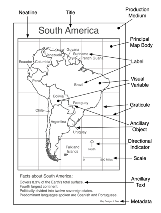
Figure 10.1: Map elements (Source:http://www.spatialquerylab.com/FOSS4GAcademy, example authored by Richard Smith, http://creativecommons.org/licenses/by/3.0.).
| Neatline | Defines the visual border of the map, separating it from other content. |
| Principal map body | The primary element of visual hierarchy, placed in the visual centre, occupying most of the space. The only map element that must be present, even though a map is much more useful when other elements are also involved. |
| Graticule | Visual representation of a coordinate system. It helps the user determine the location of objects on the map. Usually left out on thematic maps where the precise location of objects is not of primary concern. |
| Title | Explains the map’s theme, the most importat textual map element. Its basic assignment is to focus attention on the map’s purpose. |
| Legend | Explains cartographic signs used on a map. The signs must be indentical to their representation on the map. |
| Visual variables | Basic task of a visual variable is to present the user the map’s attribute or additional data regarding objects on the map. |
| Ancillary text | Complements the message conveyed by the map. Carries additional information enabling a better understanding of the map. |
| Ancillary objects | Images, audio, video, graphs, etc. They provide information relevant to map interepretation. An example is an inserted smaller map which has the task of supplementing the map’s message or placing it into a wider geographical context. |
| Scale | Enables the measurement of lengths and areas on the map; it can be graphical (a line with divisions) or numerical. |
| Directional indicator | Allows for orientation on the map. |
| Metadata | Provides data about the map, e.g., author name, publishing institution, information provider, etc. |
10.2 Map organization12
The goal of map organization is to develop an intellectual and visual structure that the map’s user can use in order to understand the message that the map’s authore is trying to convey. A well-designed map clearly points out the map’s purpose by using an appropriate choice and design of map elements.
Additionally, well-designed maps achieve a balance between basic and thematic elements so that the user has enough geographic contexts to interpret the main objects and phenomena on the map. The goal is to make the map easy for use for as many users as possible.
When designing a map, it is important to take into account two concepts: planar and hierarchical map organization.
There are three aspects of planar organization when creating a map composition: balance, focus of attention, and internal organization.
Every image, especially maps, has two centers. The first is the geometric center, the location at the intersection of the image’s diagonals. The optical center is the location first observed by the human eye when looking at an image. The optical center is located somewhat above the geometric center. This fact is important when composing a map since the goal is to make the most important element of the map the one that the user sees first. Hence, the most important map elements should be place in the optical center.
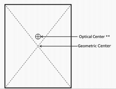
Figure 10.2: Relation between optical and geometric center.
The first aspect of planar organization is balance. Balance provides a visual impact of the arrangement of map elements. There are two factors determining balance: visual weight and orientation. Weight refers to location, size, and shape of map elements. Orientation refers to the relative location, shape, and subject of map elements.
Visual weight of an object depends on its location on the map. Elements at the center of the map composition carry less weight than those off center, Figure 10.3, source. An object in the upper part of the map composition has less weight than an object in the lower part of the map composition. It is also considered that objects on the right side have more weight than those on the left and that weight increases proportional to the distance from the center. Because of all this, it is important to distribute weight evenly across the map.
Another characteristic determining visual weight is object size. Larger objects weigh more than smaller ones. If a large object is located off center, there is a significant imbalance.
Visual weight also depends on color, interest, and isolation. As for color, red weighs more than blue, white weighs more than black, and bright weighs more than dark. Furtermore, objects of natural interest to the map’s user are considered heavier since the user will look at that part of the map. When an object is isolated from others, especially with a significant amount of white space between them, this object will have larger visual weight.
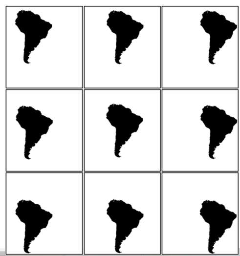
Figure 10.3: Relation between optical and geometric center for series of maps.
Parts of this section are adapted according to http://spatialquerylab.com/foss4g-academy-curriculum/gst-104-cartographic-design/ under license https://creativecommons.org/licenses/by/3.0/↩
Parts of this section are adapted according to http://spatialquerylab.com/foss4g-academy-curriculum/gst-104-cartographic-design/ under license https://creativecommons.org/licenses/by/3.0/↩