9 Cartographic communication
9.1 Cartographic communication model
For a good understanding of cartography as a discipline, it is important to look at maps as a form of visual communication or as a result of using a specific language with the purpose of describing spatial relationships6. In that sense, maps are actually symbolic abstractions or representations of the real world and its phenomena. This means that the wolrd, as shown on a map, is significantly generalized, and cartographic signs are used as words with the aim of signifying phenomena which exist—or which the cartographer believes exist—in the real world.
A generalized model of cartographic communication explains how the process of communication via maps functions (Figure 9.1).
Figure 9.1 Generalized model of cartographic communication (redesigned according to https://www.e-education.psu.edu/geog486/l1_p3.html)

Figure 9.1: Generalized model of cartographic communication.
The cartographic process begins with the cartographer’s interpretation of the real (or imaginary) world and a certain phenomenon within it. This phenomenon is then transferred onto the map which becomes a text, i.e., a messenger. A cartographer’s interpretation of the world is formed under the influence of their background: cultural, technical, academic, historical, professional, personal, national, or any other. The cartographer creates the map using a graphic sign language and applying methods of cartographic expression (which will be discussed later), with the intention of having the user interpret the map in a way that the cartographer intended.
The basic precondition for relaying information to users via maps is that both the cartographer and user have a shared understanding of the meaning of the graphic signs on the map. A sing on a map represents a phenomenon in the real world and has the role of carrying meaning. The user reads the sign and creates a mental image of the real (reference) phenomenon. The scientific discipline which forms the conceptual framework for thinking about and studyin this shared understanding of signs is called semiotics, Figure 9.2.
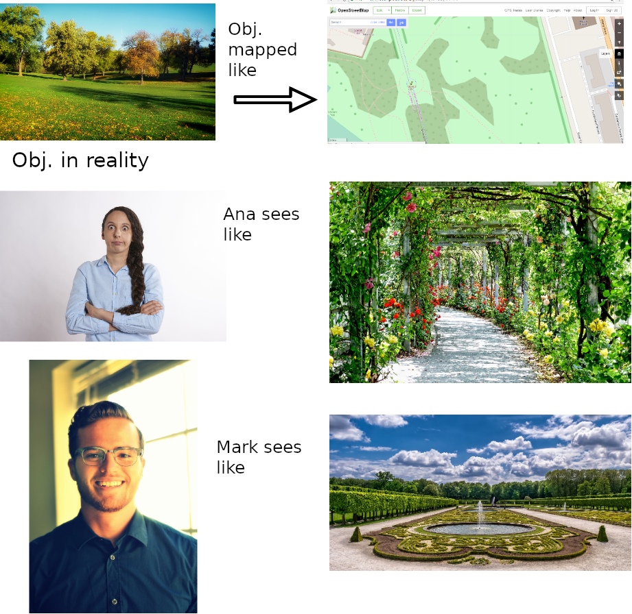
Figure 9.2: Semiotics model.
It is important to emphasize that maps cannot be viewed as reconstructions of the real world; rather, they are always constructions of a certain view of that world. A cartographer’s interpretation of the real world actually represents the creation of geographic information from spatial data based on a specific conceptualization. Since a single geographic information can be conceptualized in different ways (depending on the cartographer’s background, map scale, technical conditions, historical context, etc.), this means that geographic information is, unlike geographic data, essentially unreliable – there is no truth, or at least, there is no signle and unique truth, . Besides, a user’s interpretation of a map depends, just as any cognitive process, on the context and the user themselves (their professional and private profile,, ).
9.2 Cartographic research resources
Means of cartographic expression are cartographic signs, alphanumerical symbols, and names.
Cartographic signs are visual graphic signs which, due to their meaning and location on a map, have the ability to represent objects and phenomena in ther real world (Vasilev 2006). They possess two types of attributes: proper (meaning and location) and inherited from the map (scale, projection, coordinate system, etc., )
Generally, every sign is something that replaces something else in some feature or quality7. The basic characteristic of signs is their meaning which connects them to the real objects they represent.
There are several types of cartographic signs: iconic signs, symbols, and geometric signs.
Iconic signs represent a perspective drawing, a horizontal or vertical projection of the representation subject. These signs are very good at representing objects; however, their drawbacks are their single-use (most often they represent a single object), distraction from the whole, and limited of use (they crowd a map). Iconic signs do not require a legend since they do not need additional explaining.
Figure 9.3: Example of iconic signs (Source: Vecteezy.com).
Symbols
Symbols are a type of cartographic sign whose appearance resembles the object being represented. They are suitable since they facilitate the recognition of objects being represented by them, thus enhancing map readability.
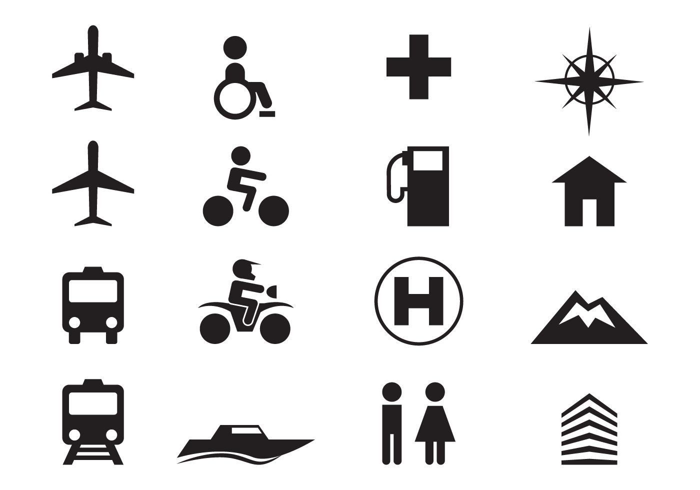
Figure 9.4: Example of symbols (Source: Vecteezy.com).
Geometrijski znaci
Geometric signs
Geometric signs are a combination of lines and points. Using these signs offers wide possibilities in cartographic communication since they enable infinitely many visual solutions. However, geometric signs do not resemble the object being represented and must be explained in a legend. They can be divided into point-, line-, and polygon-like signs.
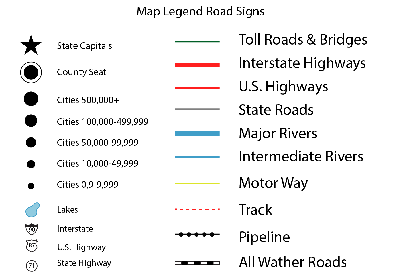
Figure 9.5: Example of a map legend (Source: Vecteezy.com).
 under license CC BY-SA). (middle) Example of line-like geometric signs (Source: [*www.openstreetmap.org*](http://www.openstreetmap.org) ). (right) Example of polygon-like geometric signs (Source: [*https://land.copernicus.eu*](https://land.copernicus.eu).](_media2/dr2.png)
Figure 9.6: (left) Example of point-like geometric signs (Source: http://mapserver.org/mapfile/symbology/construction.html under license CC BY-SA). (middle) Example of line-like geometric signs (Source: www.openstreetmap.org ). (right) Example of polygon-like geometric signs (Source: https://land.copernicus.eu.
Alphanumerical signs
Letter signs usually symbolize a qualitative characteristic of a phenomenon (line, point, polygon), and in the caseof points, their location as well. For example: Al- aluminum mine (point-like object, qualitative information, Kjm- type of rock (surface object, qualitative information).
).](_media2/image24.png)
Figure 9.7: Example of alphanumerical signs – Geologic map of West Virginia (Source: West Virginia Geological and Economic Survey, http://www.wvgs.wvnet.edu/www/maps/geomap.htm).
Numerical signs can represent qualitative and quantitative characteristics of phenomena. For example: terrain level (quantitative information), road number (qualitative information).
).](_media2/dr25.png)
Figure 9.8: Example of alphanumerical signs (Source: www.openstreetmap.org).
Names and labels
Names are used on maps to give meaning to represented phenomena. A special group of names are toponyms. A toponym is the name of any geographic entity: village, city, state, river, sea, mountain, etc.
The characteristics of name texts can be nominal or ordinal8.
Nominal text characteristics are used to point to differences in phenomena types. An example is given in Figure 9.9 where the name of the highway is in black and the name of the river in blue.
).](_media2/image27.png)
Figure 9.9: Different letter colors used for different phenomena (Source: www.openstreetmap.org).
Ordinal characteristics are usually used to point to differences in quantity or significance of phenomena. For example, the names of larger and more significant cities are usually written in a larger font size compared with the names of smaller cities (Figure 9.10).
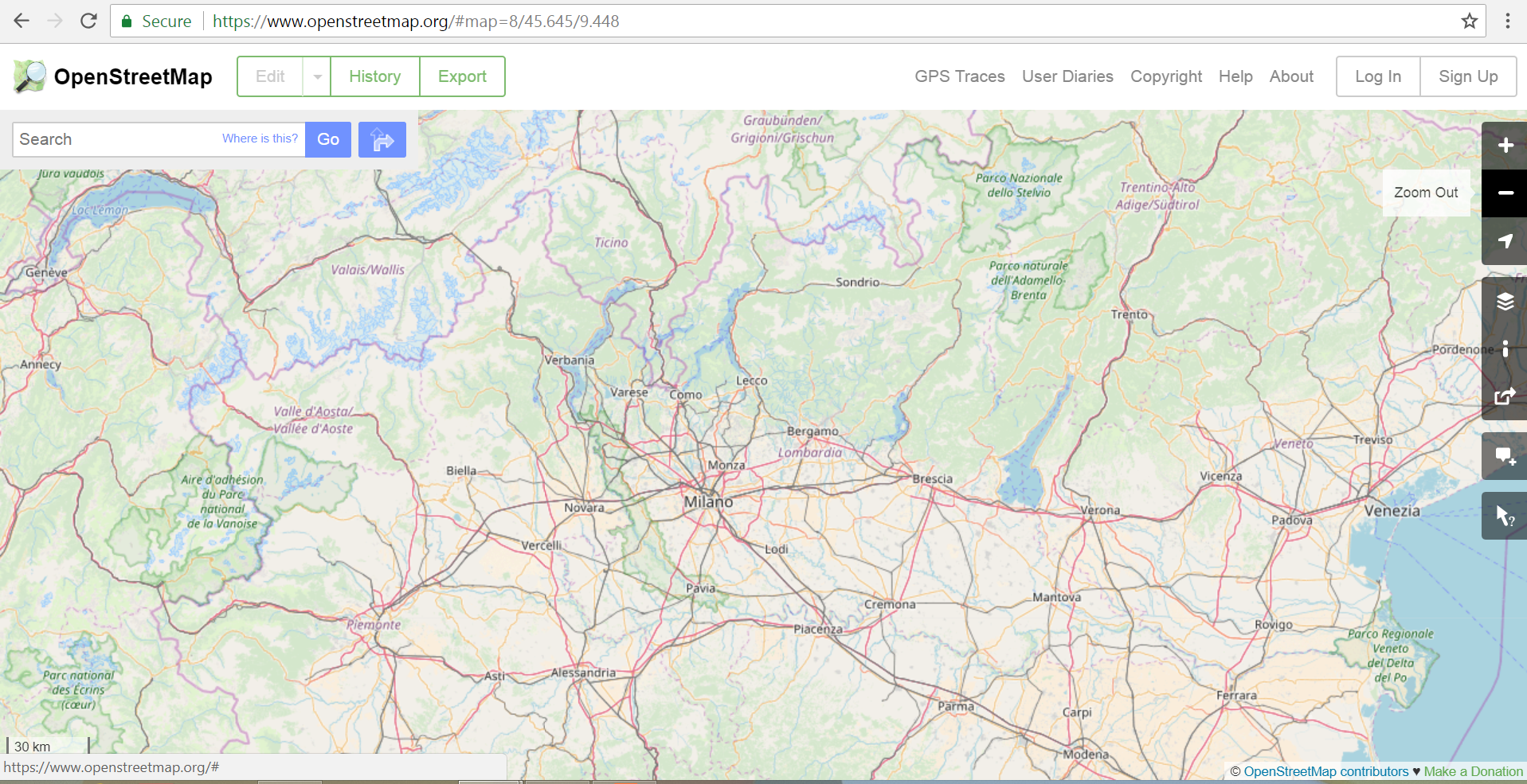
Figure 9.10: Example of emphasizing the size and significance of cities by their name’s font size (Source: http://www.openstreetmap.org).
9.3 Visual variables of cartographic symbols
Visual variable represent ways in which we can create differences in signs used on a map. Standard visual variables in cartography are shape, size, color, intensity, texture, and orientation. Visual variable enable the mapping of qualitative and quantitative characteristics of objects or phenomena.
Shape is a variable which determines an object to be unique or to belong to a certain type or class of phenomena.
Color is a very important tool in cartography. Colors draw the attention of a map’s user and engage them. They also provide a wider range of design possibilities than a black-and-white representation and enable more expressivity and creativity in mapmaking. However, in order to maximize map efficiency, colors must be used in an optimal manner. They can complicate a map and, if used wrong, cause a user’s confusion or a perception of unattractiveness.
Size as a visual variable had the role of implying relative or absolute significance levels of an object.
Intensity (and saturation) represents different sizes or sequences of data significance.
Texture is applicable to cartographic signs that have a surface. The effect of using texture is the perception of an object’s belonging to a group or class.
Orientation of an object in different directions creates the perception of its belonging to a group or its similarity with other objects.
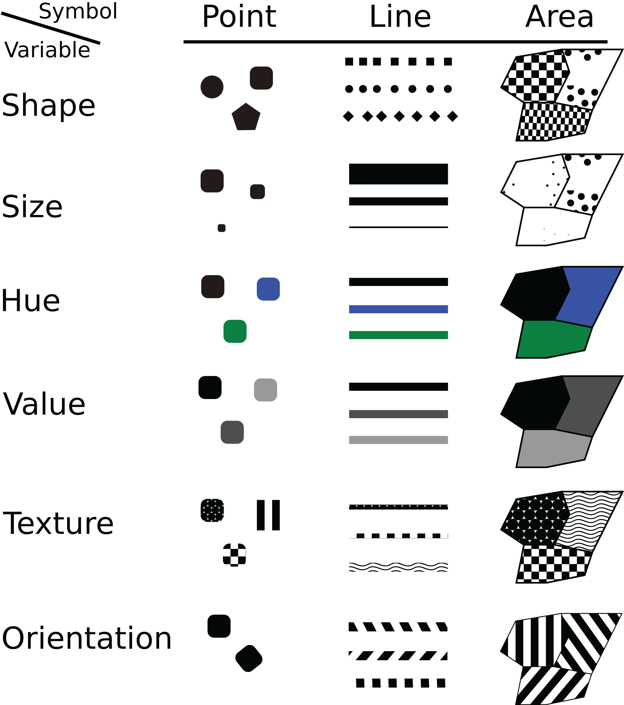
Figure 9.11: Visual variables of cartographic signs (Source: .).
9.4 Color
In cartography, colors are used to provide structure, readability, and a psychological reaction to the map. If used properly, colors can significantly improve the attractiveness and usefulness of a map and vice versa, improper use of colors can repel a map’s user and make it difficult to read.
There are generally adopted color conventions in cartography. For example, bodies of water are usually displayed in blue, while forests, parks, and other surfaces under vegetation are shown in green. Red is used to represent high and blue to represent low temperatures.
The role of colors is especially important when we want to emphasize an object which is in focus relative to its out-of-focus background9. The goal we want to achieve is that objects in focus are instantly visible and interesting to a map’s user, while the background remains useful since it provides contextual information and data on the object’s surrounding. Similar colors, intensity, and saturation are perceived by a map’s user as similar phenomena. Warm colors emphasize an object in focus better than colder colors.
Figure 9.12: An example of adequate (left) and inadequate (right) relations between an object in focus and its background.
Additional information regarding the use of colors in cartography can be found at:
http://www.freac.fsu.edu/download/MM-color.pdf
https://thumbnails-visually.netdna-ssl.com/using-color-in-maps_50eef8021d920.jpg
An online app for experimenting with color combinations in cartography can be found at: http://colorbrewer2.org
9.5 Representation of qualitative and quantitative characteristics of phenomena
Maps can show qualitative and quantitative differences between mapped phenomena. Qualitative mapping is a descriptive representation of phenomena, whereas quantitative maps provide absolute or relative information about the size or number of phenomena.
Qualitative and quantitative mapping is achieved with appropriate use of visual variables on cartographic signs. Typical uses are shown in Table 9.1.
| Visual variables for qualitative mapping | Shape |
| Orientation | |
| Color | |
| Visual variables for quantitative mapping | Texture |
| Intensity | |
| Size |
Qualitative maps show nominal and ordinal data.
Nominal data are related to the names of phenomena or existence of classes of phenomena., Figures: 9.13, 9.14, 9.15.
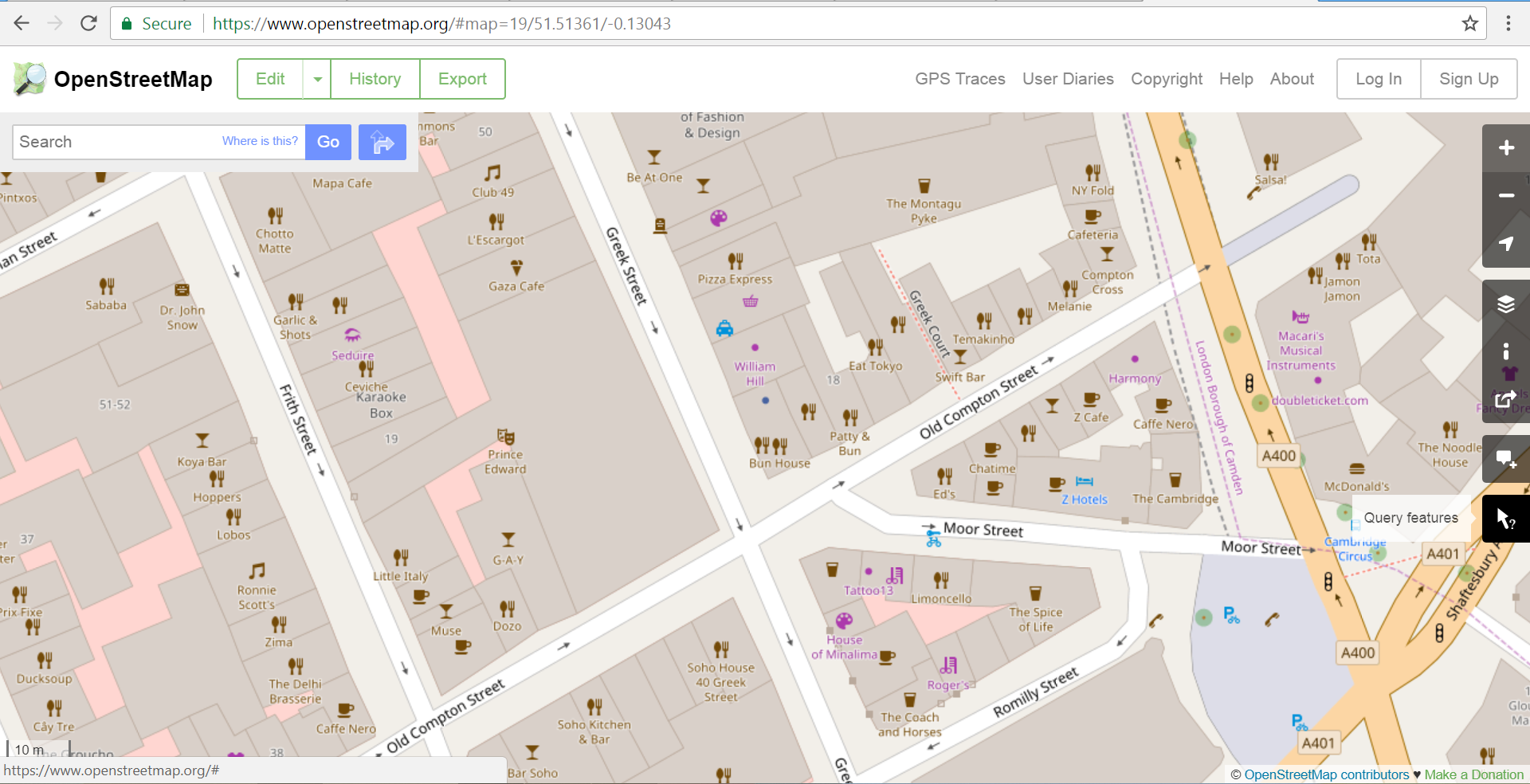
Figure 9.13: Example of point nominal data – names of bars and restaurants (Source: www.openstreet.map).
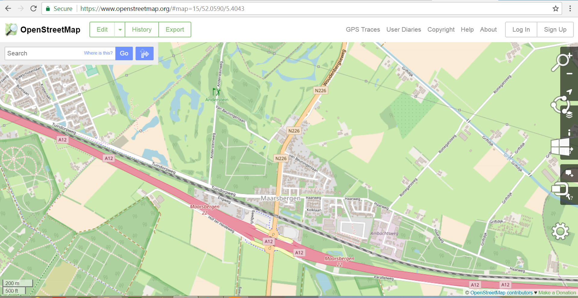
Figure 9.14: Example of line nominal data - names (labels) of roads (Source: www.openstreet.map).
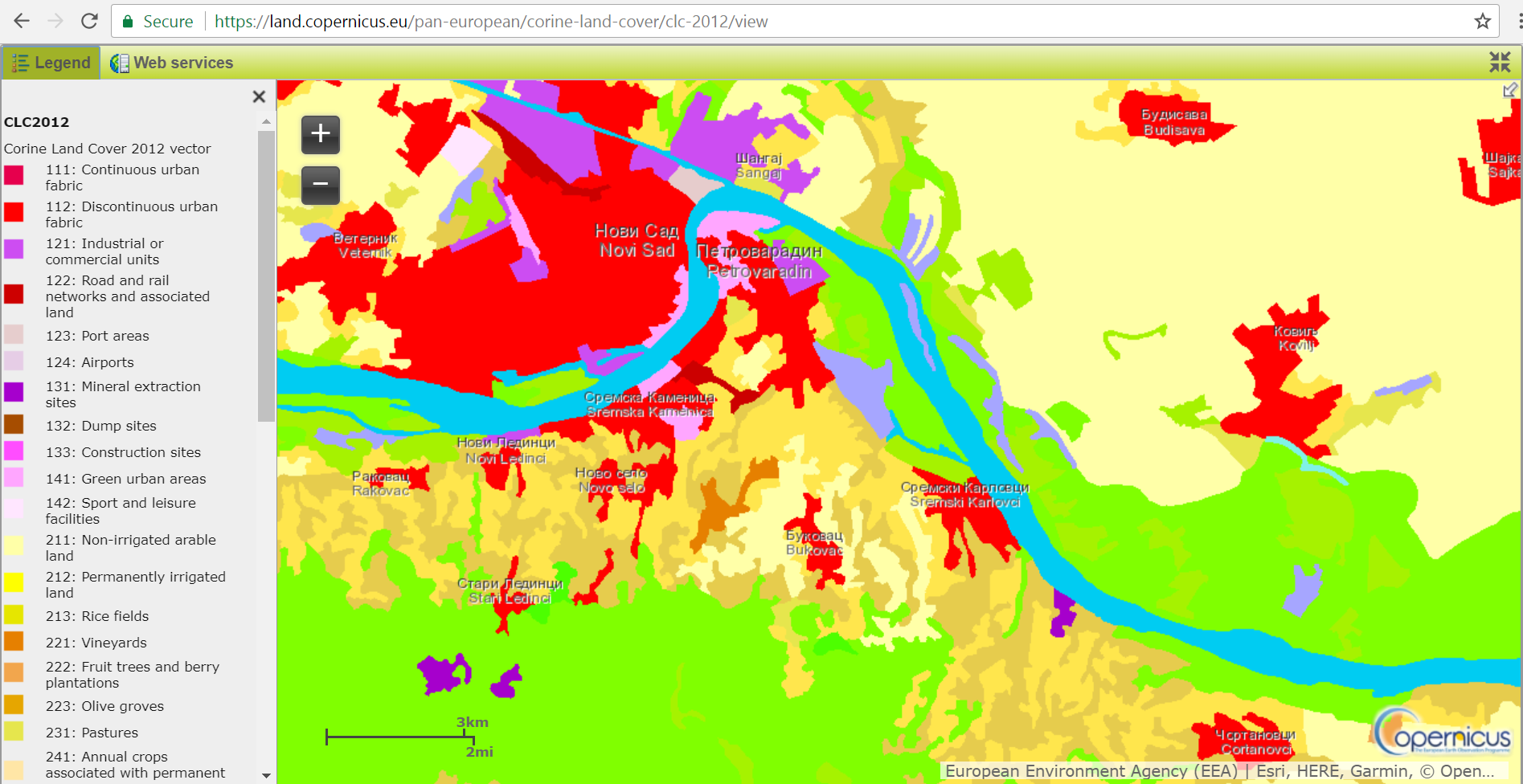
Figure 9.15: Example of surface nominal data – classes of soil layers (Source: Copernicus Land Monitoring service).
Ordinal data include ranking (one class is always above or below another by rank), Figures: 9.16, 9.17, 9.18).
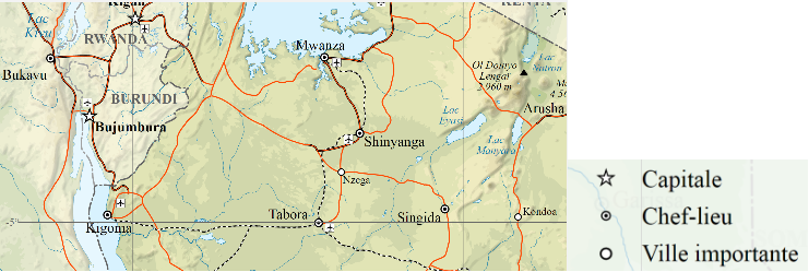
Figure 9.16: Example of point ordinal data – cities of different significance (Source: © Sémhur / Wikimedia Commons).
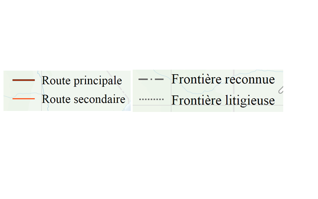
Figure 9.17: Example of line ordinal data (related to the previous map) – roads and borders of different significance (Source: © Sémhur / Wikimedia Commons).
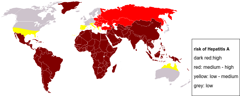
Figure 9.18: Example of surface ordinal data – risk of Hepatitis A by country (Source: Wikimedia Commons).
Quantitative maps show data related to intervals and relations.
Interval data are numerical data, but on an arbitrary scale (typically, numerical data are classified). With data relations, numerical data values are on a scale with an absolute zero (these can be physical quantities, e.g., air temperature, or ratios of two numbers, e.g., population density), Figures: 9.19, 9.20, 9.21)..
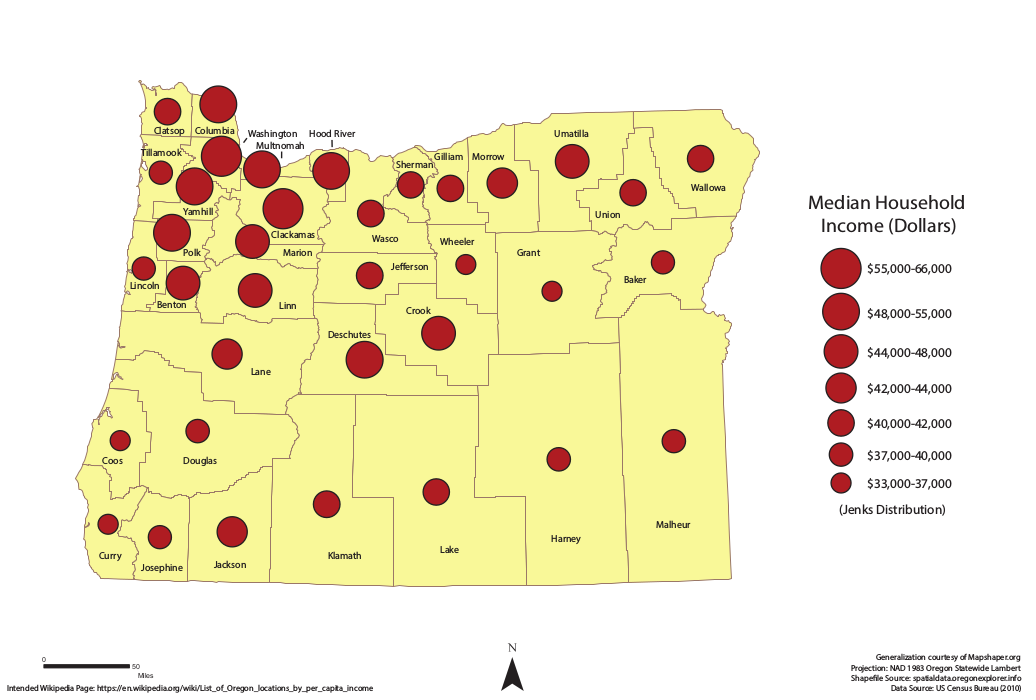
Figure 9.19: Point phenomena. Proportional symbols – symbol size is proportional to the value of the quantitative characteristic.
Figure 9.20: Line phenomena. (upper) Flow lines – line thickness is proportional to the value of the quantitative characteristic. (down) Isolines – connecting points with identical parameter values.
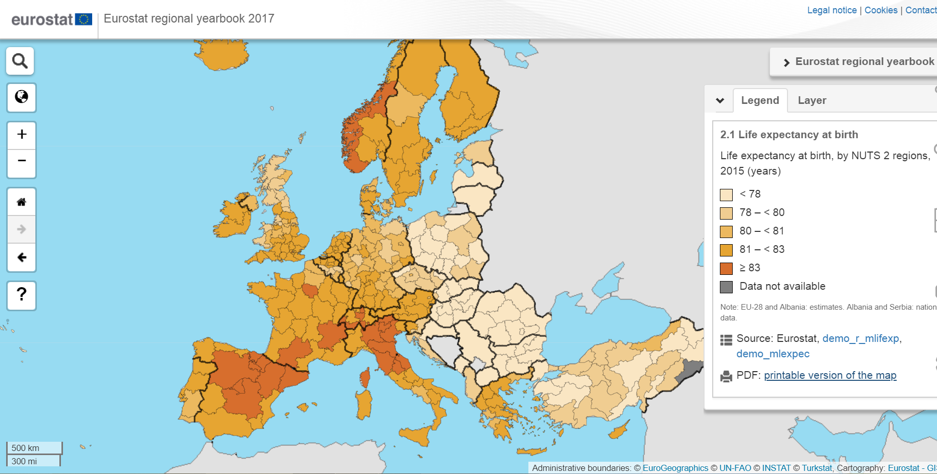
Figure 9.21: Surface phenomena. Choropleth maps – quantitative information is shown for certain surface units (e.g., administrative units). This example shows data on life expectancy in Europe according to NUTS 2 administrative units. (Source: Eurostat).
9.6 Classification of quantitative data10
Phenomena and objects shown on a map can be classified based on a set of conditions. The result of classification can be new or modified attribute data for every object. For example, data on population density can be classified as densely populated, medium populated, and sparsely populated.
The basic reason for classification is that it simplifies data for the purposes of visual presentation, in such a way that spatial patterns become more easily recognizable and clearer to the map’s user. Besides, the goal is tho group similar data and show differences between groups.
During classification, care must be taken to preserve the character of the source data. Besides, there are other requirements that must be met: data classes still have to represent trends very well; classification must cover the entire data range; when defining classes, care should be taken to avoid overlap and values falling outside any category; a balance should be found when determining the number of classes – as the number of classes increases, visual representation becomes more difficult, hence, it is important to select a number of classes suitable for interpretation but still adequately representative of data complexity (Figure 9.22); data should be divided into reasonably equal groups – classes need not be of same size but there should not be large discrepancies in data ranges; colors should be chosen carefully when representing classes – two basic color choices appropriate for classifying quantitative data are sequential and diverging color schemes (Figure 9.23).
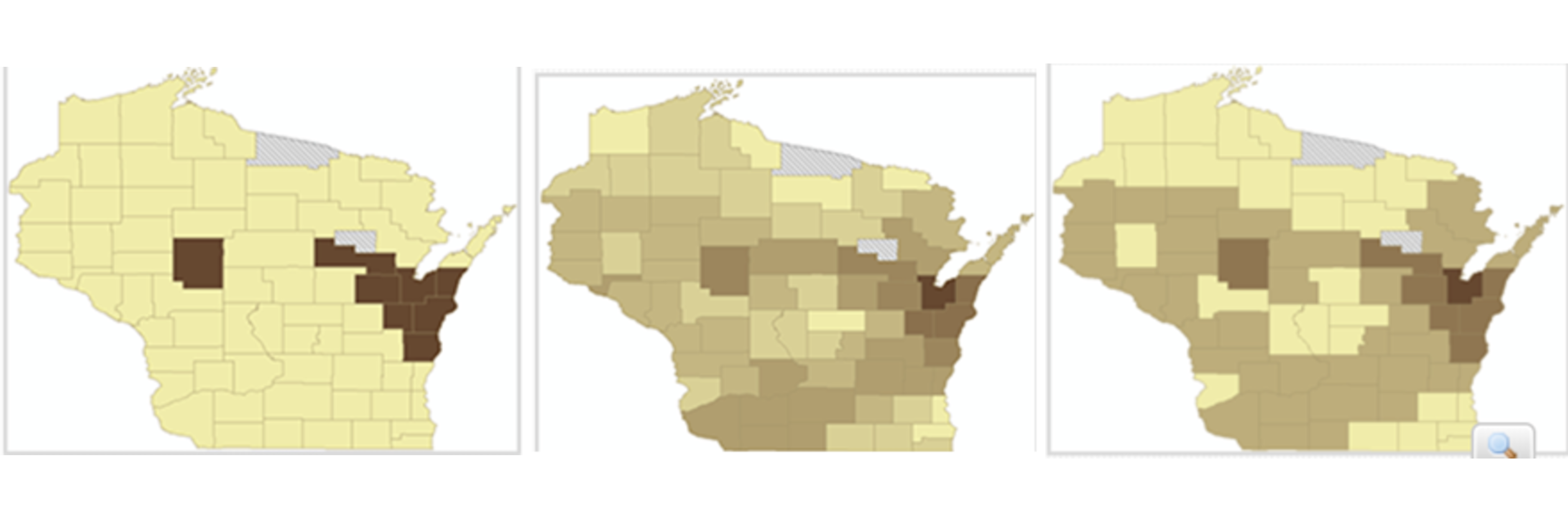
Figure 9.22: (left) This map only has two classes, making it dull and probably obscuring complex spatial patterns. (middle) This map has too many classes, making it difficult to discern different colors – the user must look at the legend several times to remember which color represents which class of data.(right) This map has four classes and represents data patterns and complexity very well.(Source: http://www.spatialquerylab.com/FOSS4GAcademy, autor primera Richard Smith, http://creativecommons.org/licenses/by/3.0).
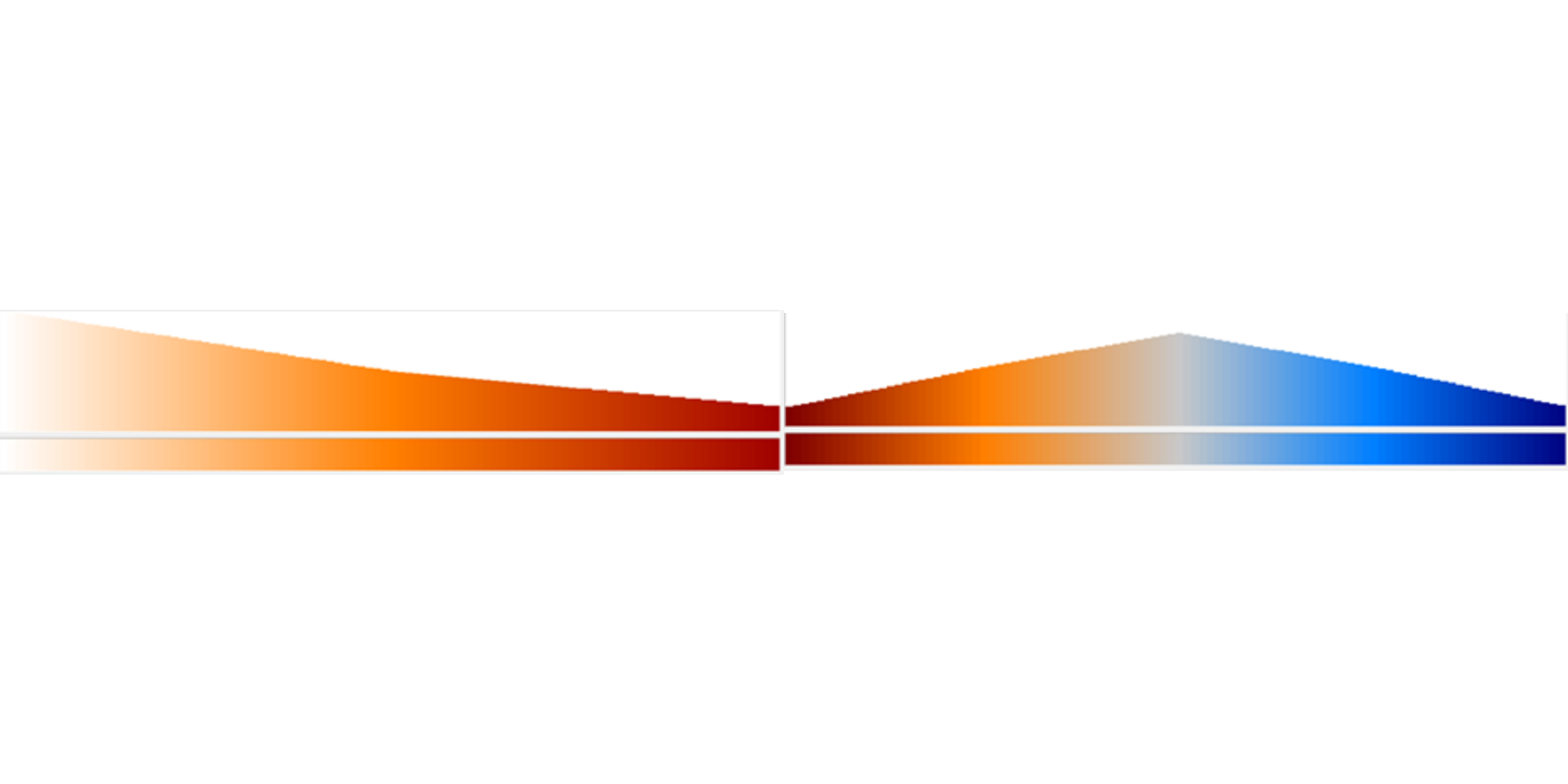
Figure 9.23: (left) Sequential color scheme – used for representing classes when data values increase steadily from low to high values. Typically, one color is used, changing its intensity or saturation. (right) Diverging color scheme – used for representing classes when data values increase in opposite directions from a neutral point. Typically, complementary colors are used, increasing their saturation towards extreme data values. The neutral point should be neutrally grey or with equally low-saturated colors on both sides.
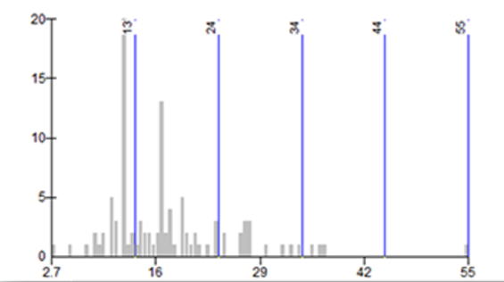
Figure 9.24: Classification with equal intervals creates classes with equal attribute value intervals. This classification provides good results when data are equally distributed over the entire range. A negative aspect of this method is that it does not take into account data distribution; hence, some classes may contain no spatial objects.
)](_media2/image48.png)
Figure 9.25: Quantile classification is a method that divides a set of data values into groups containing an equal number of data points. The figure shows a histogram of data with the data string divided so that every group contains 10 data points. With this classification, each class is equally represented on the map. (Source: http://wiki.gis.com/wiki/index.php/Quantile)
Figure 9.26: Jenks natural breaks method maximizes class homogeinity. This method analyzes the histogram, recognizes groups of data that are similar, and breaks classes accordingly. This way, the data distribution is taken into account by minimizing the variance within classes.
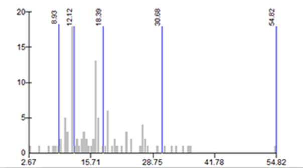
Figure 9.27: The geometric interval method creates class boundaries which systematically change in a mathematical progression. This classification is a compromise between Jenks natural breaks, equal intervals, and quantiles, and is useful when the data value range is significant or when it follows a mathematical progression which needs to be described with appropriate classes.
9.7 Displaying the third dimension (terrain)
Typically, maps are a two-dimensional representation of space which is, in reality, three-dimensional. Finding a way to represent the height of terrain and objects has always been a challenge for cartographers.
Classic cartography has developed three methods to display terrain: 1) using isohypses, 2) shading, and 3) using an hypsometric scale.
Isohypses are (closed) curvilinear objects connecting points on the map of equal height. Equidistance represents the difference in height between two adjacent isohypses and defines the level of terrain detail. Using isohypses does not allow for a good perception of terrain by the map’s user but provides quantitative data on terrain height.
Modern GIS software tools make it possible to automatically generate isohypses from a set of points with known heights or from a digital elevation model (DEM).
Isohypses can be displayed using different line thicknesses or colors, and it is common to write the height of certain isohypses for easier map use.
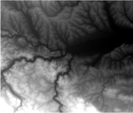
Figure 9.28: An example of a DEM of an area (vicinity of the city of Valjevo, Serbia).
Using a DEM of the vicinity of Valjevo, Serbia (Figure 9.28), isohypses were generated in the QGIS software with three different equidistance values (Figure 9.29).
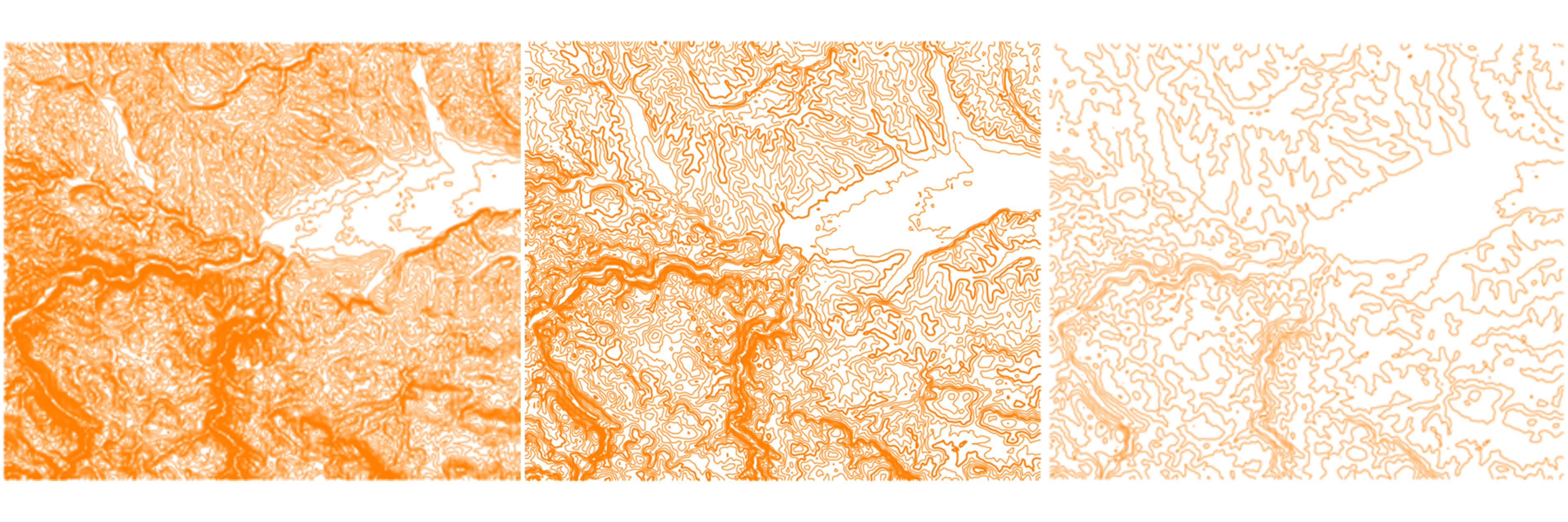
Figure 9.29: Isohypses generated in QGIS using the DEM (vicinity of the city of Valjevo, Serbia). (left) Equidistance 10 m. (sredina) Equidistance 50 m. (desno) Equidistance 100 m.
It is typical to emphasize certain isohypses for better map readability. Figure 9.30 shows isohypses with an equidistance of 20 m and with every fifth isohypse highlighted with greater line thickness (isohypses divisible by 100).
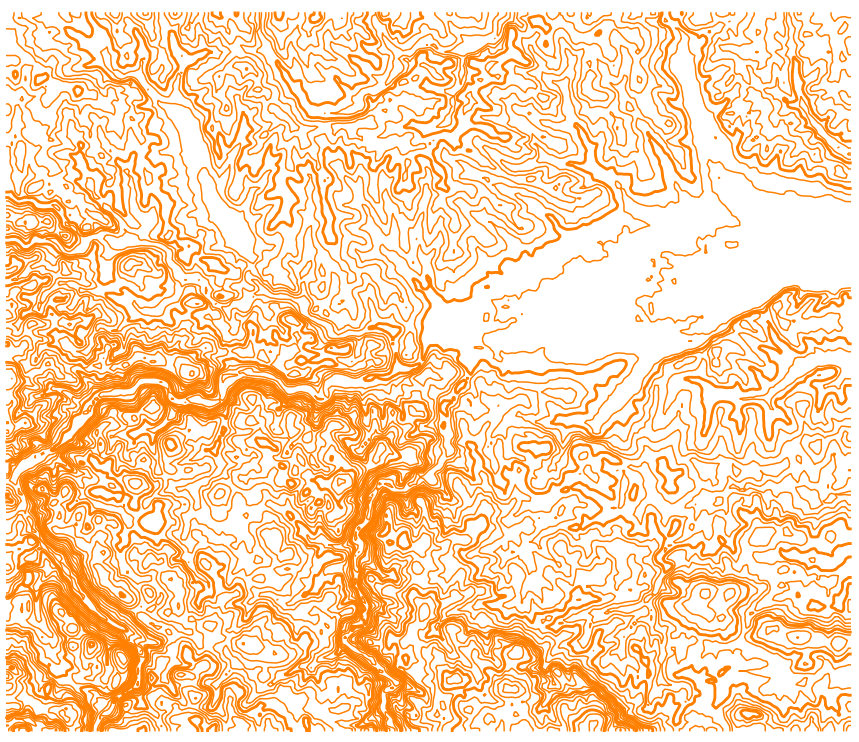
Figure 9.30: Example of isohypse emphasis – isohypses with an equidistance of 20 m are shown and with every fifth highlighted (100 m, 200 m,…).
Shading imitates the illumination and shading of terrain under a source of light (e.g., the Sun), viewed from above. Shading provides an impression of “plasticity”, i.e., it provides the user with a feeling that the terrain is threedimensional. However, with this method, quantitative information about the terrain are lost.
Modern GIS software tools (e.g., QGIS) can automatically generate shading from a DEM. Typically, the cartographer can adjust the light source’s position (azimuth and vertical angle), as well as the shading method (Figure 9.31).
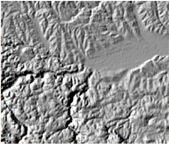
Figure 9.31: Shading generated in QGIS with the following light source position: 300 degree azimuth, 40 degree vertical angle.
Hypsometric scale is a method which includes the use of a color scheme to achieve the effect of height differences, i.e., a perception of relative height differences by the map’s user. In this method, however, the user can not easily obtain quantitative information about terrain height. When generating a hypsometric scale for a map, the terrain is divided into height bands and a color is defined for each band (Figure 9.32).
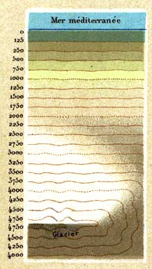
Figure 9.32: Hypsometric scale created by Rudolf Leuzinger for his map Carte physique et géographique de la France (Source: http://www.reliefshading.com).
For a DEM in the previous example, a hypsometric scale was applied in QGIS by dividing the terrain into five equal height bands, each 125 m wide (Figure 9.33). Every pixel in the DEM is shown in the corresponding color based on its belonging to a certain height band.
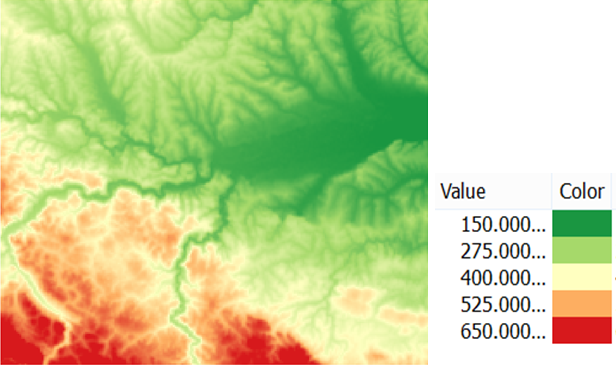
Figure 9.33: Visualization of a DEM using a hypsometric scale.
Combined method – often, multiple methods for displaying terrain are used in combination. This approach takes advantage of each method’s upsides: quantitative information conveyed by isohypses, the effect of “plasticity” conveyed by shading and using a hypsometric scale. However, in this case, care should be taken not to make the terrain display too dominating on the map when it is only used as background for other thematic information.
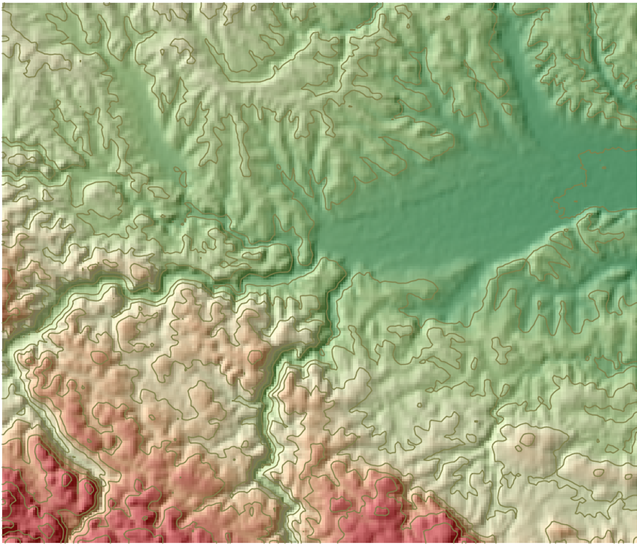
Figure 9.34: Combination of isohypses, shading, and hypsometric scale to display terrain.
Additional useful information regarding displaying terrain in cartography can be found at: http://www.reliefshading.com/
References
Vasilev, Stanislav. 2006. “ABOUT the Cartographical Signs.” Conference Proceedings of 1-St International Trade Fair of Geodesy, Cartography, Navigation and Geoinformatics GEOS 2006.
The Geographer’s Craft, Department of Geography, University of Colorado at Boulder, Cartographic Communication by Kenneth E. Foote and Shannon Crum, 1995 ↩
Peirce, C. S., 1897, Collected Papers. 8 volumes, vols. 1-6, eds. Charles Hartshorne and Paul Weiss, vols. 7-8, ed. Arthur W. Burks. Cambridge, Mass.: Harvard University Press, 1931-1958.↩
http://www.spatialquerylab.com/FOSS4GAcademy/Lectures/GST104/L6/Map%20Symbols%20and%20Visual%20Variables%20output/story_html5.html↩
Adapted according to http://www.spatialquerylab.com/FOSS4GAcademy/Lectures/GST104/L5/Data%20for%20a%20Map%20output/story_html5.html↩